Halloween Costume Sneak Peek!

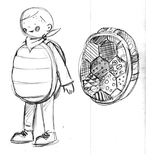
Halloween is just over the horizon, so it's time, once again, for another possibly overly ambitious halloween costume!  This year's costume is inspired by the boys' various sea creature obsessions - Jude happens to be a big fan of turtles at the moment, and this concept was inspired by a turtle embroidery kit that our mom did back in the 70's.

The idea is to have the shell be made from a piece of patchwork which will then be stuffed with batting for a cool soft sculpture look - I have a feeling Jude's really going to enjoy throwing himself around once he realizes being ensconced in this costume will make him semi-impervious to doing himself bodily harm. The overall costume will have a front and back shell attached to each other with wide bands of fabric and elastic, paired with a green long sleeved tee and leggings. Some cute rosy cheeks, a red sassy bandana, and voilà! Turtle-y goodness!

Of course, Sabrina's twins James and Alex must have coordinating costumes! James loves starfish and suction cups right now, so our plan is to make him a plush starfish costume with suction cups glued all over the front like starfish feet. Possibly a bit of a patchwork look on the back to match Jude's 70's vibe. Still have to sort out the logistics of the neckline - fingers crossed!

Alex is going to be a jelly fish - essentially an organza or other sheer fabric fashioned into a bubble skirt with some tulle for structure, worn decorated with shimmery paillettes and ribbon tentacles. It will be blue so we don't compromise his masculinity TOO much!  Love the idea of a little starfish perched on his head as an homage to James.

We're thinking that the dads will be dressed as fisherman, complete with pipes, yellow hats, and stripey shirts. Sabrina and I are tbd - possibly mermaids (really just an excuse to own a pair of metallic American Apparel leggings) although we are toying with turning Sabrina, who is very pregnant at the moment, into a pufferfish, her belly being perfectly proportioned!

Stay tuned, the crafting begins in full force this week! We'll be sure to post photos of the finished costumes here!

Today's Bride

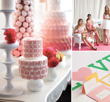
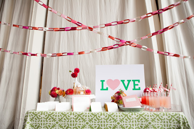
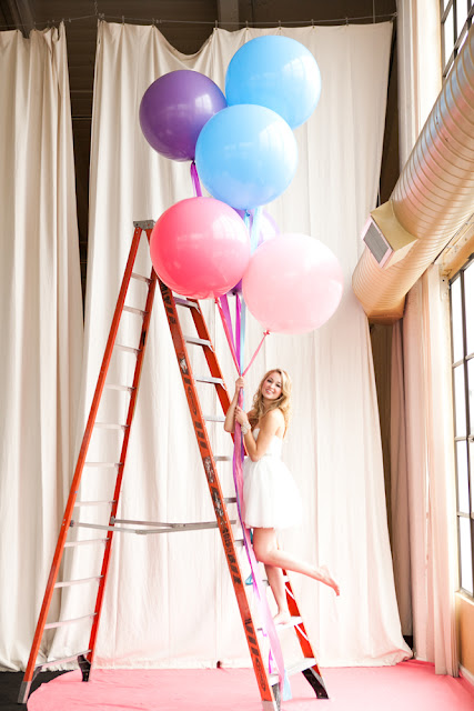
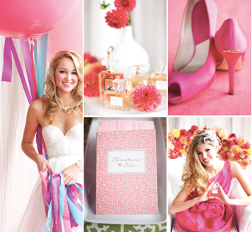
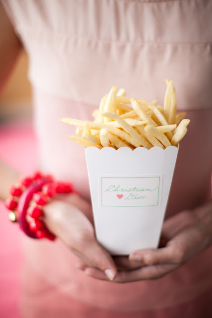
These photos from Nancy Liu Chin's Anatomy of Today's Bride for Today's Bride SF are to die for! We were approached by Nancy awhile ago in efforts to come up with a classic and whimsical invitation and day-of paper suite for her ultra-sweet photo shoot. It was a piece of cake once she shared her inspiration with us, and knowing which amazing vendors were also on board, we knew it would be a hit.

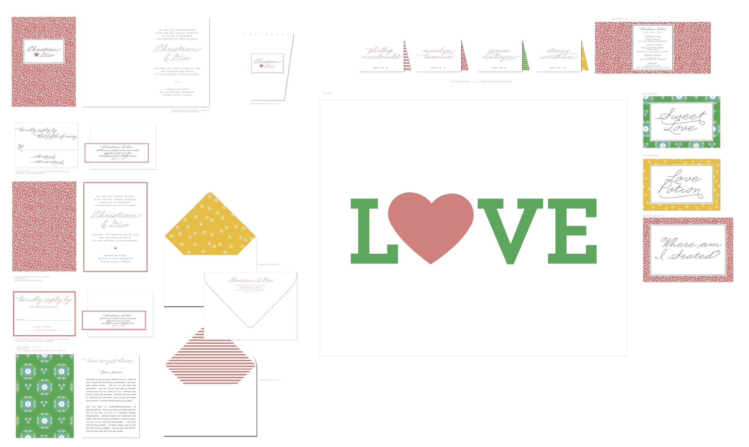
You can see our working files below. We were really into mismatched patterns and folded cards. If you look closely, the invitation reads Christian & Dior, tres chic!

Visit Nancy's Brown Bag to view Anatomy of Today's Bride Part I and Part II, and watch the amazing video by Luke Goodman here!
Photography by Kevin Chin

Inspired by: Wedding Invitation Suites

With wedding season about to kick off, we're gearing up for some amazing additions to our collection. Wedding invitations serve as the first source of inspiration for the big day, and with all the pieces in check, you can really start to see all the details come to life. Frequently we find ourselves browsing through the photo database for inspiration drawn from particular invitations, and we wanted to share a place where you can do the same. Whether your wedding has a rustic farm theme, a sleek and modern theme, or a whimsical and playful theme, these photos will have you planning in no time! Click on the photos for a larger view!
Southern Belle (above) and its darling motifs will make that sweet southern wedding that much more charming. The delicate watercolors by Anne Smith are calling for lots of floral garland and white daisies!

 Rolling Acres is just right for a summer celebration. And the pennant liners (available soon!) will add a festive flare to your party invitation.

Figs has more rustic and natural qualities. Perfect for an outdoor wedding where locally sourced food and flowers are the focus.

We love the crisp and clean details of the Desert Skyline invitation suite. Bouquets of succulents and dried flowers arranged among rough wooded tables would complement this style beautifully.

Heartland is another favorite and best for the down-home country weddings we all dream about. We've seen lots of brides customize the colors and layout of this design, but it always stands out with some amazing farm-chic accessories.

 Big Day is one of our most popular suites, with its playful wording and simplistic hand-drawn icons, it's definitely a party starter. We've replaced the Golden Gate Bridge icon with other simple motifs, and it's still just as sweet!

We can't imagine a Cape Cod wedding without lots of nautical accompaniments. This maritime suite designed by Anne Smith was made just for our brides ready to wed by the ocean air.

A custom design gallery with all of our invitation suites is in the making, along with lots of brand new designs. Do you have a favorite style or wish we would create a wedding suite around a certain theme? Let us know in the comments!

All photos by Edyta Szyszlo

Design Notebook: a kitchen bridal shower!

photo

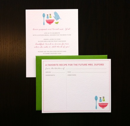
Sometimes the cutest cards start with the simplest of ideas.  Kendel was having a kitchen bridal shower and wanted to send out invites that were playful and fun along with recipe cards so her guests could share their favorite dishes.  We love the tiny faces on the bowl and spoon reminiscent of our Big Day rsvp cards and Type(face) thank you cards.

DSC_0003

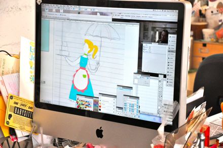
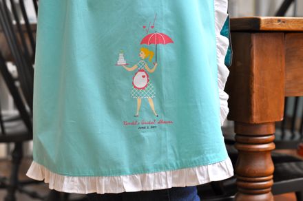
We also created custom artwork to be printed on aprons for the party.  Eunice did a few sketches, scanned in the best one, and got to work designing the most adorable illustration!

DSC_1045

DSC_1046

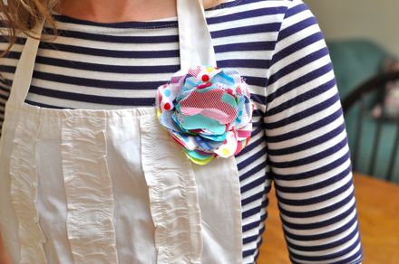
How darling is that apron?  I'm sure the ladies looked fabulous and had a blast cooking and sharing recipes!

Design Notebook: Sarah's Woodsy Mural

DSC_0424

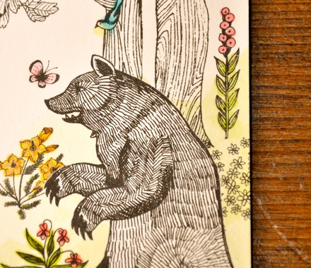
When Sarah first called us to create custom wedding invitations inspired by her gorgeous venue, the Ahwahnee Hotel in Yosemite National Park, she had a very specific vision for what she wanted.  She loved the hand-draw illustration style of our Cala Lily suite but wanted to recreate the flora and fauna depicted in the hotel's painted mural.  In her words, "vintage elegance with a little bit of whimsy".  Sign us right up!  We don't want to steal her thunder, so here's just a glimpse at a few of our favorite bits. The details are the best part!

DSC_0422

DSC_0425

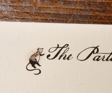
How cute is this little guy heading up the Particulars card?

A Craft Podcast Studio Visit, Revisited

We'd almost forgotten this one! Waaaay back in 2008, when we'd first moved into our current studios in SOMA, we did a little interview for Craft Video Podcast. There's some great stuff toward the middle/end where James shows how the polymer plates work in the Heidelberg presses while printing some wedding invitations. Then Eunice shows some of her inspiration and drawings for a couple of the fab letterpress greeting cards we've featured on Lucky Fridays! So stay tuned, or skip ahead to those parts if you're short on time.

The video is great for its completely ad-lib, unrehearsed, unplugged honesty. :D Hopefully we won't embarrass Shauna or Eunice too much.

Design Notebook: Katie's Big Day

DSC_0142

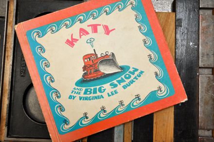
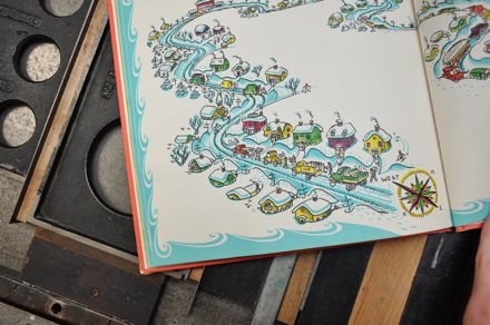
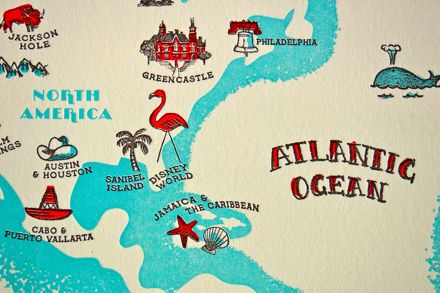
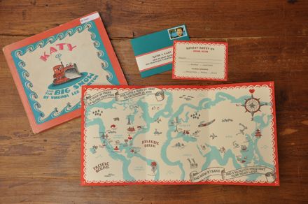
We're SO excited to share this sneak peak of a custom design we recently created for the lovely Katie and Gary.  The concept was based on one of Katie's favorite childhood books, Katy And The Big Snow by Virginia Lee Burton.  We just went nuts over the super detailed illustrations and knew her invite had to be something special!

DSC_0144

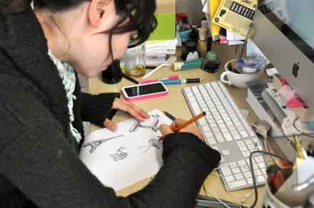
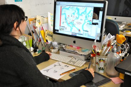
Eunice hand-drew the illustrations and scanned them in to Illustrator where she created vector artwork and "mapped out" the details of the wedding suite (pun intended - hint, hint!)

DSC_0015

DSC_0023

DSC_0093

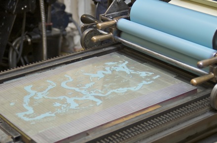
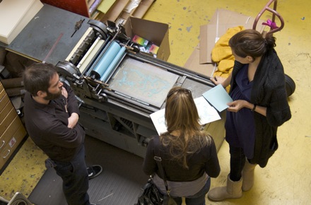
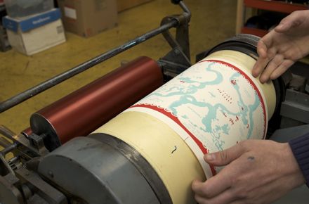
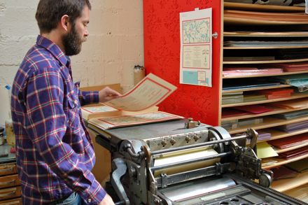
Each ink color requires a separate plate and press run and Katie was able to meet with the printers and check in as the job progressed.

DSC_0080

DSC_0008

DSC_0009

DSC_0043

As each new color is added, the illustrations start to take shape with more detail and depth.

DSC_0047

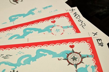
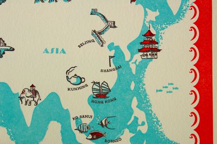
Katie and Gary met while on vacation in San Francisco and traveled to so many exotic locales that they knew they wanted a map to be central to their wedding invitation.  With so many adorable icons and illustrations is hard to choose a favorite but we have a feeling Katie's a bit partial to the Disney World flamingo - Gary proposed in the park!

DSC_0053

DSC_0060

And voila!  The finished invitation suite - a tri-fold map invitation and rsvp set alongside its literary inspiration!

DSC_0153

Congrats and best of luck Katie & Gary!

DSC_0172