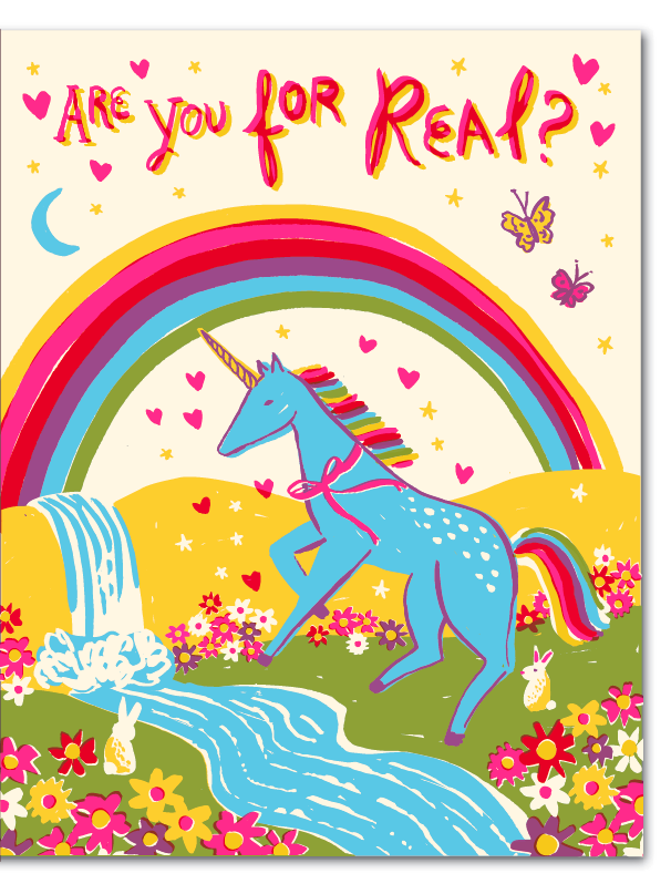
Unicorn Card Winner!

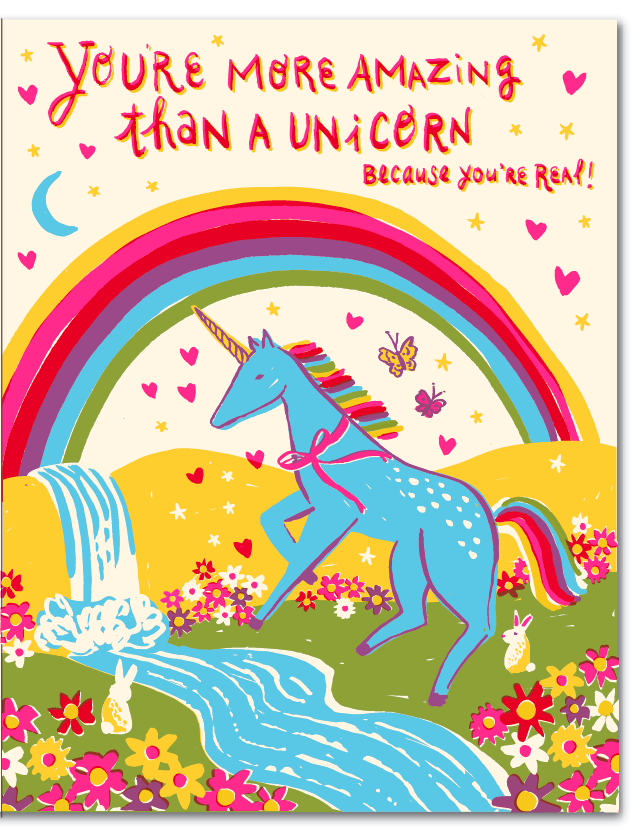
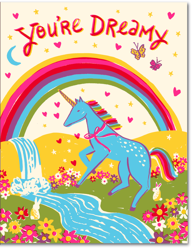
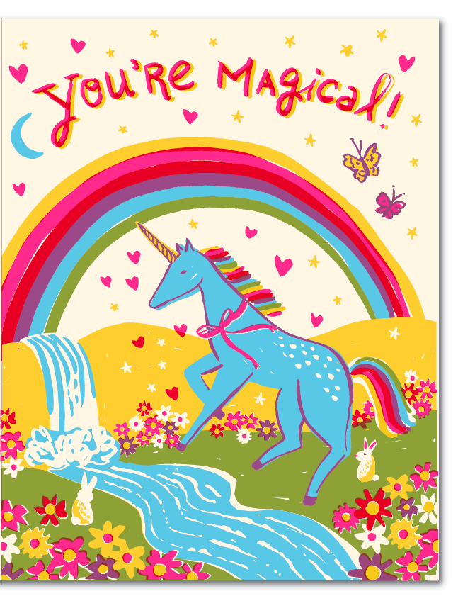
You have no idea how much we enjoyed reading your comments and suggestions for this card. You all are a witty, clever group of people. Thank you SO much for your feedback, it really helps us in this process when we are stuck on a design. In the end we settled on Are You For Real? And the final version is above. But that doesn't mean we didn't mock up a bunch of versions with your genius ideas before we settled on the final. Below are versions of the card with your words. They are all great, but we liked the silliness of Are You For Real? And thought the message could be interpreted more broadly.

We promised one lucky commenter a years worth of cards (totaling 12 letterpress cards). The winner of our caption contest is..... Tracy! Thanks for so many great suggestions Tracy, look out for an email from us so we can get your address and ship those cards to you.

Thanks to everyone else as well -- that was fun!

New! Lisa Congdon for Hello!Lucky

When Lisa Congdon agreed to do a line of cards with us for 2013 we were beyond thrilled. We love Lisa's colorful illustrations, hand lettering, and imaginative renderings of nature and animals. We think her cards are perfect for any occasion but we're especially excited to launch the line just in time for Valentine's Day. Check out these images of her studio (Taken by Victoria Smith of SF Girl by Bay). No wonder her designs are so bright and cheerful, her space is an inspiration in itself!

We asked Lisa a few questions about her process and what she has in store for 2013:

What is your process like? Does it change with every project?

It does depend. Sometimes I draw things straight from my brain, especially if I am making a simple drawing without much nuance. The cards I did for Hello!Lucky were all things I drew that just came from my imagination. When I paint or draw something more realistic or complex, I find images (photographs) to use as reference, so I can get the proportions and lighting right. Typically, especially in my commissioned illustration work, I make sketches first. And then I move to making the final artwork.

I always start by drawing things by hand. Always. None of my work starts as digital work, even if it ends up as digital work. In the case of the card line for Hello Lucky, I drew the designs in pen on paper, then scanned them and turned them into vector so they could be reproduced as plates for letterpress printing.

What was your inspiration for this line? 

I remember I got really simple, straightforward art direction for this line: create designs in your own style around the theme of love. So I brainstormed different sayings that would lend themselves easily to colorful illustration: things like You are My Sunshine, You are my Queen, You Light up My Life. It was really as simple as that! I really enjoyed it!

Do you have a favorite in the collection or do you love them all equally?

I think You Light Up My Life is my favorite! But I like them all.

(My Sunshine, Sailboat Love, Falling for You, Lighthouse)

We loved your 365 days of hand lettering project you did for 2012. Is there a favorite quote/motto you have from that project? 

One of my favorites is: "Leap and the net will appear," which John Burroughs is quoted as saying. It's the motto for many things in my life.

What are you currently working on or what's your latest release? Is there a 365 day project for 2013?

I just launched a weekly project for 2013 with Maria Popova of Brain Pickings called The Reconstructionists. It's a a yearlong celebration of remarkable women who have changed the way we see the world. Every Monday in 2013, we'll publish an illustrated portrait (by me) of one trailblazing woman (artist, scientist, writer), along with a hand-lettered quote that captures her spirit and a short micro-essay (by Maria) about her life and legacy. I'm pretty excited about it!

(Queen, King)

Thank you Lisa for being such an inspiration and so much fun to work with! Visit Lisa's website for more lovely illustrations and follow along with her blog here. Shop Lisa's new collection for H!L here!

Product Photos by Edyta Szyszlo Photography

Portrait of Lisa by Leslie Sophia Lindell Photography

New! Letterpress Prints + Giveaway!

Remember the letterpress prints we designed for our Open Studio Event this year? Well now you can order them online! Our Etsy shop is a great way to get your hands on our cards and gifts, and the newest additions are these limited edition split-fountain letterpress prints hand-drawn by our Creative Director, Eunice. The playful typeface prints are a fun way to add color to any space, and their quirky quotes are sure to brighten your day. Get yours online here, or enter to win your favorite! All you have to do is comment below telling us which is your favorite print and why. We will pick three lucky winners to receive their print of choice. Our winners have been chosen and contacted via email! Thanks for participating and stay tuned for more fabulous giveaways!

Be Awesome Today (above)

Don't Grow Up

Magic

Print Details: Paper Weight: 130 lb ecru 100% recycled paper, Dimensions: 11" x 14"

Inspired by: No Nostalgia Typeography Video

Agesandages - No Nostalgia from Philippe Tytgat on Vimeo. Is there a new genre brewing in the design world? It seems the art of chalk lettering has become quite the trend, so we're unofficially crowning this video the king of the unofficial genre "Chalkography." The music video for Agesandages called No Nostalgia has to be one of the most inspiring typography videos we've seen lately. French artist Philippe Tytgat hand lettered the lyrics to No Nostalgia making for a totally original and compelling visual story.

But don't take our word for it, watch and see for yourself!

Found via Molly Jacques Illustration

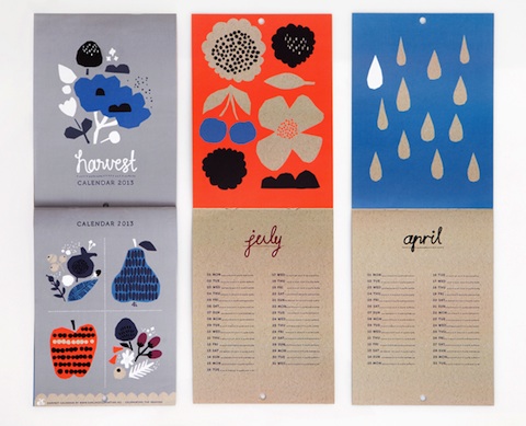
Harvest by Darling Clementine

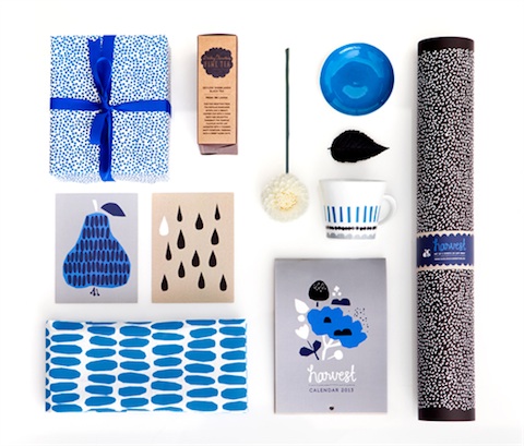
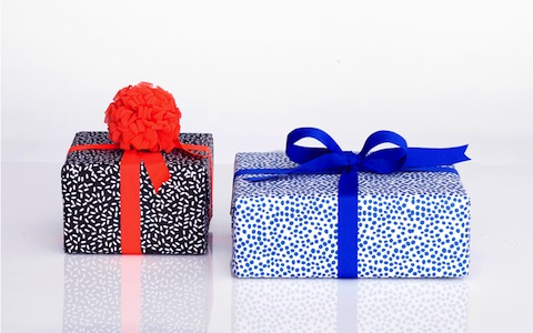
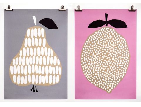
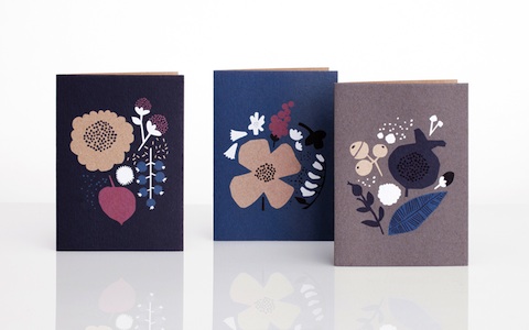
Has everyone been introduced to Darling Clementine's new collection Harvest? If not, we're delighted to do the honors. We've been huge fans of Darling Clementine since long before they agreed to be a guest designer for our 2011 Holiday Collection, and were thrilled when they wanted to work with our team. Harvest, a collection of prints, cards, gift wrap (and more!) is a perfect way to welcome the fall and winter seasons. The pairing of cool blues and grays with warm reds and pinks makes us melt with design envy. Check out the Harvest collection right here!

Set of 8 single greeting cards

Harvest gift wrap

Harvest poster

Set of 6 greeting cards

Harvest 2013 Calendar


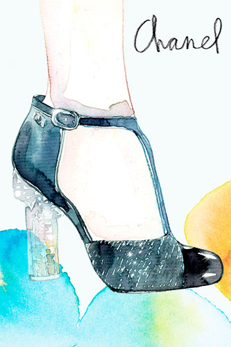
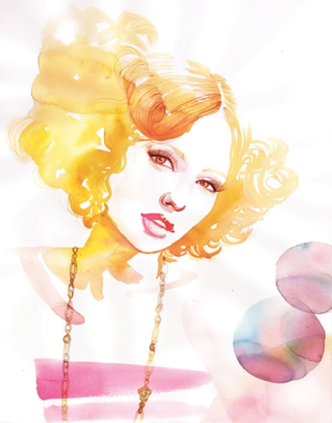
Inspired by Samantha Hahn

It's officially Fashion Week and we're gearing up for some major trend watching. Although we may not be hitting the runways any time soon, we're constantly gathering inspiration from all the exotic textiles and handmade garments. With Fashion Week comes a wave of fashion focused blog posts and images. We're really digging the tasteful and whimsical illustrations by artist Samantha Hahn. As a New York native, Samantha sees new fashion trends everywhere she goes. Her couture illustrations give a nod to the groundbreaking designers but keep within her own aesthetic and we're loving her painterly style.

To view more of Samantha's work, head over to her website and be sure to read her blog Maquette for insider designs and inspiration.

En Vacances!

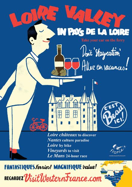
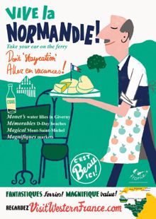
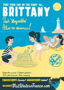
It doesn't take much to get the average Brit. thinking about holidays, especially considering the hit-and-miss wash-out Summer that we've been having recently. What could be more enticing than these charming retro-inspired posters by the French tourist board that have appeared all over the capital in the last few weeks to gently tempt us wet and weary commuters into packing our suitcases and heading South.

We love the use of the different fonts and the wonderful graphic cartoons that put us in mind of those classic Pink Panther opening sequences.

Beautifully fresh and oh so very French - who but a Frenchwoman would co-ordinate her deckchair with her son's t-shirt!

Allez...en vacances! Bon Voyage

Lab Partners Show at Super 7

Hey all you San Franciscans! If you're free tonight you should head over to Super 7 for a show by our friends the Lab Partners! They will be exhibiting a bunch of new prints like the ones shown here. We love supporting local artists so you bet we'll be there! The event, titled Next Stop: San Francisco starts at 6pm. Super 7 is located at 1427 Haight ST. See you there!

Office of Nature Blog

How awesome is the new blog by Office of Nature?? Our friend Katherine Webb (who you might remember from our holiday guest artist collection!) has built an incredible blog about art and illustration for kids and since it's launch in April we've been hooked. She has an extremely well curated collection of designs by artists like Methane Studios (above) and Sol Linero (below) along with many others. We definitely suggest taking some time to scroll the pages. It will make you feel like a kid again!

(Brad Woodard)

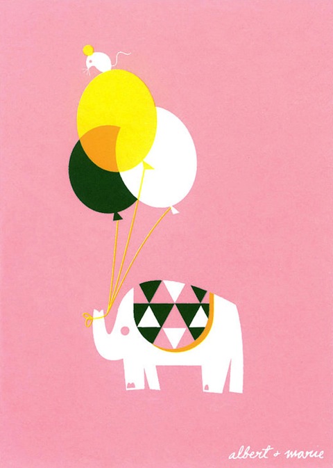
(Albert and Marie)

Visit the Office of Nature blog here and don't forget to browse her shop here!

The Best of NSS, Part 3

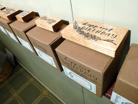
There was so much good work at NSS this year that it was hard to keep it to just two posts. So here is my third and final post, but really I could have done about three more! Rose from The Great Lakes Goods always has a strong showing and this year was no exception (above and below).

Newcomer Pei Designs featured some super cute illustrations - all letterpressed (above and below)!

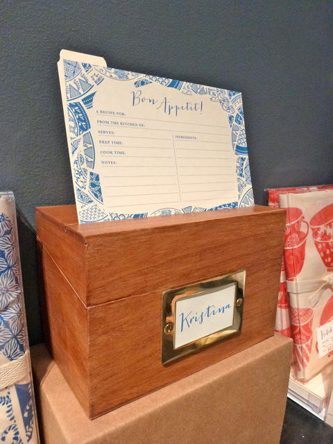
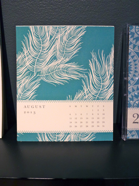
Our buddy Susy (from Susy Jack) really knocked it out of the park this year with her awesome recipes boxes, paperweights and calendars (above and below).

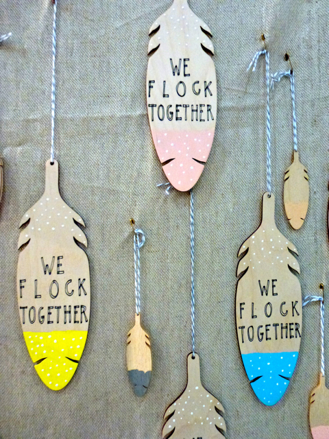
Do you recognize the feather illustration?

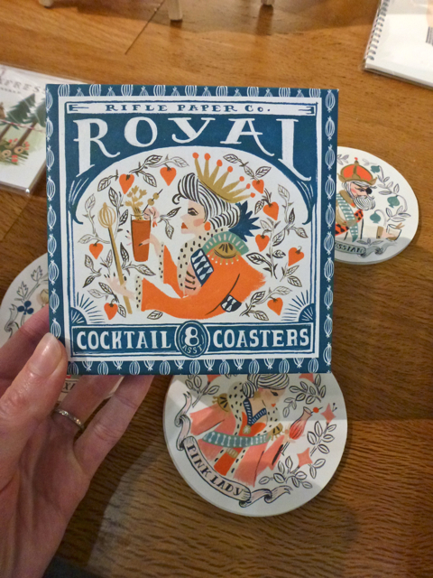
The always amazing Rifle Paper debuted these ridiculously adorable cocktail coasters:

Fawnsberg is run by two sisters, and features sweet illustrations on their cards and rubber stamps (above and below).

Finally, Atlanta-based Alee and Press really nailed it with their ombre style:

Whew! It was a great show and I loved checking out all the beautiful new work. Let us know in the comments if you discovered anyone new and amazing at the show this year!

The Best of NSS, Part 2

Hey peeps! It's time for more goodies from this years National Stationery Show (click here to see Part 1). First up is the amazing work from 1 Canoe 2 (above and below): 3 talented girls who draw, design and letterpress print in a barn in Missouri. Living the dream.

Making their NSS debut this year was Los Angeles based The Social Type (below). I love how the same sentiment can be interpreted in many different ways!

Another favorite of mine was Banquet Atelier & Workshop, based in Vancouver. Our mutual love of neon was obvious:

How incredible is their guest sign (below)? I'm loving their prints also.

My favorite birthday card of the show came from Anemone Letterpress (below). So clever!

Stay tuned for part 3!

The Best of NSS, Part 1

This year we didn't have a booth at the National Stationery Show but our New York satellite office (aka Design Director Shauna Leytus) was there visiting some of our favorite artists and making new friends. She'll be doing a series of posts recapping what she saw and loved. Here's her first post!

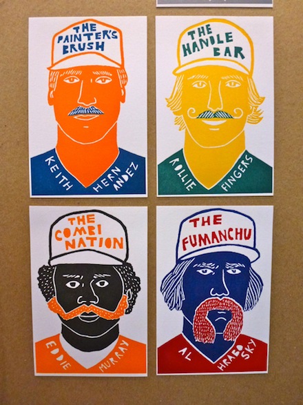
Where do I begin?! There was so much amazing work at the National Stationery Show this year from new comers and old favorites. Making her NSS debut, Left Field cards (above) showcased nine letterpressed "baseball cards" complete with mustaches, edibles and bizarre injuries. Collect them all!

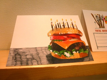
One of my favorite cards of the entire show belonged to Red Camper (above and below). Need I say more?

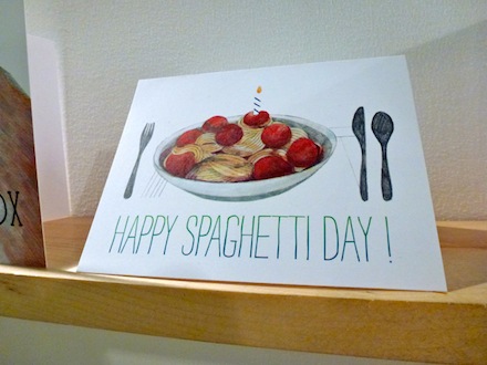
A fellow card maker sharing a love of food-themed imagery was Fox Tail Press (above and below). When I asked when "national spaghetti day" actually was, Danielle rightly answered "everyday". Duh.

Design*Sponge declared Linda & Harriet's over-sized Quilt Calender the best thing she saw at the show and I couldn't agree more. My photos do not do it justice - this is a work of art and it is amazing.

More coverage of the show to come!

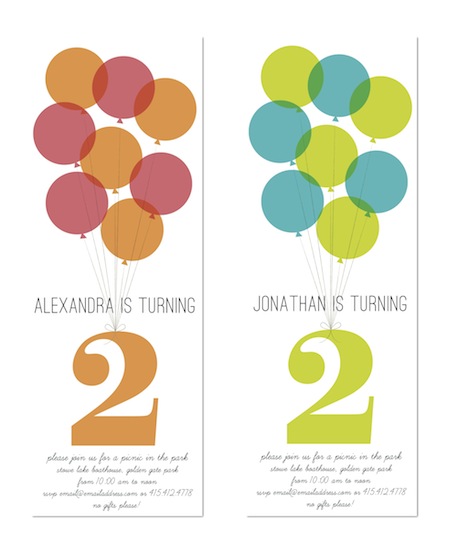
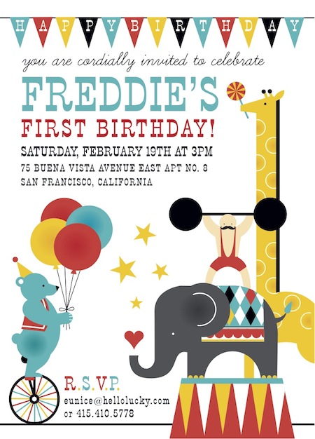
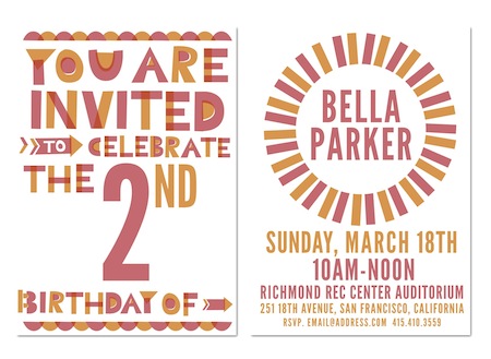
New Kids Birthday Party Invitations

We have some exciting news to share with all of you! For years we've heard from our devoted fans and customers about how a variety of children's birthday party invitations would be the perfect addition to our collection. Well the time has come! Some of our favorite invitation designs are coming out of the archives, and even some brand new invitations are making their big debut.

Balloons (above)

You might remember Jude's first birthday party invitations (a whole year ago!) but now they are available just for you. Perfect for a group party or just one headlining guy/gal. This Big Top invitation sets the bar for a roarin' good time.

Alex and James' cardboard box party was such a hit, we couldn't resist adding their custom designed first Box Party invitations to the mix.

As for the boys' second birthday party (along with a whole march of kiddo's) we designed this stellar Color Block invite similar to the one created exclusively for their neon-inspired bash. Check out more photos on Apartment Therapy here!

 All these designs can be customized for twins or even group parties, so give us a call for more information. Enjoy!

New Jacqui Lee Wedding Invitations

Hold on to your hats! The brand new Jacqui Lee collection has completely blown us away. The four invitation suites each have their own magical theme, but all have one thing in common - they were hand illustrated by the insanely talented Jacqui Lee. It's easy to see how much time and consideration was given to these mini artworks, all suitable for their own frame. These designs are now available just in time for spring, and just in time for your wedding stationery needs. Flora and Fauna (above and below) includes all the tiny elements of spring that we adore. And with Jacqui's charming critters and characters making appearances, they are perfect for an outdoor celebration.

Classic Parisian delight inspired this French Bicycle suite. With dreams of strolling the cobblestone streets and picking up a fresh bunch of flowers at the local market, this design is c'est magnifique.

It's time to channel your inner princess! Happily Ever After is exactly how you'll be living after a wedding inspired by this fairytale suite.

And Adventure sets the tone for a lifetime of romance and thrill. We love the evening enchantment of this suite, which would suit a celebration under the stars just magically.

Meet Jacqui Lee. Currently living and working in Vancouver, BC, her painterly style shines among a growing world of graphic design. Her holiday cards last year were such a hit, we honestly couldn't wait to collaborate for a wedding collection. Jacqui give us some insider information about her process:

1. What was your inspiration for this collection?

A lot of my inspiration came from imagery I associate with spring. I was working on this in the middle of a rainy and gloomy winter, so it seemed natural that all the ideas I was sketching down were bright and fun.

2. Did you like designing for a wedding collection?

Yes! I think there is so much opportunity to get really creative when designing for weddings. I've been seeing a lot of really great wedding work lately, so it was a ton of fun to try my hand at it. I was really trying to get into different niche personalities for each suite, and I hope that people can really connect with them.

3. What usually inspires your illustrations?

I'm always very inspired by the work of mid-century designers and illustrators.

4. If you had to pick one which suite would you chose?

Honestly, it's a tough choice. I worked on all of the suites simultaneously so they sort of grew off one another, yet there are separate elements in each that I really like. However, my initial starting point for the whole collection was the Foliage design, so I would have to say it's closest to me.

5. You illustrate so many adorable animals, is there anything behind that? Which is your favorite to illustrate?

That's funny because I never considered myself an illustrator who especially enjoyed drawing animals until they started showing up everywhere in my work. I decided to just embrace it, and then it became very natural for me to start using animals as different personalities. As of yet, I don't think I have a favourite...but bears have been popping up a lot in my work lately.

Check out the entire Jacqui Lee collection right here!

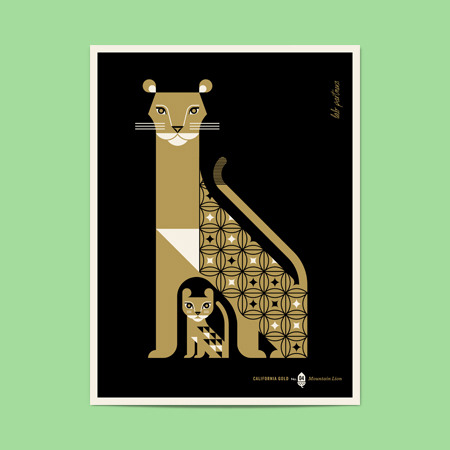
New from Lab Partners

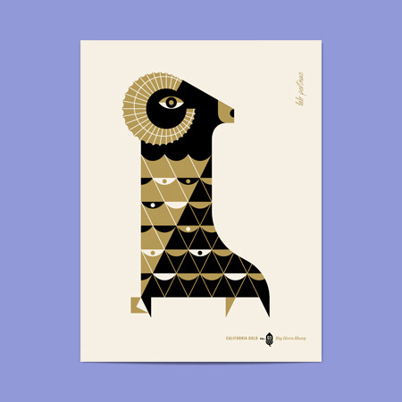
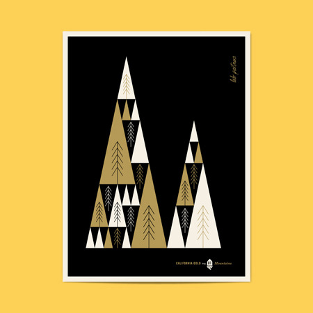
Can you say "Me-ow?" This new collection of silkscreened prints by the Lab Partners is majorly tantalizing. The series (printed in the USA!) features the many natural wonders of California. The best part? 5% of all sales are donated to the California Nature Conservancy. We love that they are contributing to a good cause, and can definitely picture these sleek black/gold printed pieces making a statement at home or in the office. Check out the entire shop here!
Today's Bride

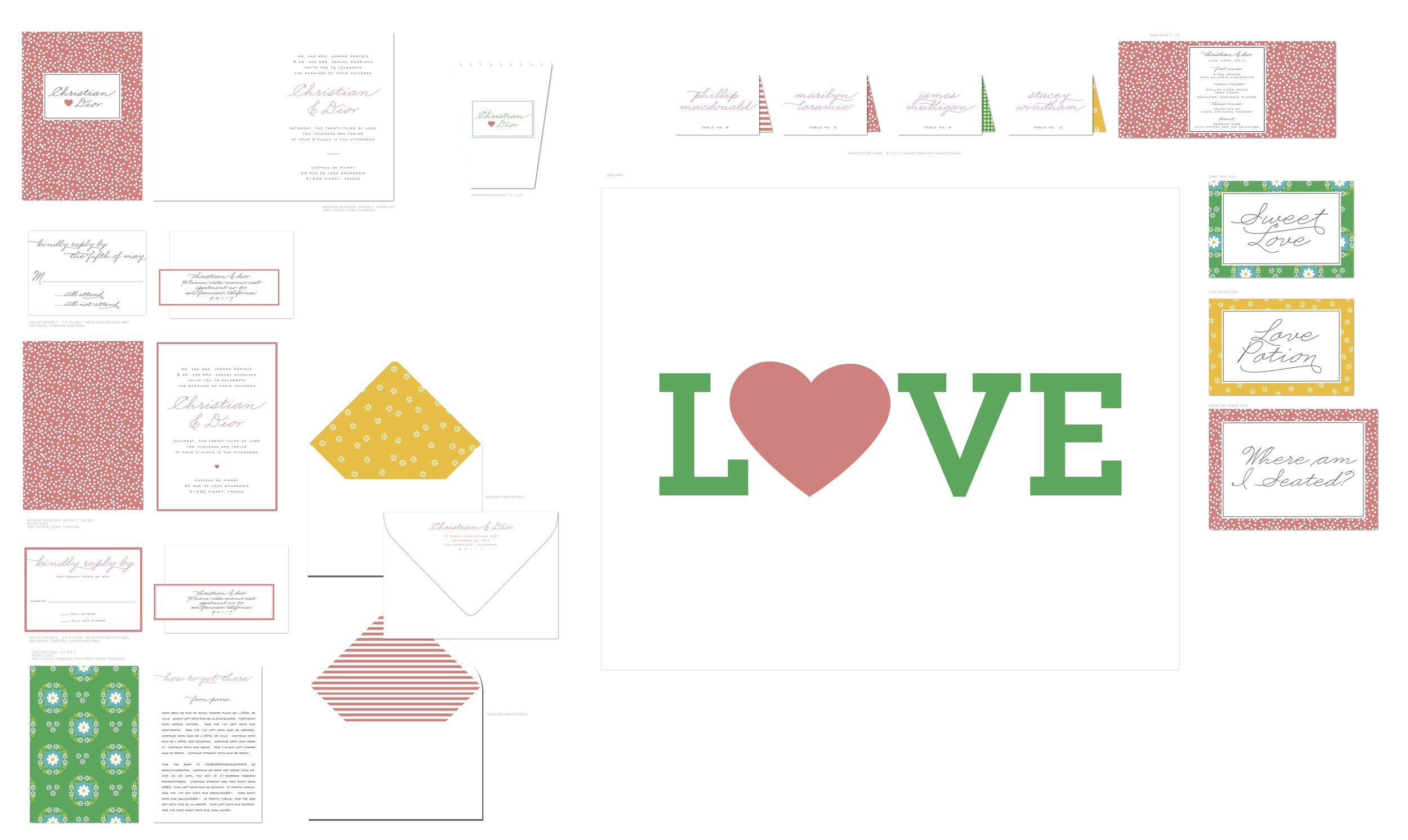
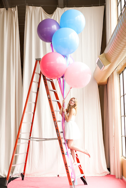
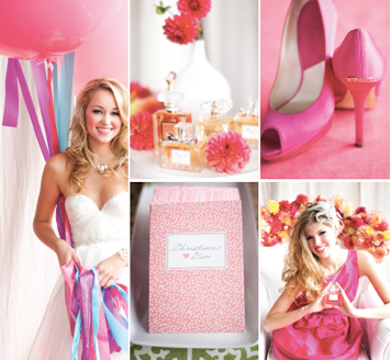
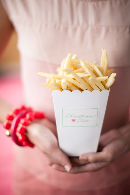
These photos from Nancy Liu Chin's Anatomy of Today's Bride for Today's Bride SF are to die for! We were approached by Nancy awhile ago in efforts to come up with a classic and whimsical invitation and day-of paper suite for her ultra-sweet photo shoot. It was a piece of cake once she shared her inspiration with us, and knowing which amazing vendors were also on board, we knew it would be a hit.

You can see our working files below. We were really into mismatched patterns and folded cards. If you look closely, the invitation reads Christian & Dior, tres chic!

Visit Nancy's Brown Bag to view Anatomy of Today's Bride Part I and Part II, and watch the amazing video by Luke Goodman here!
Photography by Kevin Chin

New Susy Jack* for Hello!Lucky Wedding

 One of the things we take pride in most here at Hello!Lucky is our enthusiasm for working with talented artists and designers aside from our own. Combining forces with brilliant minds gives us a great pleasure, and there is no shortage of brilliant minds out there. As you saw this past holiday season, we paired up with 16 various artists around the world for our curated custom holiday collection, and it was quite a hit. Not only were we exposed to the extraordinary design skills of our favorite illustrators, but their designs were made available for our customers to enjoy. Since the holiday collection launched last year, we knew we were in the midst of some potential lifetime friends, one being the insanely gifted Susy Jack*. Her classic patterns and bold color palettes make up the perfect combination for a modern wedding invitation, and we're here to bring you just that! Six brand new, completely exclusive, letterpress and flat printed wedding invitations, save the dates, and day-of stationery, all for you!

Bohemian (above)

Meet Susy Jack*. A lover of textiles and paper, Susy's career took flight after her collection on Etsy made a splash in the design world. Now, you'll find her paper products and home accessories in stores all over the world. We asked Susy a few questions about her new wedding suite for Hello!Lucky:

What was your inspiration for this collection? 

My inspiration for this collection was to bring my most-loved motifs from decorative arts into a fresh, inviting, welcoming and stylish new place. I grew up in a house full of vintage and antique items. I was surrounded by decorative objects and they were a huge influence on my own creativity. I thought that exploring the place where art and craftsmanship meet, and combining that with a modern approach to style, was a great starting point for a wedding collection.

What was your process like?

My process is actually very mental--I spend a lot of time thinking before I get down to work. Often I'll perceive what I want something to look like before it even hits paper. I don't do a whole lot of sketching outwardly but in my mind. I sketch all day and play with ideas. Usually my sketchbooks are more filled with words than drawings; when I sit down to work, I often have words in mind instead of images. I'll want something to evoke humor, or love, or happiness or a combination of emotions and ideas.

 Cross Stitch

                       "Each suite is like a mini-collection, which I hope the bride will see as her very own."

 Daisy

     "I love overlapping patterns, and the idea of using a different pattern for each piece in the suite is so much fun." 

 Duchesse

 What usually sparks a design idea for you?

I'm an inspiration omnivore, which helps when you live in the middle of New York City. Usually an idea is sparked by browsing a flea market, museum or other place that's full of textural objects from bygone days but I also love the latest fashion and art. I try to get out and about and take in a lot of the real world: what people are wearing, what exhibits are happening. I love looking closely at something and figuring out what exactly it is that I like about it or what makes me interested in it. Then I start to work on my own new ideas. It's always amazing to see how looking closely, paying attention and being in the moment can make things come to life, creatively. It can be difficult to remember to stop and actually look more closely at something for a quiet, thoughtful moment, see it in all it's dimensions, experience it. I love doing that. It's always worth the time.

Feathers

"It's always amazing to see how looking closely, paying attention and being in the moment can make things come to life, creatively."

Tropic

To view the entire Susy Jack* collection and read more about her inspiration, click here!
 Photos by Edyta Szyszlo

Evolution of a Design: Seagulls

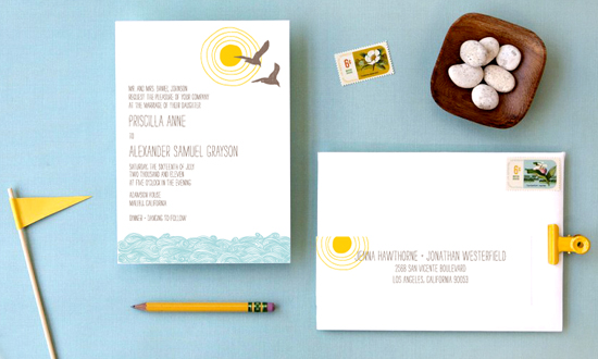
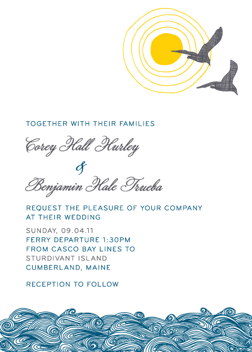
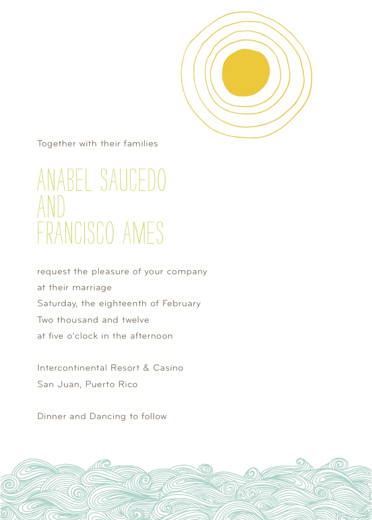
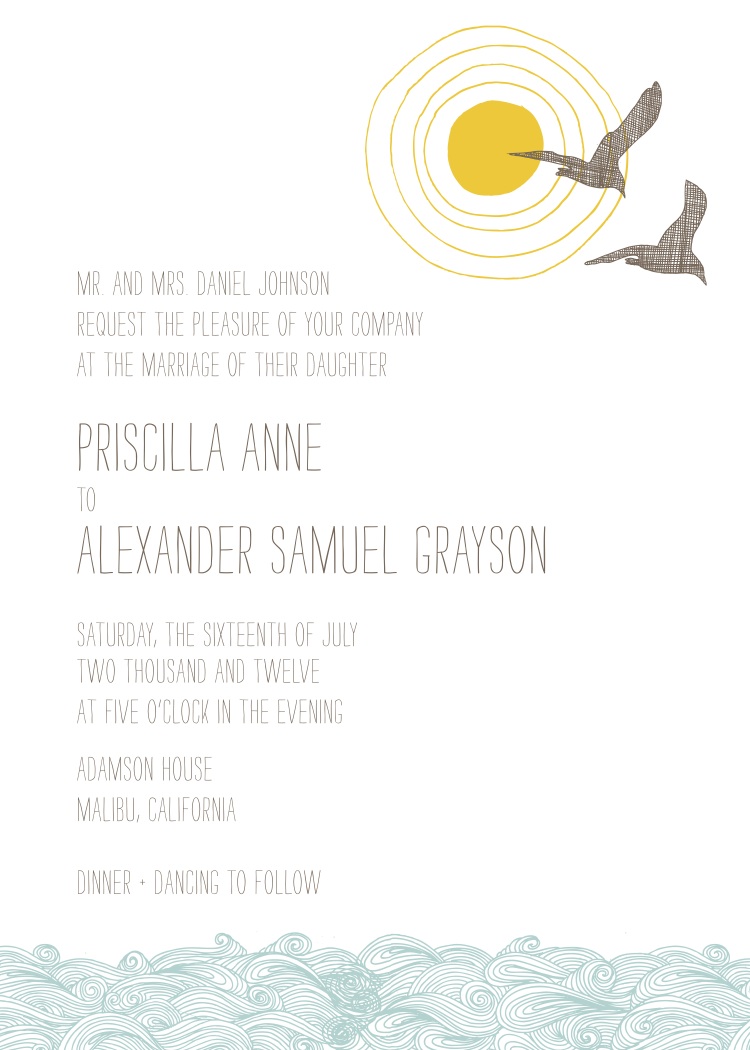
One of the joys of working in a design studio is getting to see our ideas come to life on paper. Seagulls has been a favorite invitation for quite some time, but it's the little changes that makes this design unique. It fits perfectly with outdoor beach weddings and oceanside events, and with a personal touch, it's great for any event.

The soft pool and stone colorway creates a casual vibe, but customizing the fonts and ink colors can really make a bold statement.

And simply removing an icon makes for a fresh, clean composition.

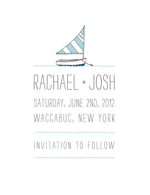
This save the date was inspired by the original design, but simplified to match the couples' nautical New York wedding.

Fly fishermen Erin and Joseph wanted to incorporate icons that represented their favorite hobby, so the fish were the perfect fix.

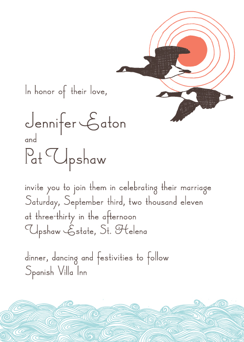
And as the seasons change, this early autumn invitation designed for Jennifer and Pat offers a more comfortable style. If you like any of the designs you see here, just give us a call and we can give you more ordering information!
Check our our evolution of Heartland and Big Day!
New Wedding Invitations!

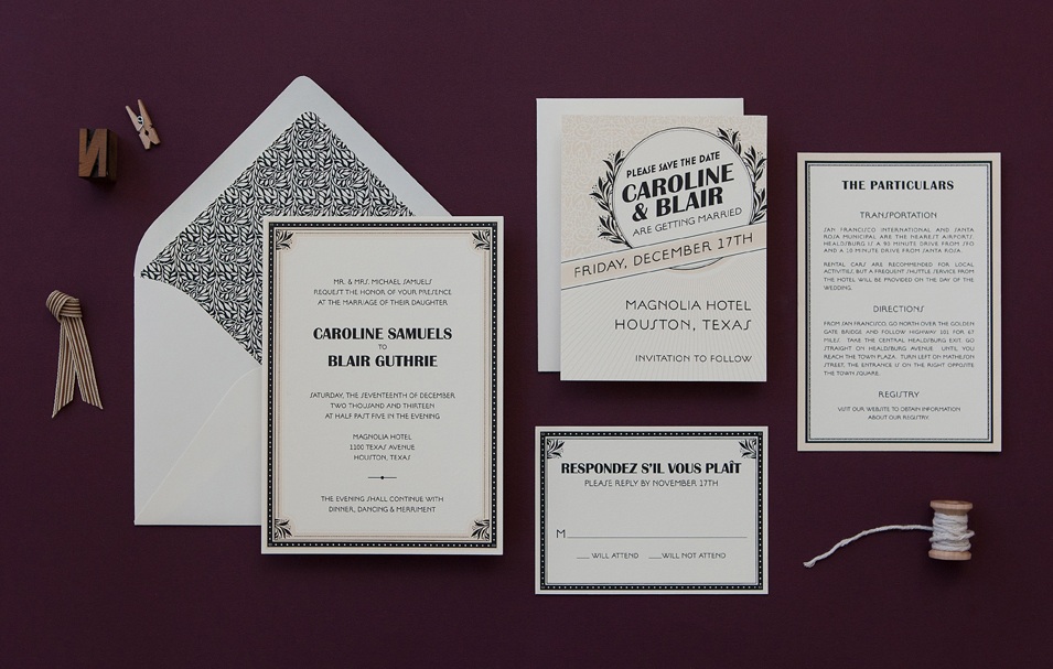
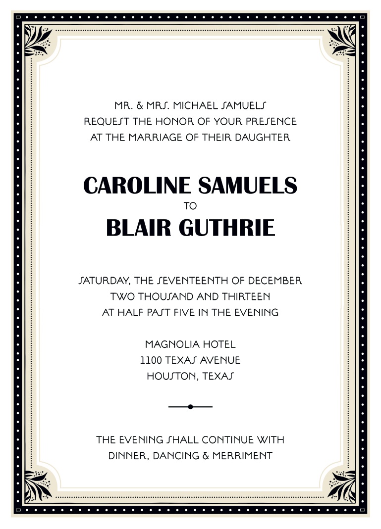
Get ready to dazzle your guests with these new sophisticated wedding suites. We triggered our traditional instincts when coming up with our latest collection, and are certain these designs will leave a lasting impression. Marquee, inspired by the glamour of the roaring 1920s, pulls out all the stops with its vintage embellishments and architectural borders.

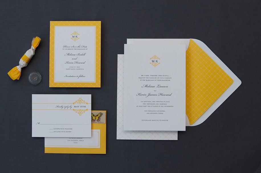
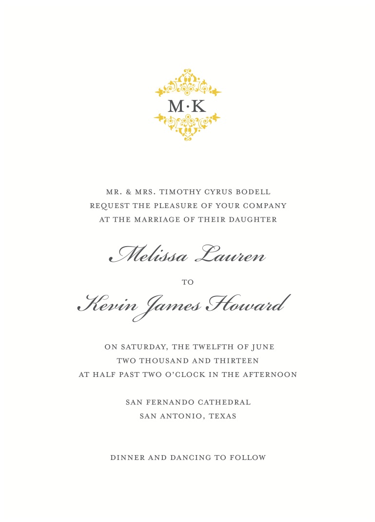
Fillmore focuses on clean, classic lines and simple icons, perfect for a contemporary wedding. Plus, the invitation is double-sided to add a little flare to the entire suite. Customize the ink colors to match your wedding details and your big day will instantly fall into place. And remember, envelope liners are always available as an extra, so feel free to ask us about details!

 Photos by Edyta Szyszlo