Perfect Paper Wedding Details

Whether you're in the middle of planning your wedding day or just getting started, we have some gorgeous paper products that will make your big day come together perfectly. You can carry on the theme of your wedding invitations into your wedding and reception, without lifting a finger. All of our wedding invitation designs have matching day-of paper details, and can be customized just for you. Programs (folded and flat), printed place cards, menus, favor tags, table numbers, you name it, we've got it!

 Beautiful calligraphy by Michele Papineau will add an elegant touch to your day. With personalized place cards or favors, your guests will go home with their own little piece of art. Plus, there's a variety of styles to choose from!

Interested in having matching paper details printed for your wedding? Simply give us a call 1.888.552.3724 or email us info@hellolucky.com for options.

Studio Shapshot: New Window Display

It's a beautiful day for a new window display! We decided to get crafty and enlarge our San Francisco Skyline into full-sized window art. Throughout the process we learned first hand that paper cutting is a true test of patience and craftsmanship. First, we drew the skyline on 3 full sheets of pool colored text weight paper. Then with a ruler and craft knife, carefully followed the lines revealing our cityscape.

The bridges were definitely the most difficult, but they are the most iconic!

Double-sided tape did the trick - we hung the skyline so it greets the passers-by on Howard Street.

The final product! What do you think? We had so much fun paper cutting this skyline we also made an SFMade sign which Jon is holding here. Can you tell we're getting excited for our big event tomorrow?

Lucky Friday # 64, I Melt For You

Hello all you lucky folks out there! This is the 64th edition of our Lucky Friday Giveaway.  Each Friday we feature one of our letterpress greeting cards. We’ll choose THREE LUCKY WINNERS to get a free card.  Post a comment by 12 p.m. PST the following Thursday, and we’ll announce the winners on the following Friday!

The three winners from last week are (drum roll, please): Phoebe, Finch and "am12pm"! We’ll contact you next week to arrange sending your Go Wild card.

Design: I Melt for You Artist: Eunice Moyle Inspiration: Many of us melt at the mere mention of lolling in Dolores Park with a cone of Bi-Rite's Salted Caramel. (SF folks— you know.) Who to send it to: The cream in your coffee, the sugar on your cone, the cherry on top— or the coolest, sweetest, yummiest one of all. Ideas we scrapped in favor of this one: The chocolate bar idea was a mess, and the M&Ms were prudishly impervious to our warmth and charm. Favorite detail: Love the icy & caramel hues and the sunset shadows of cool and warm colors overlapping. Why letterpress? Smooth, rich paper and sweet color combos— the cream always rises to the top.

Don’t forget to post your comment and tune in next week, same time, different stationery, to see if you’ve won!


Real Wedding: Ashita and Mark

 This New York City wedding is definitely one to remember. Ashita and Mark shared their love with friends and family over two traditional celebrations, and both are equally stunning. Ashita's family oriented Hindu wedding ceremony incorporated bright hues of red and gold, with plenty of shimmering embellishments. Their second ceremony inside the Angel Orensanz Foundation for Contemporary Art provided a breathtaking backdrop for the couple's "I do's." Of course such a beautiful wedding deserves beautiful recognition, and Inside Weddings was sure to deliver. You can read their adorable story here, and browse through the entire collection of photos (including our Visit New York City invitation!).

Congratulations Ashita and Mark! Visit Inside Weddings for more!

Photography by Stak Photographer Duo

On Press: Overprinting

For this year's new trade releases, we are doing a whole mess of overprinting, but Max's registration is super clean. By overprinting one color smack on top of another, we can turn two colors into three, and it looks super cool. But it can be a difficult process that allows no room for error.

On Eunice's new hand-drawn "Thanks A Brunch" card, the overprinted third color outlines the images and is the color of the text. So, even the slightest shift in registration would not go unnoticed.

 Max is an exceptional printer, and they look amazing. Great Job!

Interview with Leslie Yang of feistyelle

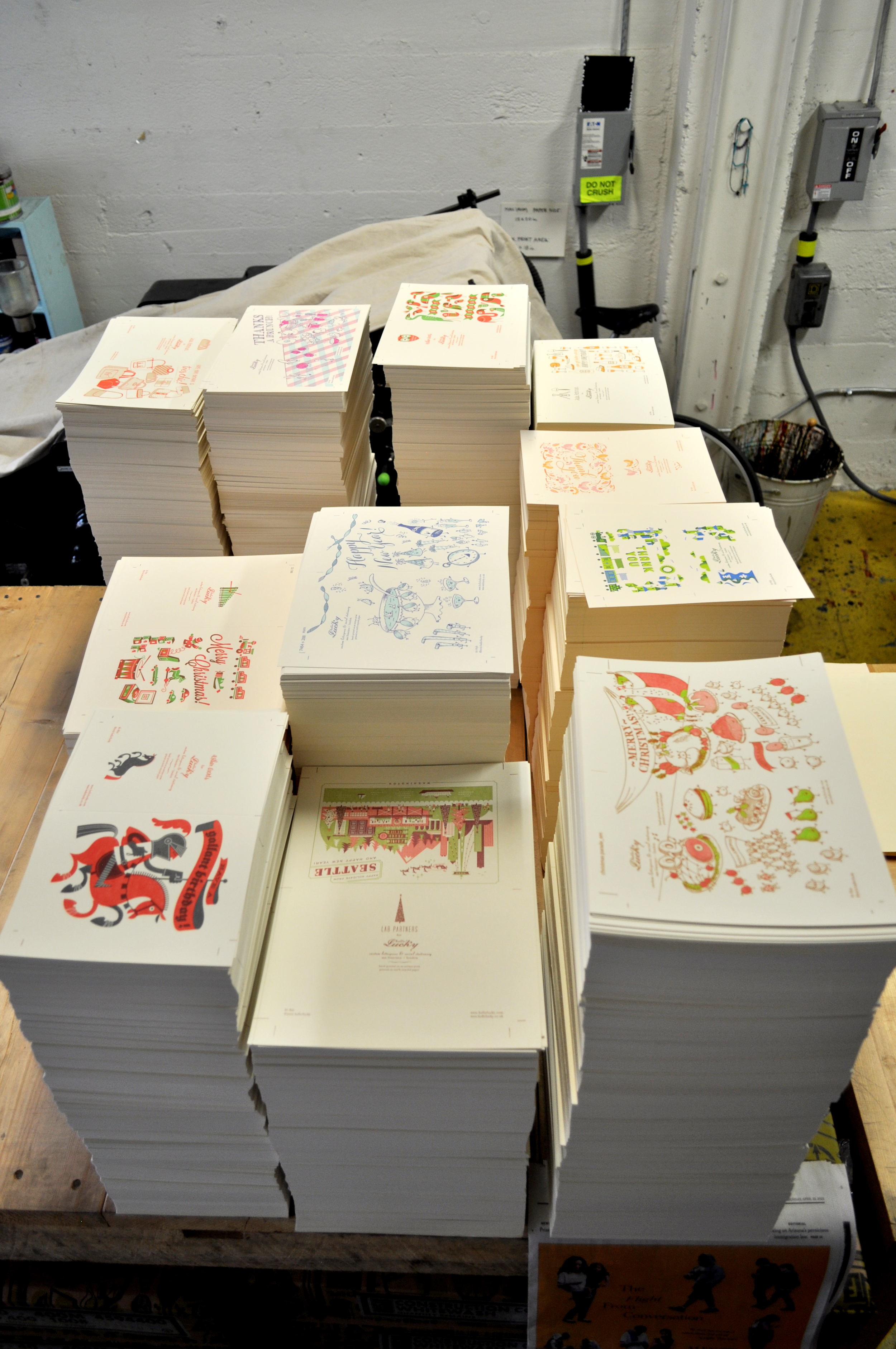
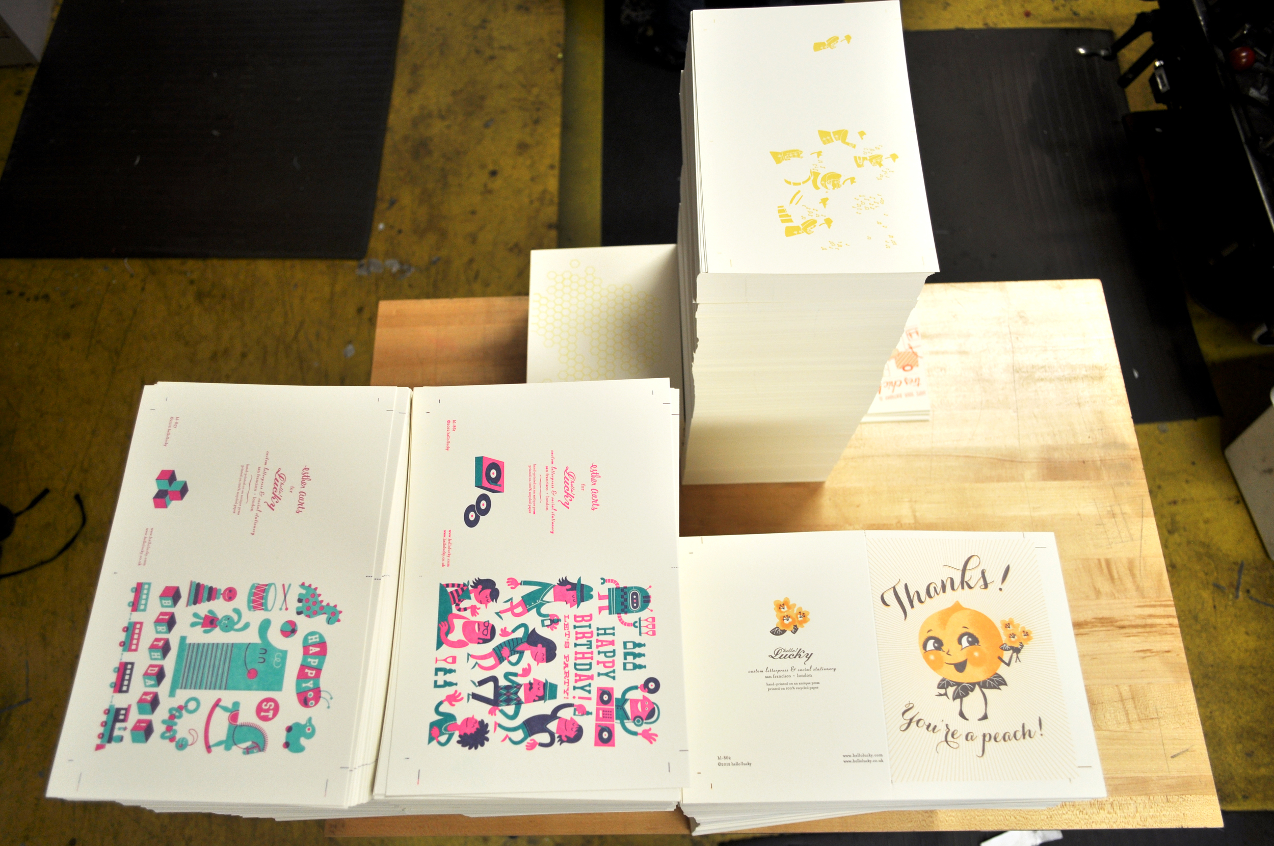
We are so excited that one of our favorite local jewelers will be joining us in the studio this Saturday for SFMade day. Come early and snag some beautiful jewelry along with Hello!Lucky goods. We chatted with Leslie Yang, the force behind feistyelle, about sustainable design, how she got her start, and what she loves about style in San Francisco.

When did you start feistyelle and what's different about your designs and materials?

I started making women's accessories out of felted merino wool in 2005 but over time felt (no pun intended!) that it wasn't scalable as a business, meaning I was working too hard for too little. I took a year off, told myself to be open to new ideas and ways of making things. Near the end of that year, I discovered how to lasercut wool felt based on my own designs. The Dahlia design was one of my first designs and it's still our bestseller!  Feistyelle designs are different because we're deeply committed to using eco-friendly materials like vegan suede, wool felt, and bamboo ply throughout our jewelry, accessories, and home decor lines. No one else really is making and mixing sustainable materials specifically in jewelry and accessories quite the way we are. Our jewelry is above all else: playful! All of our pieces are colorful, fun, super light, AND you can stack, swap, and flip our earrings.

 How does creating in SF impact your final product and design? 

I make a very conscious decision to make as much of my product and packaging in San Francisco. It matters to me that I can meet the vendors I work with, see their employees' working conditions, as well as make sure that the money I put into our community stays in the community.

 Tell us about your new collection. 

We just launched our new collection: Glimmer & Cream. I'm ridiculously excited about every piece! Featured throughout the collection is the new material of our dreams: vegan suede. Our vegan suede is incredibly light, soft and, like leather and suede, thin but strong with a touch of stretch. Made from recycled polyester film and plastic bottles, this is our most eco chic material ever.  Our new Stacked Lotus earrings come in a selection of creamy pastels and coral, which we screened with gold water-based ink on one side making reversible earrings (6 earrings in 1). We also screened neon pink and yellow on light gray vegan suede for that neon pop to your color block (outfit). We also have some new long necklaces, perfect for wearing every day over tunics or shirts.

What do you love most about style in SF?

I love that everyone in SF celebrates holidays as an excuse to put on a costume. Along that same vein, there's a lot of love for color, individuality, play, and rule-breaking. We're not terribly snobby about our style and because of our microclimates, we're pretty cozy chic and clever with our layers. I'd say SF has been a good influence on feistyelle!

You can meet Leslie and snag some of her beautiful goods this Saturday, May 12th from 11am - 5pm. Visit us at 977 Howard Street between 5th & 6th.

Shop Local on SFMade Day

Did you know this week is SFMade Week? All week long the city will be celebrating locally made products and manufacturing with events, warehouse tours, and parties. We're joining in on the fun this Saturday, May 12th when our studios will be open from 11am until 5pm. We'll have the presses running, gifts and cards on sale, and local artist FeistyElle selling her beautiful jewelry in the studio. Tell us if you can make it here.

Our address is 977 Howard Street (btw 5th & 6th streets) in San Francisco.

Hope to see you all Saturday!

Mother's Day Gift Guide

Mother's Day is May 13th and although there are endless ways to say "I love you," we chose a few of our favorite gifts and accessories that would make any mom smile.

1. Starting out with these coral Signature Ballet Flats from L.L. Bean, your mom will love a splash of color to liven up her spring wardrobe.

2. Gardening gloves can come in handy even if your mom doesn't have a green thumb! Use them when spring cleaning or simply raking the yard. These chic Fleur de Lis gloves will get her ready for some hands-on fun!

3. You can never have enough bags. This modern lattice dopp kit from Hammocks and High Tea is the ultimate travel accessory, and can help prevent any liquid mishaps from happening on that much needed summer vacation.

4. Continuing with the bright coral color trends, Laura Mercier's Sheer.Bold.Tres.Chic gel lipstick is a great gift for any woman - old or young!

5. Love mom's homemade cooking? She'll have lots more to offer after flipping through The Preservation Kitchen by Paul Virant. With expert guidance and brilliant flavor combinations your mom will be glued to her kitchen trying new techniques of canning and storing, and of course, eating. Just hope she's willing to share!

6. These white ceramic candlesticks by Tourne will work wonders in her home, and you won't have to worry about matching her color palette since these pure and simple home accessories go with everything.

7. Don't stop there! Pair mom's gift with a totally practical and virtually indestructible apron by Tourne as well. And while you're at it - browse the entire Brook Farm General Store for gifts for Father's Day too (June 17th)!

8. Personal Stationery makes the perfect gift year-round, but with so many new designs choose from [and $25 off orders of $100+] your mom won't be able to thank you enough. Don't forget to use the code TREATYOURSELF.

9. One of the best presents a mom could get is probably quality time with her kids. Sit down over a cup of this Bellocq breakfast tea and reminisce over good times.

Happy Mother's Day to all moms out there. We love you!

Lucky Friday # 63, Go Wild!

Hello all you lucky folks out there! This is the 63rd edition of our Lucky Friday Giveaway.  Each Friday we feature one of our letterpress greeting cards. We’ll choose THREE LUCKY WINNERS to get a free card.  Post a comment by 12 p.m. PST the following Thursday, and we’ll announce the winners on the following Friday!

The three winners from last week are (drum roll, please): Laura H, Angela, and Ana Laura de Romero! We’ll contact you next week to arrange sending your Going Places card.

Design: Go Wild Artist: Julia Rothman Inspiration: We were wool-gathering for a while, and though the idea was a little fuzzy at first, we eventually found it had teeth. Who to send it to: Someone's who's packin' pachyderm, who's a giraffe-and-a-half or who's the ostrich with the mostrich. Ideas we scrapped in favor of this one: "Let's Get Domestic" was a cute design, but we didn't feel like it was going anywhere. Favorite Detail: Why, all the animals have de-tails, so how can we choose our favorite of de-tails? Why letterpress? Animals all make such interesting prints, we figured we'd use a heavyweight press method for all our animal champs.

Don’t forget to post your comment and tune in next week, same time, different stationery, to see if you’ve won!


New Greeting Cards!

Our brand new letterpress greeting cards are hot off the presses and arrived just in time for spring! We've got smashing new designs by Esther Aarts, Julia Rothman, and yours truly. We've taken a new spin off our popular BBQ Parade Father's Day card and created Thanks a Brunch, and Julia's Better With Age card speaks simply the truth - we are especially fond of this card being so close to wine country!

Our wedding Skyline series is such a hit we couldn't wait to offer letterpress skyline cards for all our favorite cities! San Francisco, New York City, and London are all available now but there are more to come! Also making it's big debut is our bright and cheerful Visit Seattle card.

To view the entire collection of new letterpress greeting cards, click here!

Our Poms in Martha Stewart Weddings

Our signature pink poms are featured in Martha Stewart Weddings Special Issue! Back when Eunice and Daniel got married they handmade each of these coffee filter poms and dyed them various shades of pink. They were a huge hit strung along the top of their reception tent, and since then we've found lots of ways to reuse them.

We keep them in the studio to brighten up our blank white walls. They are easy to store, too! Just re-fluff the paper filters each time you've got a new decor project and dust with some fresh paint or glitter.

Inspired by Chloe Fleury

As artisan printers and paper enthusiasts we feel an instant connection with artists who share similar interests. The incredibly talented paper aficionado Chloe Fleury has literally blown us away with her paper constructions. Recently featured in Anthology Magazine, the French born and now San Francisco based artist creates one of a kind paper sculptures. If you haven't visited her website by now, you must.

She even created a stop animation video trailer for issue no. 6, highlighting up-close details about each paper piece. Check it out here.

Her San Francisco neighborhood posters are definitely a favorite.

La Boutique in San Francisco is hosting a solo exhibition of Chloe's work! If your're in SF be sure to stop by the gallery and check it out, it's located at 414 Jackson Street, Suite 101.

To see more of Chloe's work, click here!

Store Feature: ink & peat

This week we’re continuing with our vendor feature series and highlighting the lovely indie shop ink & peat. ink & peat is both a retail store and a floral design shop based in Portland, Oregon. It opened in 2009 by Pamela Zsori, who spent 15 years as a designer in the fashion industry before deciding to open up shop. As you can see from these photos her thoughtful displays and bright beautiful products make for a stylish and welcoming space. We asked Pamela some questions about how this unique shop got its start and what makes it so special...

How long have you been in business? 

We have been open for 3 1/2 years.

Can you tell us a little bit about the neighborhood where ink & peat is located?  ink &  peat is in an up-an-coming section of the Boise-Eliot neighborhood in North Portland. Many of the shops and restaurants were built in old warehouses.

What inspired you to open ink & peat?

I was a textile designer for many years. My boyfriend and I wanted to move to Portland from San Francisco and I started thinking of ways to re-invent myself. I had an "a-ha moment" at 5 in the morning while I was shopping on the east coast for antiques. I started thinking about what I would be willing to get up early for - I loved antiques, home decor, and flowers. I soon started taking night classes in floral design and thinking of ways to incorporate all the things I love into one career. It ended up being this lifestyle store called ink & peat!

How long have you been carrying H!L cards? 

We have been carrying Hello Lucky! cards for 1 1/2 years. I love the sense of whimsy and seeing people smile when they pick them up.

Do you have a favorite or best selling card from us?  

The Spring Chicken card sells well - Portland is definitely a chicken town - so many folks raise them in their yard. I always love Julia Rothman's unicorn card - maybe because I grew up in the 70's!

From what's selling in your store right now what do you think is the next big trend?

I'm not sure about the NEXT big paper trend - but right now people can't get enough whales! In home decor, there is definitely inspiration from Native American handcrafts and there is a lot of color coming on strong. I think people are ready to climb out of this tough economy and need some bright inspiration and a return to handmade goods.

Lucky Friday #62, Going Places

Hello all you lucky folks out there! This is the 62nd edition of our Lucky Friday Giveaway.  Each Friday we feature one of our letterpress greeting cards. We’ll choose THREE LUCKY WINNERS to get a free card.  Post a comment by 12 p.m. PST the following Thursday, and we’ll announce the winners on the following Friday!

The three winners from last week are (drum roll, please): Danyun, Nicky and Shannon! We’ll contact you next week to arrange sending your Champ card.

Design: Going Places Artist: Julia Rothman Inspiration: Julia's a REAL jet-setter—what more inspiration could she need? Who to send it to: A friend who's movin' on up, movin' on out and taking the high road. Ideas we scrapped: The original text went, "If you have a lot of baggage make sure, at least, that it's old and beautiful." Favorite detail: Adore the color combination— perfect for spring travel and new beginnings! Why letterpress? Old suitcases and typecases have much in common—they hold a lot more than you think, and both can easily become heavy as lead.

Don’t forget to post your comment and tune in next week, same time, different stationery, to see if you’ve won!


New birth announcements!

Our brand new birth announcements are now available! For all you happy parents to be, you won't want to miss out on these fresh new designs. The best part is that they are completely customizable, so if pink or blue isn't your style, try a sage green or sunshine yellow to change things up. Toy Train (pictured above) is modern but still playful with it's youthful illustrations. The possibilities are endless with this card - just customize the wording to make a fantastic toy train kids party invitation!

You'll be welcoming your bundle of joy in fashion with this Bundle of Joy announcement. And with all those lively rooftops, this card is perfect for city-dwelling parents.

Our Butterflies announcement also looks fabulous customized in any color, and the retro butterflies suit both genders.

To view all of our photo birth announcements, click here!

Photos by Edyta Szyszlo Photography

Featured: Brides Magazine

We always feel honored whenever our name is featured throughout the growing realm of wedding magazines, blogs, and resource websites. We also love to cater to our community by offering one-on-one consultations with brides when making the big decision to buy wedding stationery. It truly is a joy to be listed in Brides Magazine as one of the "people and places you need to know to plan a wedding in San Francisco!"

The issue highlights all of the places throughout the city that offer helpful advice and inspiration for your wedding. Our beloved Faye even made her way into the spotlight!

The current issue of Brides Magazine is available now!

On Press: 2012 Trade Releases

This week Max is working hard and printing all of the upcoming trade releases for 2012. Along with Eunice's and Anna's fun and beautiful new designs,  we have an armful of great new cards from our friends and favorite designers: Esther Aarts Lab Partners, and Julia Rothman.

Employee Spotlight: Meet Max

Technically, Max isn't at a desk all day, and that's the way he likes it! He's one of our pressmen here at Hello!Lucky. He keeps our vintage presses humming along and masterfully cranks out our letterpress greeting cards. He knows all there is to know about letterpress and we love him for his easy going attitude and sense of humor.

My role at Hello!Lucky is...

Print-Wallah.

I can't get through the day without...

apple and peanut-butter.

My ideal weekend activities include...

sleeping, walking, separately.

My favorite Hello!Lucky design to print is...

Wiser, and anything by Julia Rothman.

If I wasn't a pressman I'd be...

a fishmonger.

Secret insider info you might not know about Hello!Lucky...

it used to be a billiards supply.

Inside the studio with Anne Smith

When we pictured the workspace of the talented illustrator and our guest designer Anne Smith, we imagined a the kind of place that makes you feel inspired to create something beautiful. These pictures from Uppercase reveal exactly what we imagined, only better. From the colorful arrangements of fresh flowers to the towering collections of books, we're feeling quite at home in the studio of our dear friend Anne.

The launch of our Anne Smith wedding designs earlier this year brought a fresh new face to our collection, especially with her delicate watercolor illustrations and bright color palettes. We've received an outpour of enthusiasm for her designs such as Southern Belle and Wildflowers, and still gush over the nautical details in Cape Cod.

To view more photos check out the entire spread featured in Uppercase!

On Press: Dinosaurs--Trimming and Packaging

This week On Press we show the final steps in the process of creating Hello!Lucky's birthday card, "Dinosaurs." This sweet card was designed by Julia Rothman for Hello!Lucky. Max trims them down on the guillotine and folds a few to make sure each cut is perfect. Then each card is folded by hand, packaged, and bundled in packs of six.