Card Caption Help and a Giveaway

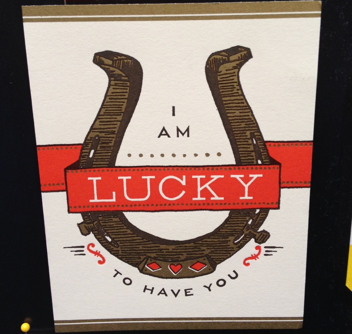
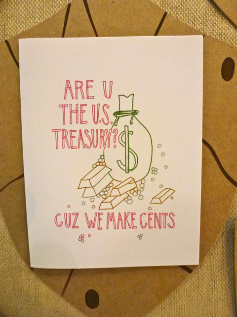
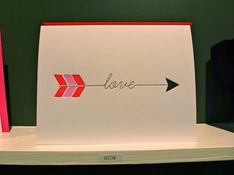
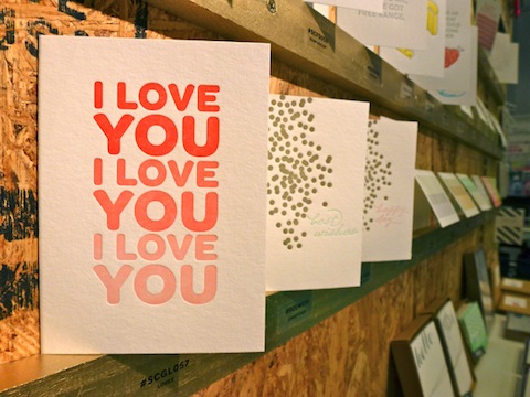
We need your help! We're in the process of designing some new cards and we can't settle on a caption for this one. We're planning to release it for Valentine's Day so we're looking for something with a sweet sentiment.

Ideas we had include: Are You for Real?You Amaze MeYou Dazzle MeWould you vote for one of those or do you have a brilliant suggestion that would pair perfectly with this design?

If we chose your words for the card we'll send you a years worth of cards (12 total). If we don't chose any new suggestions we'll pick one winner at random who will win 12 letterpress cards from us.

So have at it and tell us what you think! We'll pick a winner this Friday 7/19.

New Designs from Jacqui Lee

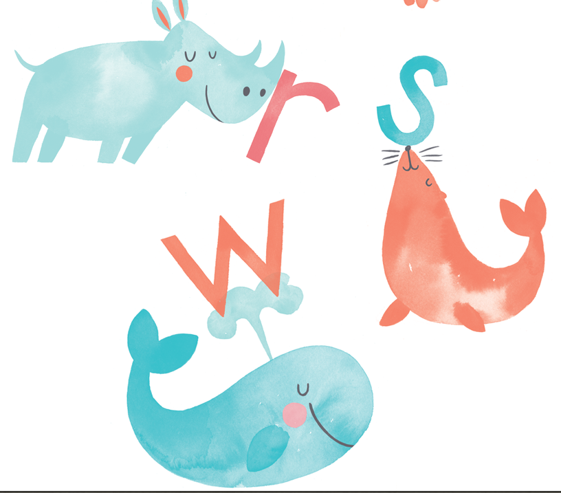
We're big fans of Jacqui Lee's work here at Hello!Lucky, as you may have noticed from the many collaborations we've done with her in the past. Today we're excited to talk to her about her latest release with us, birth announcements and kids stationery. We thought Jacqui's beautiful watercolor paintings and sweet designs would be perfect for such an important life announcement and we are thrilled with how they turned out. We talked to Jacqui about her latest release with us and her process.

These new designs are adorable! What was your process for making them and how did you decide on which animals to pair with each letter? 

Thank you! I had a lot of fun making them. Animals are always a favourite subject of mine to work on, so this was a dream project for me. In the beginning there was a lot of brainstorming to match up animals with each letter, and sometimes it was super tough to choose just one. For the letter A, an aardvark lost out because I felt I could create a more visually interesting image with an alligator. Many of the final decisions were made based on which animal and letter combinations had the most character.

Do you have a personal favorite? 

It's tough for me to pick favourites with this series, but I admit I have a soft spot for the letter L. I remember the lion was giving me a bit of trouble and I ended up doing a lot of revisions on him. I really like the way he turned out in the end.

Where do you draw inspiration from?  

For this project, I had a clear idea that all of the animals and letters in the alphabet had to be simple. I ended up taking a lot of inspiration from one of my favourite illustrators, Charley Harper. He was a master of creating distinctive animals using mainly shape and colour. 

Who are some of your favorite designers? 

There is so much great work out there that I have many, many favourites. I feel like there are too many to list, but I will say that I have always admired Louise Fili's work and her distinctive design aesthetic. As for illustrators, again, there are so many! Some of my favourites will always be mid-century illustrators such as Alice and Martin Provensen, Art Seiden, and Roger Duvoisin. 

What are you currently working on? 

I'm currently working on a children's book! It's actually the third in a series that I started on back in 2011 with Simply Read Books - the first is titled Murilla Gorilla: Jungle Detective. It has been an amazing experience so far. Jennifer Lloyd (the author) and I have been getting some fantastic reviews, and I feel really lucky to be paired up with such a great writer and publisher. Right now I'm still in the sketching and planning stage, which is probably my favourite part.

Thanks so much for taking the time to chat with us Jacqui, and thanks again for another awesome collaboration. We can't wait to work with you again!

You can see all of Jacqui's designs for Hello!Lucky here. View more of Jacqui's work on her website, follow along with her on twitter & tumblr.

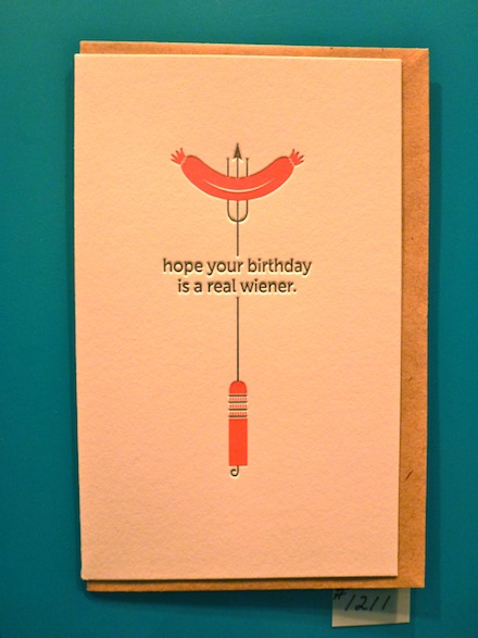
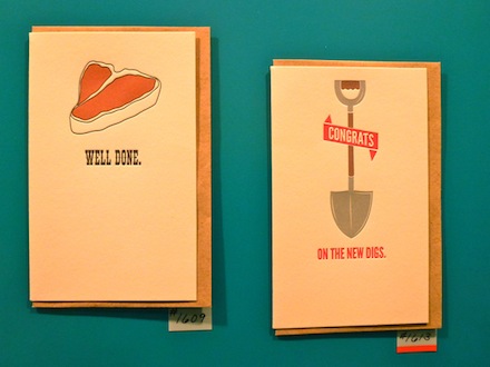
Stationery Show Favorites, Part 1

We're having a great time at the NSS this week. It's impossible to get photos of everything we've seen and loved. But here's our first post to share some of the goodness we've been staring at all week.

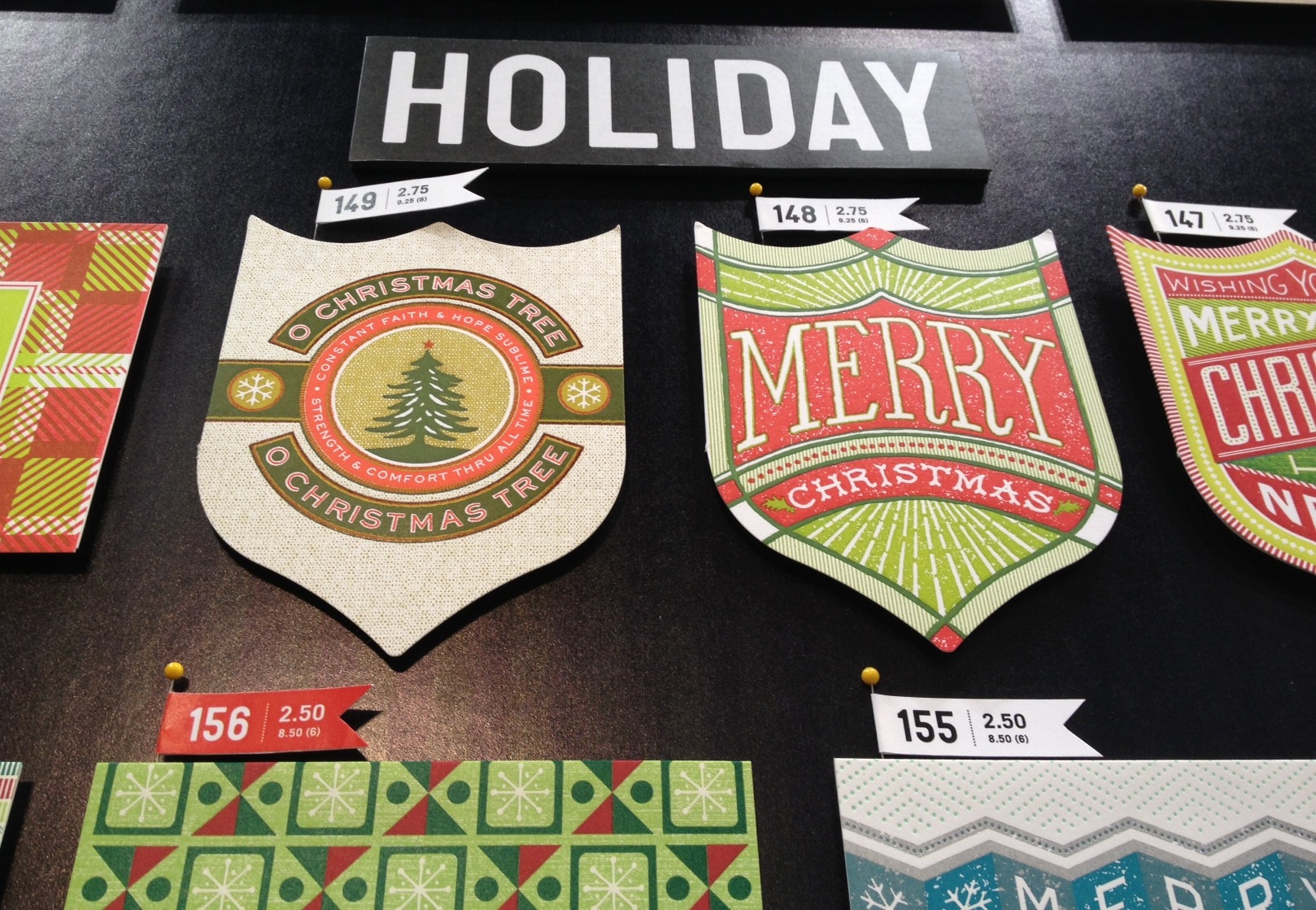
HAMMERPRESS  - We've long been fans of this Kansas City press shop and we love that our booth is directly across from there's at this years show. They've got some great new designs. Including some sweet die cut holiday cards.

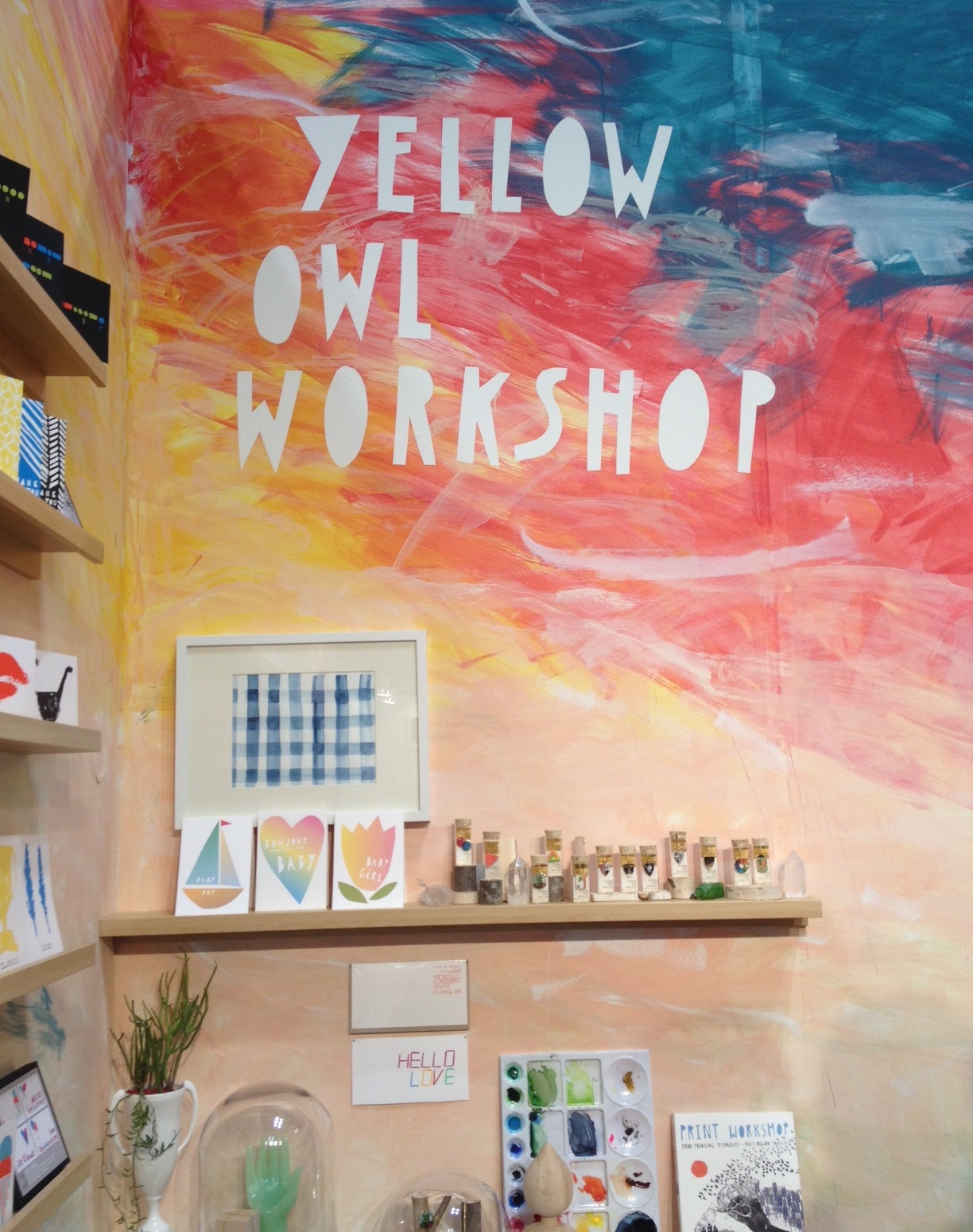
YELLOW OWL WORKSHOP - Just around the corner from our booth is one of our hometown neighbors and friends, Yellow Owl Workshop. We were so impressed during set up to see Christine painting a masterpiece in her booth - check out these lovely walls! As you can imagine their booth is definitely a stand out and we love how the cards match her amazing walls.

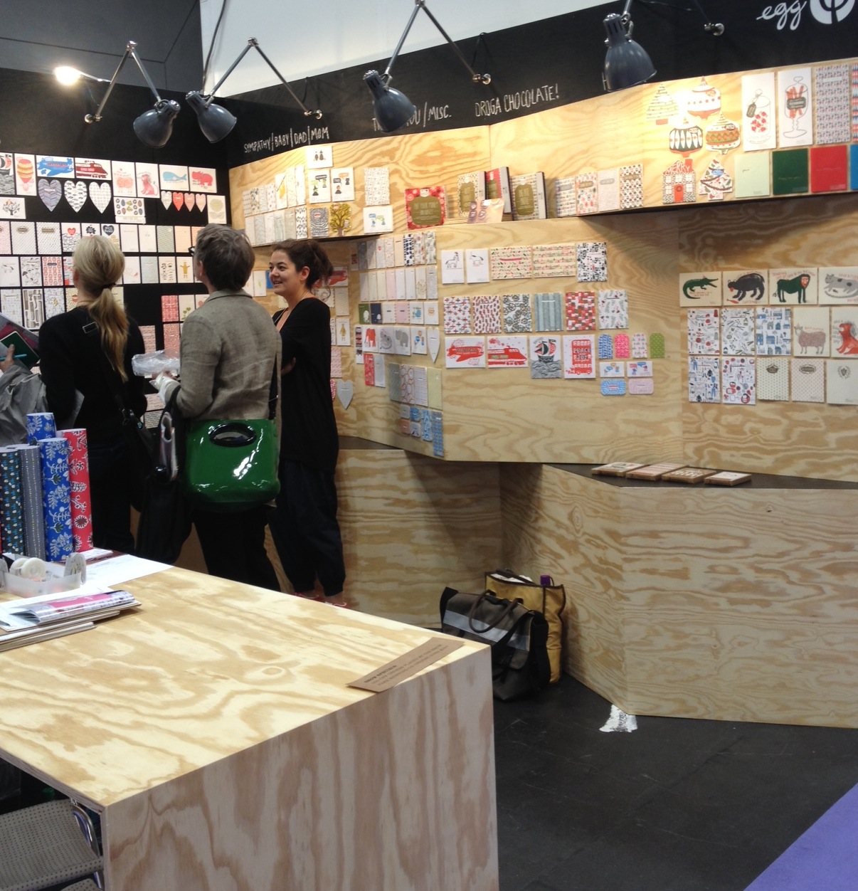
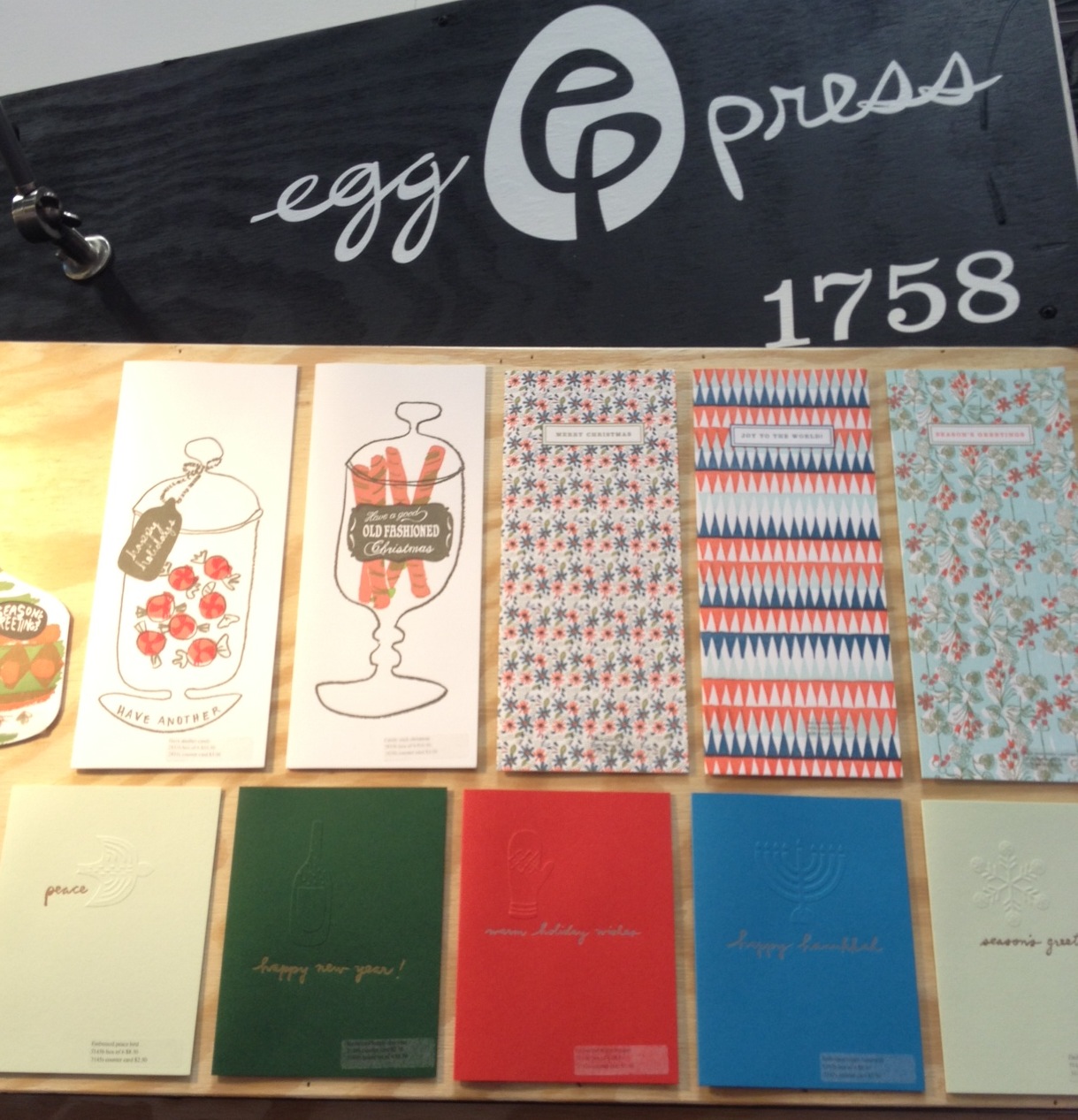
EGG PRESS - Another stand out booth is the this homemade beauty from Portland based Egg Press. Check out their custom built walls. Some great new designs from another one of our favorite letterpress companies -- and we're not just saying that in light of our big news.

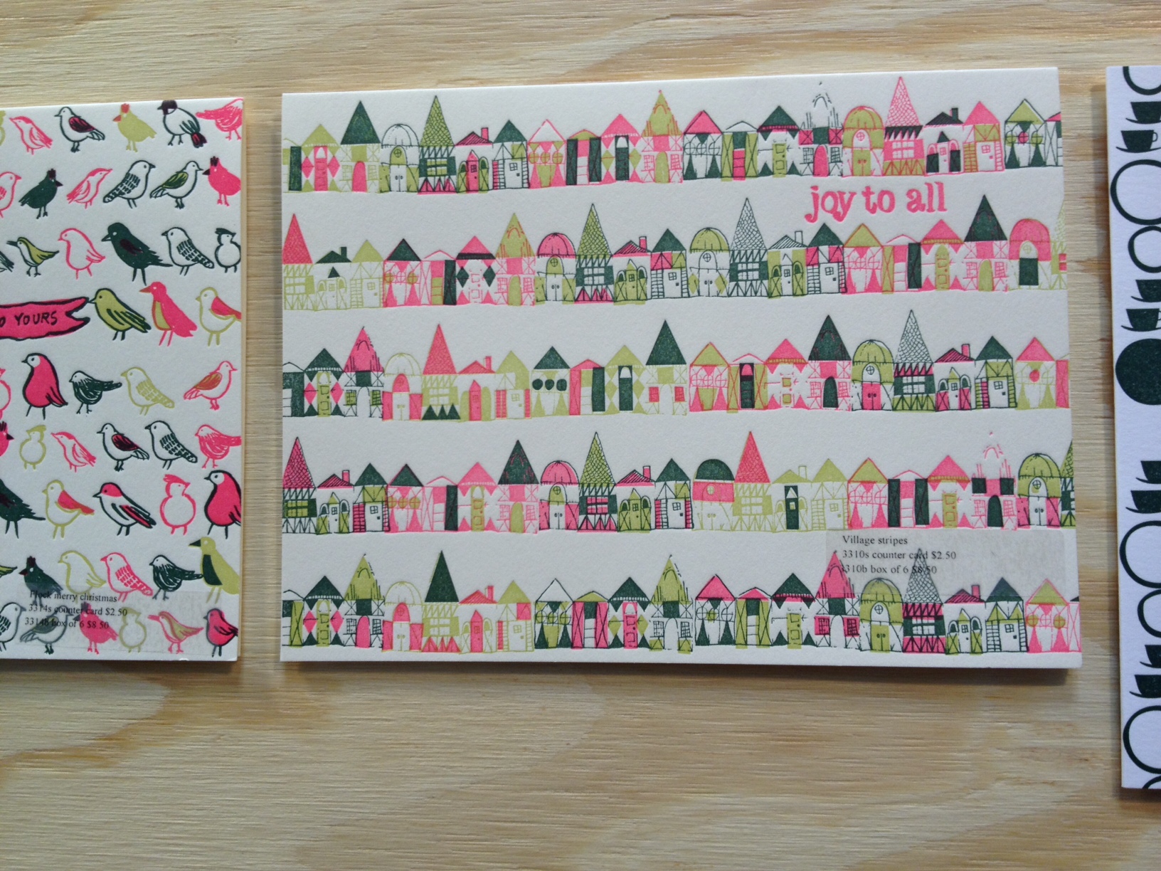
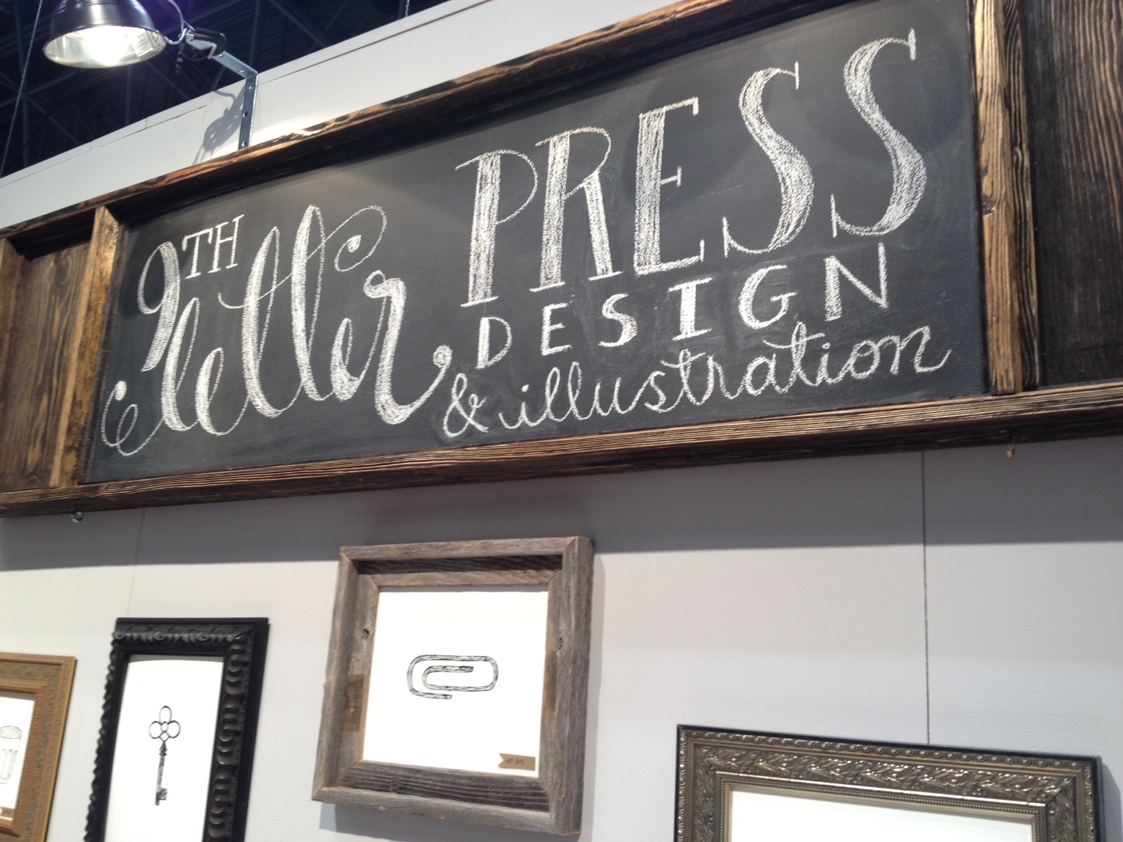
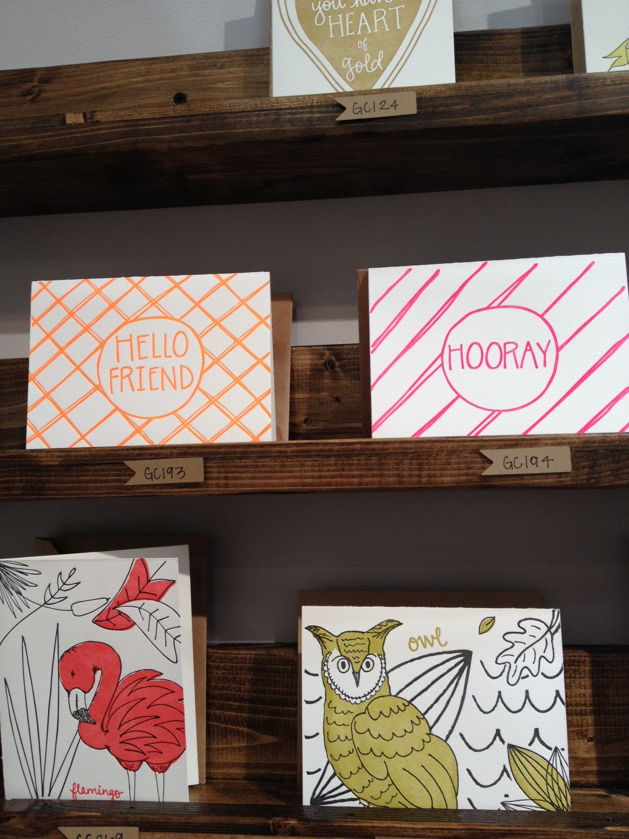
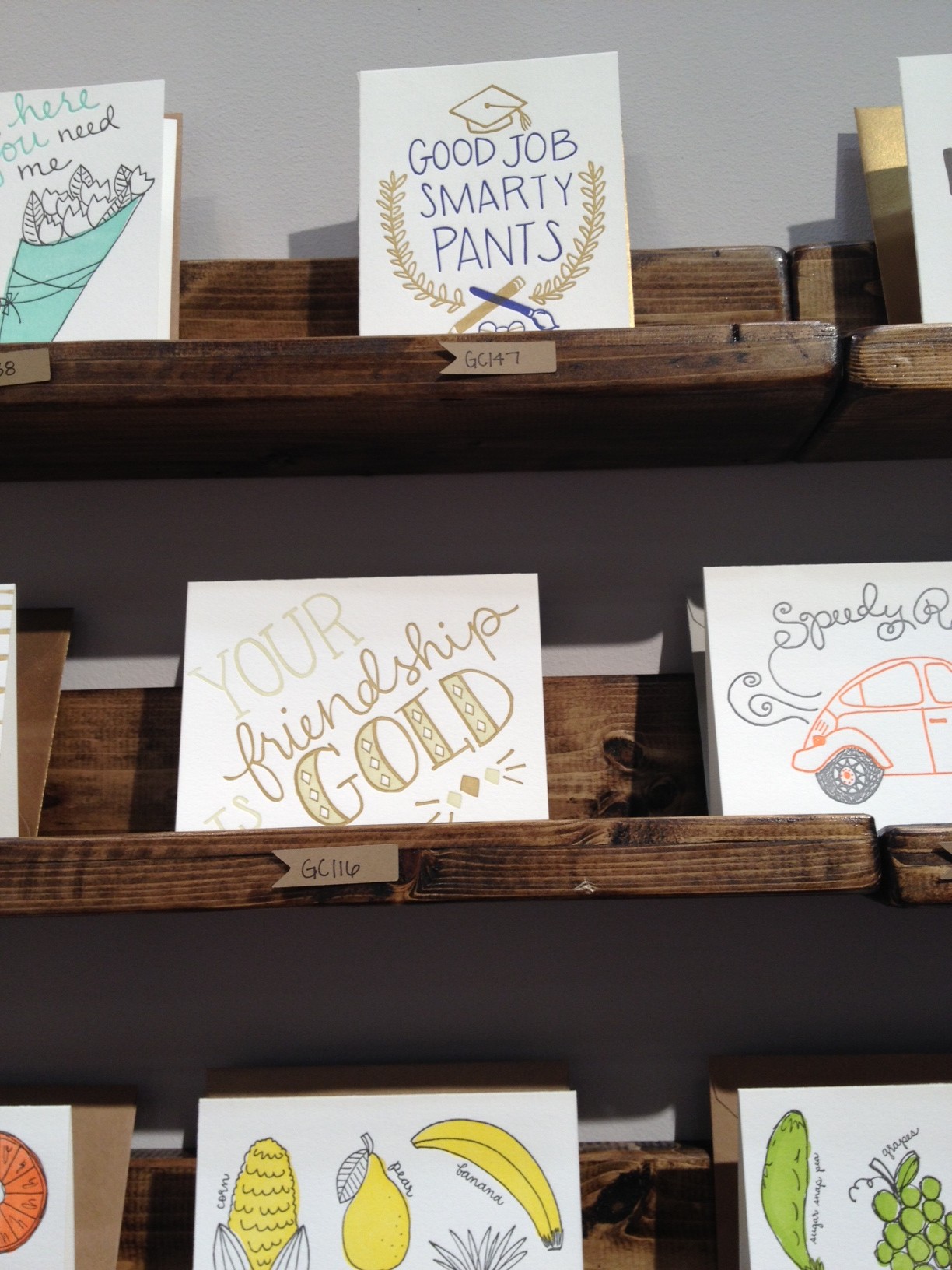
9th LETTER PRESS - Another close neighbor to us at the show is 9th Letterpress, based out of Winter Park, Florida. They've got some lovely new designs and we're also liking their big spacious booth with simple wood shelves. We love the infusion of bright cheery colors in their designs as well.

Alright! We're off to the show for another day. Check back for more of our favorites which we should have up here soon!


And the winner is....

You all are amazing! Thanks for all the comments and kind words about our newest vintage circus cards. It was so much fun reading through your comments and we love hearing which designs you like best. We can't wait to add these to the site and make them available to everyone.

The person who will be winning all five cards is.... Tasha!

We love doing giveaways so be sure to check here often and follow us on Facebook and Twitter! Thanks again for playing everyone.


Eunice's Sketchbook

One of the most fun things we do around the studio is brain storm ideas for new cards. We usually have a meeting, throw out all of our silly ideas, and then whittle the list down to something manageable since Eunice usually ends up designing the bulk of our greeting cards. One of the most lively conversations we tend to have is when we come up with card ideas that center around anthropomorphic food. The idea for a 'Wokin' Birthday' card came from a dinner Eunice and Sabrina had at a Chinese restaurant.

As you can see Eunice is still in the midst of sketching but we had to share these shots of her sketch book from this morning. She said it's not easy conveying veggies and pieces of tofu dancing so she tries to imagine Wil.i.am as a piece of tofu. These veggies definitely look like they are getting down so her method seems to be working. We can't wait to see the final design for this hysterical birthday card and will be sure to show you as soon as it's on press.

In the mean time have a Wokin' Thursday!

Studio Shots

It's been a while since we've shared some snapshots of what's been going on in the studio on the blog. As you can see we are having a lot of fun watching our printers mix ink and we're printing many new designs in preparation for the National Stationery Show in May. If you're on Instagram be sure to follow us there for daily shots of what's happening around the studio!

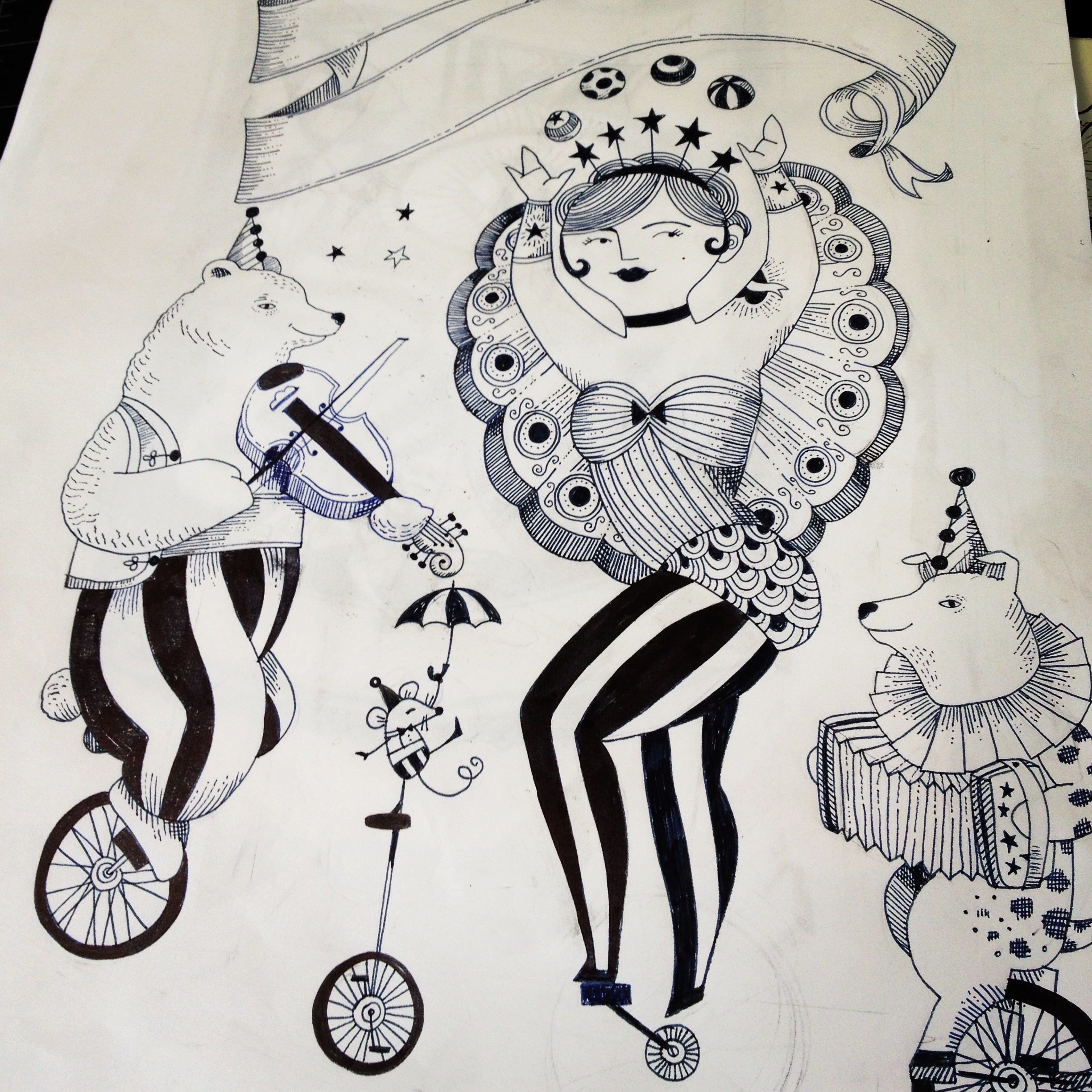
Inspired by the success of our Going Strong card Eunice is hard at work drawing new designs for an entire series of circus themed greeting cards. This is the start of one of five new circus designs.

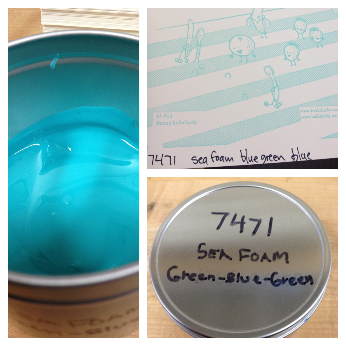
Almost as fun as the colors are the names that our printers give some of the inks in our studio.

Another brand new design on press. Jon just finished printing one color here so the full design isn't revealed. Can you tell what it is?

We're so excited about our new gold foil collection and we love seeing the shiny samples laying around the studio.

A pretty blue press.


New! Lisa Congdon for Hello!Lucky

When Lisa Congdon agreed to do a line of cards with us for 2013 we were beyond thrilled. We love Lisa's colorful illustrations, hand lettering, and imaginative renderings of nature and animals. We think her cards are perfect for any occasion but we're especially excited to launch the line just in time for Valentine's Day. Check out these images of her studio (Taken by Victoria Smith of SF Girl by Bay). No wonder her designs are so bright and cheerful, her space is an inspiration in itself!

We asked Lisa a few questions about her process and what she has in store for 2013:

What is your process like? Does it change with every project?

It does depend. Sometimes I draw things straight from my brain, especially if I am making a simple drawing without much nuance. The cards I did for Hello!Lucky were all things I drew that just came from my imagination. When I paint or draw something more realistic or complex, I find images (photographs) to use as reference, so I can get the proportions and lighting right. Typically, especially in my commissioned illustration work, I make sketches first. And then I move to making the final artwork.

I always start by drawing things by hand. Always. None of my work starts as digital work, even if it ends up as digital work. In the case of the card line for Hello Lucky, I drew the designs in pen on paper, then scanned them and turned them into vector so they could be reproduced as plates for letterpress printing.

What was your inspiration for this line? 

I remember I got really simple, straightforward art direction for this line: create designs in your own style around the theme of love. So I brainstormed different sayings that would lend themselves easily to colorful illustration: things like You are My Sunshine, You are my Queen, You Light up My Life. It was really as simple as that! I really enjoyed it!

Do you have a favorite in the collection or do you love them all equally?

I think You Light Up My Life is my favorite! But I like them all.

(My Sunshine, Sailboat Love, Falling for You, Lighthouse)

We loved your 365 days of hand lettering project you did for 2012. Is there a favorite quote/motto you have from that project? 

One of my favorites is: "Leap and the net will appear," which John Burroughs is quoted as saying. It's the motto for many things in my life.

What are you currently working on or what's your latest release? Is there a 365 day project for 2013?

I just launched a weekly project for 2013 with Maria Popova of Brain Pickings called The Reconstructionists. It's a a yearlong celebration of remarkable women who have changed the way we see the world. Every Monday in 2013, we'll publish an illustrated portrait (by me) of one trailblazing woman (artist, scientist, writer), along with a hand-lettered quote that captures her spirit and a short micro-essay (by Maria) about her life and legacy. I'm pretty excited about it!

(Queen, King)

Thank you Lisa for being such an inspiration and so much fun to work with! Visit Lisa's website for more lovely illustrations and follow along with her blog here. Shop Lisa's new collection for H!L here!

Product Photos by Edyta Szyszlo Photography

Portrait of Lisa by Leslie Sophia Lindell Photography

Child's Own Custom Toys from Drawings

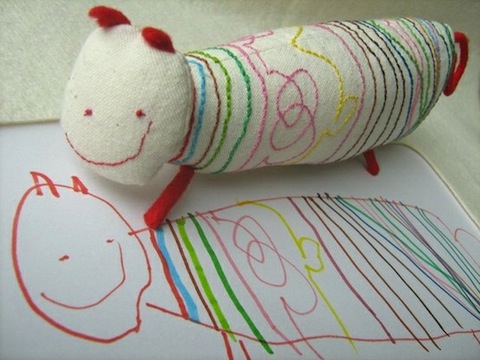
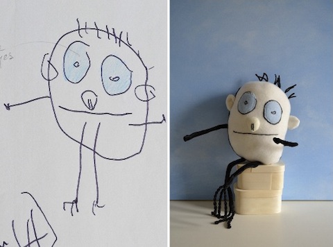
This image has spread like wildfire on Pinterest. There's something magical about a child's imagination, and the playfulness of a simple drawing. Child's Own Studio has been turning those imaginative doodles and drawings into real life toys since 2007 and we are completely in love.

The creator and master softie-maker Wendy takes time to incorporate every detail, from each finger and toe to every scribble of the nose.

This is the kind of gift that stays with a child for a lifetime, so we encourage parents, family friends, and all to invest in this one-of-a-kind toy. Currently Wendy is booked, but visit this list of other Softiemakers for your order. Congratulations to Child's Own on all the success!

New Illustrations by Karin Soderquist

Our friend and 2011 Holiday Guest Designer Karin Soderquist recently shared some images of her newest illustrations and we're literally rolling on the floor laughing. Her quirky characters are what won us over with her holiday cards, and now they're getting even quirkier. Skate Grrrls (shown above) is a colorful study of the movements and poses of skate boarders. We love the bright hair colors! That isn't even the best of it. The quirkiest of all her characters has to be her collection of sexy Swedish pastries, illustrated in celebration of Let's Fika! Does it get any better than a chocolate ball in high heels??
Perhaps the only thing better is a cinnamon bun in cowboy boots...
Lookin' good, ladies. Thanks Karin for sharing your new work! To view more, head over to her website here!

Holiday Sale & Open House! This Sunday!

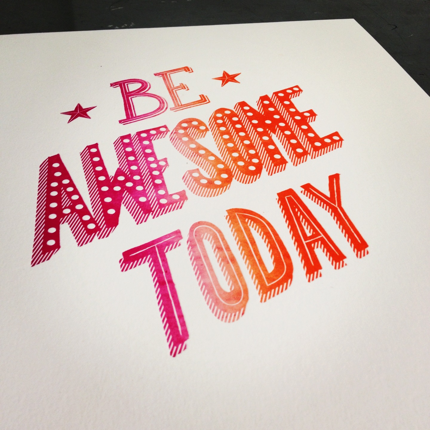
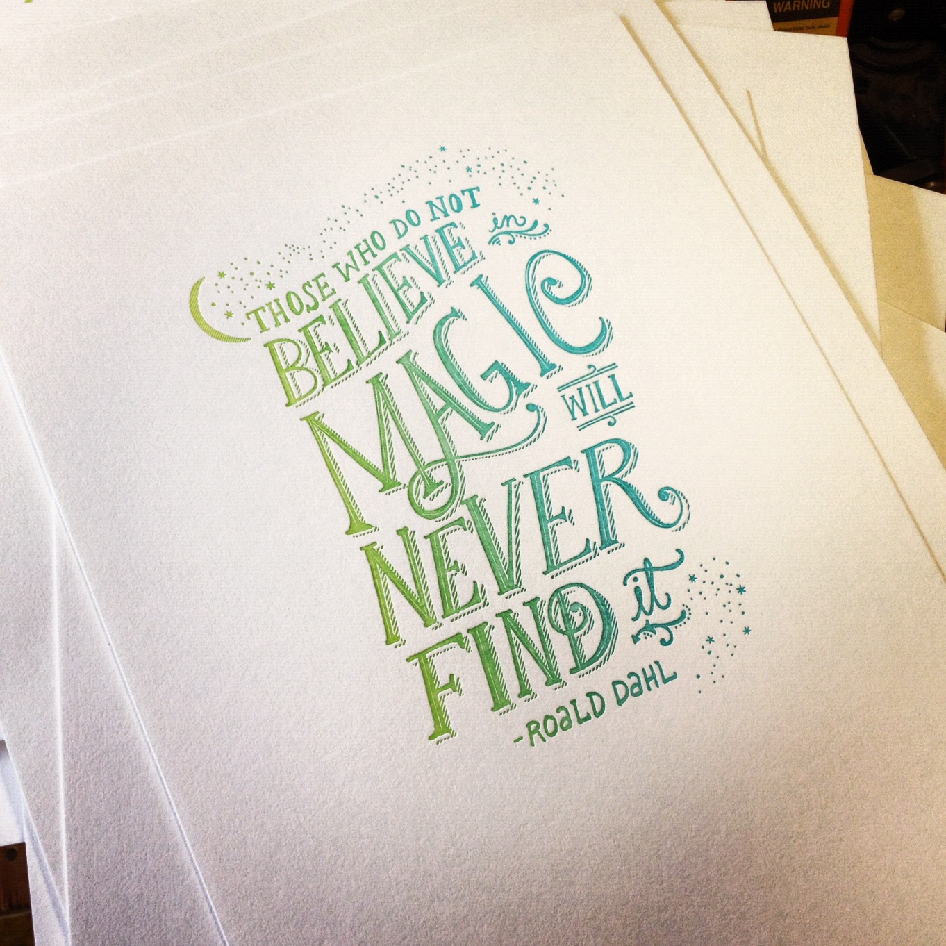
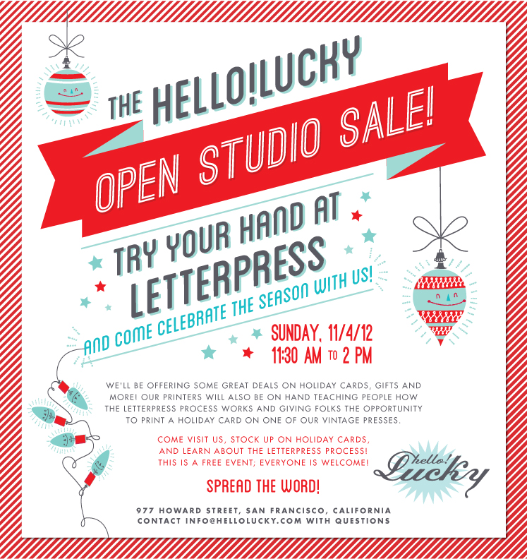
Just a reminder that this Sunday is our big open house and holiday sale! We have so many fun things going on including letterpress demos - where people can crank their own holiday card, a huge sale on holiday cards and gifts, and three limited edition letterpress prints we designed just for the occasion! We're just showing you these two - you'll need to come see us to check out the third print!

We're so excited about these prints, hand drawn by Eunice and masterfully letterpressed with split fountain by James. We only printed 50 of each so be sure to come early and buy one!

Visit us at 977 Howard Street (btw 5th & 6th) in San Francisco. Our doors will be open from 11:30am - 2pm. Email info@hellolucky.com with questions.

Inspired by Charlotte Trounce

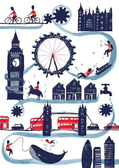
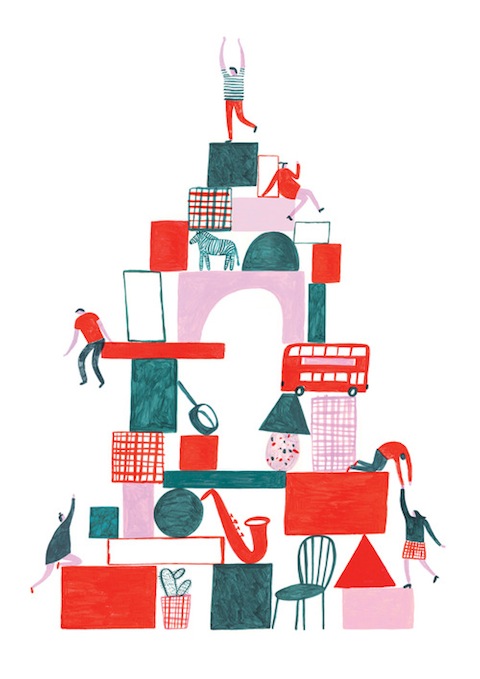
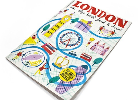
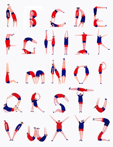
These lovely illustrations by London based artist Charlotte Trounce have us giddy with design envy. The whimsical, hand-painted illustrations are definitely up our alley, and we're crazy about her compositions and bold color palettes. Plus, they embody some of our favorite things about Hello!Lucky's second home.

Charlotte created this alphabet in honor of the 2012 London Olympics. Hilarious! To see more of her work, head over to charlottetrounce.tumblr.com

Inspired by: No Nostalgia Typeography Video

Agesandages - No Nostalgia from Philippe Tytgat on Vimeo. Is there a new genre brewing in the design world? It seems the art of chalk lettering has become quite the trend, so we're unofficially crowning this video the king of the unofficial genre "Chalkography." The music video for Agesandages called No Nostalgia has to be one of the most inspiring typography videos we've seen lately. French artist Philippe Tytgat hand lettered the lyrics to No Nostalgia making for a totally original and compelling visual story.

But don't take our word for it, watch and see for yourself!

Found via Molly Jacques Illustration

Halloween Costume Sneak Peek!

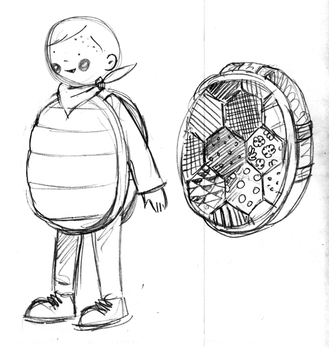
Halloween is just over the horizon, so it's time, once again, for another possibly overly ambitious halloween costume!  This year's costume is inspired by the boys' various sea creature obsessions - Jude happens to be a big fan of turtles at the moment, and this concept was inspired by a turtle embroidery kit that our mom did back in the 70's.

The idea is to have the shell be made from a piece of patchwork which will then be stuffed with batting for a cool soft sculpture look - I have a feeling Jude's really going to enjoy throwing himself around once he realizes being ensconced in this costume will make him semi-impervious to doing himself bodily harm. The overall costume will have a front and back shell attached to each other with wide bands of fabric and elastic, paired with a green long sleeved tee and leggings. Some cute rosy cheeks, a red sassy bandana, and voilà! Turtle-y goodness!

Of course, Sabrina's twins James and Alex must have coordinating costumes! James loves starfish and suction cups right now, so our plan is to make him a plush starfish costume with suction cups glued all over the front like starfish feet. Possibly a bit of a patchwork look on the back to match Jude's 70's vibe. Still have to sort out the logistics of the neckline - fingers crossed!

Alex is going to be a jelly fish - essentially an organza or other sheer fabric fashioned into a bubble skirt with some tulle for structure, worn decorated with shimmery paillettes and ribbon tentacles. It will be blue so we don't compromise his masculinity TOO much!  Love the idea of a little starfish perched on his head as an homage to James.

We're thinking that the dads will be dressed as fisherman, complete with pipes, yellow hats, and stripey shirts. Sabrina and I are tbd - possibly mermaids (really just an excuse to own a pair of metallic American Apparel leggings) although we are toying with turning Sabrina, who is very pregnant at the moment, into a pufferfish, her belly being perfectly proportioned!

Stay tuned, the crafting begins in full force this week! We'll be sure to post photos of the finished costumes here!

En Vacances!

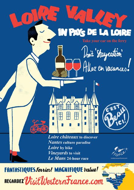
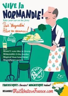
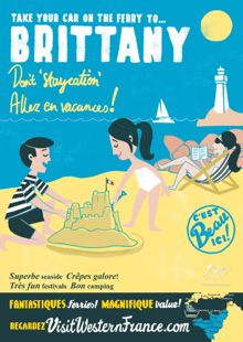
It doesn't take much to get the average Brit. thinking about holidays, especially considering the hit-and-miss wash-out Summer that we've been having recently. What could be more enticing than these charming retro-inspired posters by the French tourist board that have appeared all over the capital in the last few weeks to gently tempt us wet and weary commuters into packing our suitcases and heading South.

We love the use of the different fonts and the wonderful graphic cartoons that put us in mind of those classic Pink Panther opening sequences.

Beautifully fresh and oh so very French - who but a Frenchwoman would co-ordinate her deckchair with her son's t-shirt!

Allez...en vacances! Bon Voyage

The Best of NSS, Part 3

There was so much good work at NSS this year that it was hard to keep it to just two posts. So here is my third and final post, but really I could have done about three more! Rose from The Great Lakes Goods always has a strong showing and this year was no exception (above and below).

Newcomer Pei Designs featured some super cute illustrations - all letterpressed (above and below)!

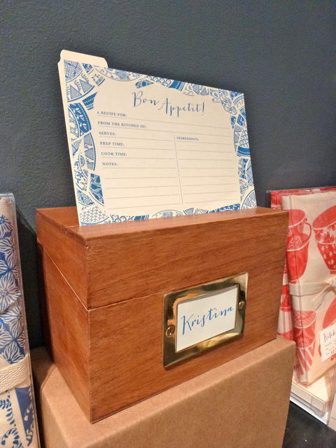
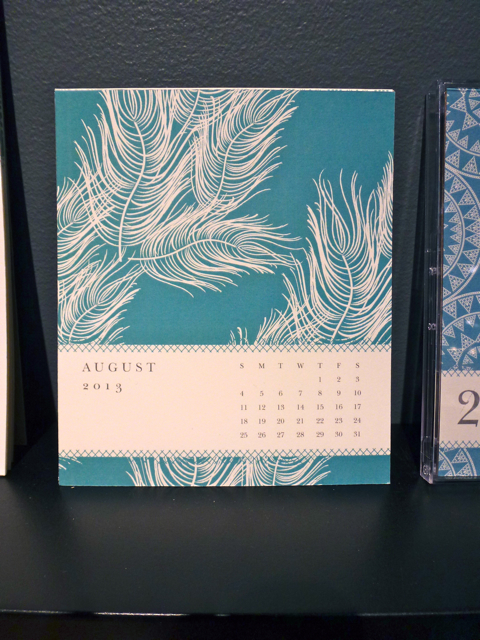
Our buddy Susy (from Susy Jack) really knocked it out of the park this year with her awesome recipes boxes, paperweights and calendars (above and below).

Do you recognize the feather illustration?

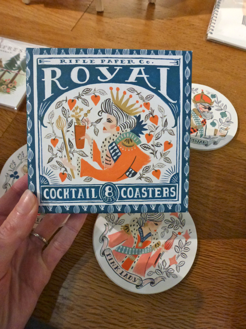
The always amazing Rifle Paper debuted these ridiculously adorable cocktail coasters:

Fawnsberg is run by two sisters, and features sweet illustrations on their cards and rubber stamps (above and below).

Finally, Atlanta-based Alee and Press really nailed it with their ombre style:

Whew! It was a great show and I loved checking out all the beautiful new work. Let us know in the comments if you discovered anyone new and amazing at the show this year!

The Best of NSS, Part 2

Hey peeps! It's time for more goodies from this years National Stationery Show (click here to see Part 1). First up is the amazing work from 1 Canoe 2 (above and below): 3 talented girls who draw, design and letterpress print in a barn in Missouri. Living the dream.

Making their NSS debut this year was Los Angeles based The Social Type (below). I love how the same sentiment can be interpreted in many different ways!

Another favorite of mine was Banquet Atelier & Workshop, based in Vancouver. Our mutual love of neon was obvious:

How incredible is their guest sign (below)? I'm loving their prints also.

My favorite birthday card of the show came from Anemone Letterpress (below). So clever!

Stay tuned for part 3!

The Best of NSS, Part 1

This year we didn't have a booth at the National Stationery Show but our New York satellite office (aka Design Director Shauna Leytus) was there visiting some of our favorite artists and making new friends. She'll be doing a series of posts recapping what she saw and loved. Here's her first post!

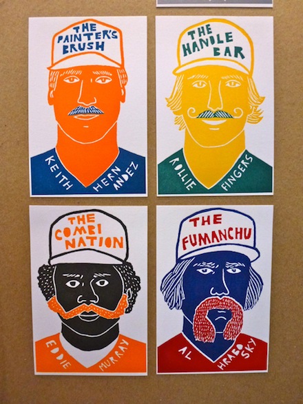
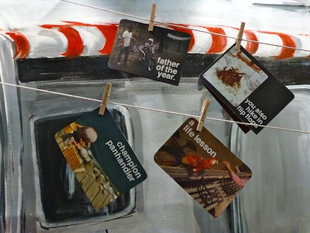
Where do I begin?! There was so much amazing work at the National Stationery Show this year from new comers and old favorites. Making her NSS debut, Left Field cards (above) showcased nine letterpressed "baseball cards" complete with mustaches, edibles and bizarre injuries. Collect them all!

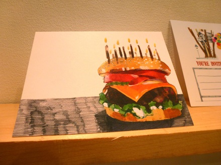
One of my favorite cards of the entire show belonged to Red Camper (above and below). Need I say more?

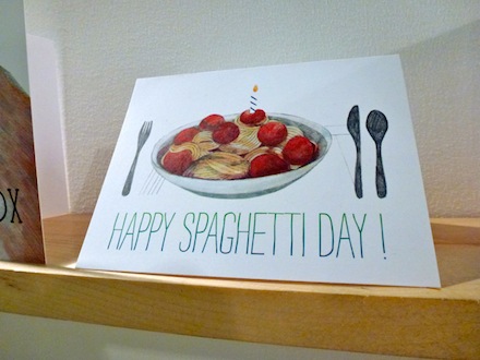
A fellow card maker sharing a love of food-themed imagery was Fox Tail Press (above and below). When I asked when "national spaghetti day" actually was, Danielle rightly answered "everyday". Duh.

Design*Sponge declared Linda & Harriet's over-sized Quilt Calender the best thing she saw at the show and I couldn't agree more. My photos do not do it justice - this is a work of art and it is amazing.

More coverage of the show to come!

Hello!Lucky B Sides & a Giveaway

We think one of the most delightful things about our greeting cards is the fact that the design often continues to the back of the card.

It's a fun little surprise you find when you hold one of our cards in your hands. And since only the front sides of our cards are shown online people often don't get to see this fun little party on the back. So here are some rarely photographed back sides of our cards. We're sharing some brand new designs along with a couple old favorites.

Another signature Hello!Lucky card trait is anthropomorphizing food, which we're big fans of around here. We've got dancing deviled eggs, talking pancakes, and laughing champagne bottles. Tell us which food you'd like to see come to life next and we'll send one lucky commenter 3 of our new cards! We'll pick a winner this Friday, May 18th.

Cards in order of appearance: Happy New Year's Eve, Yeti Love, Animal Parade, BBQ Parade.

Real Wedding: Kathryn And Joe

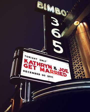
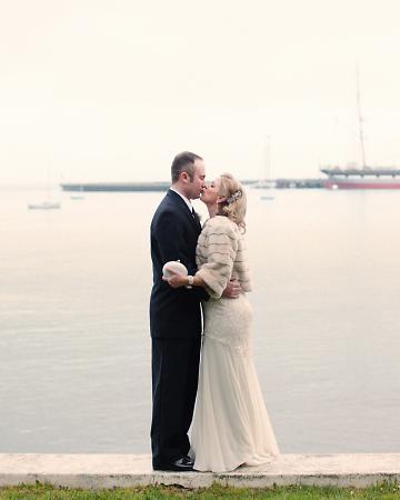
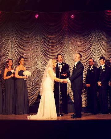
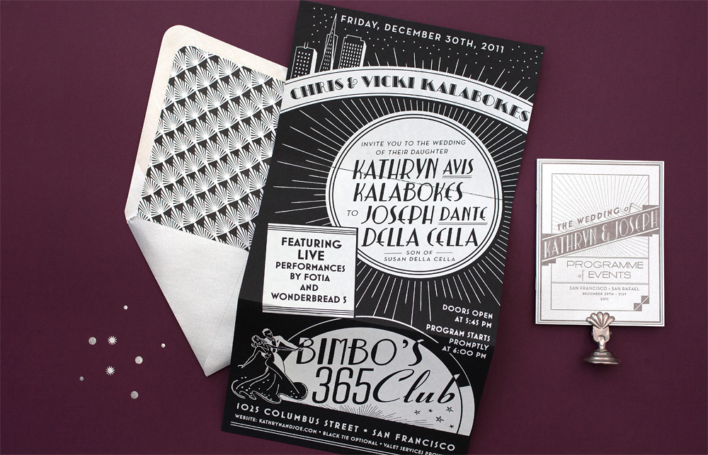
This wedding has been on our minds and in our hearts for months now, so we're thrilled to finally bring you the details of the event! Kathryn and Joe's glamorous San Francisco wedding has to be one of the most classic weddings we've seen yet. (Check it out on Martha Stewart Weddings!) Set in the heart of the city at the art deco designed venue Bimbo's 365 Club, this wedding was definitely not short on style. Kathryn is the founder and creative director of Dream a Little Dream Events, so without question, her wedding would be a show stopper. We love the classy details she and Joe chose - from all white flowers to fur shawls donned by her and the bridal party. And check out that sparkling backdrop for the ceremony!

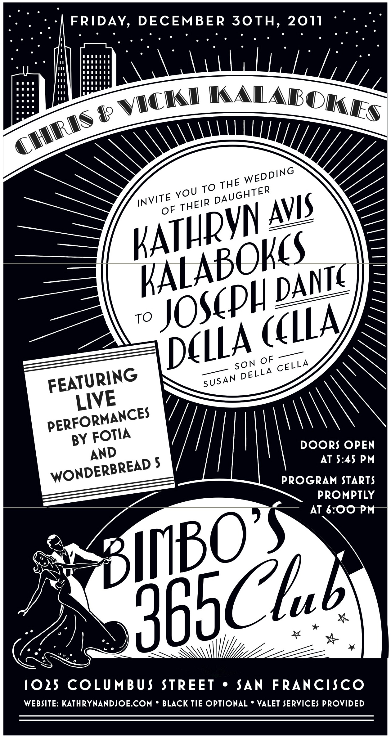
Eunice worked her magic on the wedding stationery, which included the invitation suite, table numbers, programs, menus, matchbook favors - the list goes on!  Kathryn and Joe had always enjoyed live music at Bimbo's so a New Year's Eve blowout was a no-brainer for them and creating a design to flatter such a classic San Francisco landmark was a dream come true for us.  The art deco themed invitation suite took cues from vintage concert posters and album covers with a clean black, white and silver color palette.  We called on a neighbor silk screen shop to help out with the impressive tri-fold invitation and the ever-amazing Michele Papineau added the final flourish with calligraphy addresses.

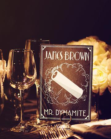
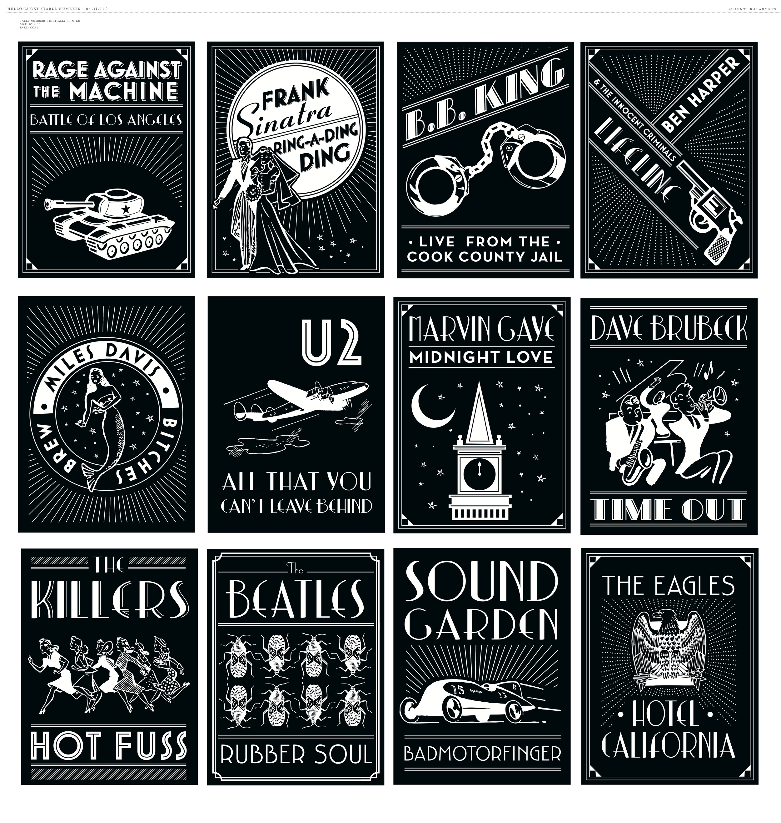
Since Kathryn and Joe are avid music lovers, it was only fitting to create table signs with names of their favorite albums.  This was no ordinary wedding of course, so we created unique artwork for every album.. that's forty-one tables!  The couple had such fun coming up with names that they ended up keeping the cards and framing them as artwork in their home!

One photo doesn't do it justice so below are a few of our working files.  Eunice really knocked it out of the park with this one, now we all want copies!

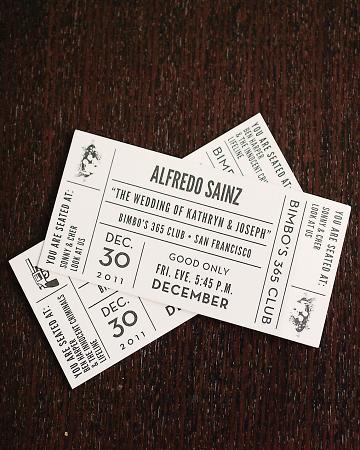
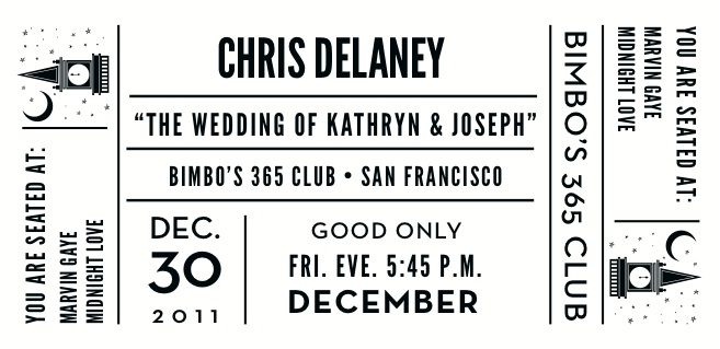
In keeping with the music theme, the escort cards were custom designed to resemble concert tickets with each guests name printed along with their table assignment and corresponding illustrations.

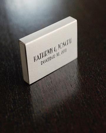
A classic takeaway from a music venue, each guest left with custom matchboxes as favors.

Congratulations Kathryn and Joe and cheers to a new year and a new life together! View more photos here.

Wedding photography by Kate Harrison Photography