Lucky Friday # 55, Three Ring Circus Thank You Card

Hello all you lucky folks out there! This is the 55th edition of our Lucky Friday Giveaway.  Each Friday we feature one of our letterpress greeting cards. We’ll choose THREE LUCKY WINNERS to get a free card.  Post a comment by 12 p.m. PST the following Thursday, and we’ll announce the winners on the following Friday!

The three winners from last week are (drum roll, please): Natosha, Tasha and Lydia! We’ll contact you next week to arrange sending your Love Birds card.

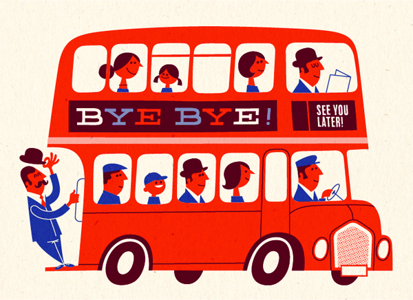
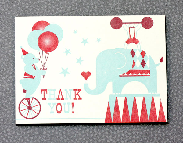
Design: Three Ring Circus Artist: Eunice Moyle Inspiration: Ah, the James family circus, of course, and the great Jude the Destroyer. Who to send it to: The one who threw the greatest party (or show) on earth, Misters K. and H (whose production was second to none), or of course, Henry the Horse! Ideas we scrapped in favor of this one: The burlesque version was a little too, er, specific for a thank you card, and we reckoned we'd tuck away the rodeo version for nigh on another year. Favorite detail: Love the translucent sheen on the bear's balloons. Why letterpress? Like letterpress, an elephant, strongman and bear all make a bold impression.

Don’t forget to post your comment and tune in next week, same time, different stationery, to see if you’ve won!


Studio Snapshots!

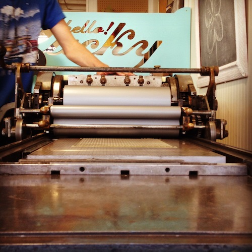
Here's Jon working our vintage Vandercook press. This is the press that started it all, originally manufactured in 1947, it lived in Eunice's garage when Hello!Lucky was just beginning.

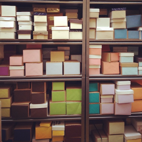
We strive to stay organized, and being the visual people we are, color coding and alphabetizing envelopes make assembly much more efficient! Above is just a portion of our envelope collection. We're really loving the Clover (kelly green) color right now.

Another way to stay organized with ribbon storage. We are always looking for a particluar shade or pattern, so it's helpful to have them side by side!

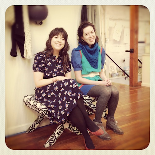
Our designers Anna H. and Shauna looking sharp and stylish!

Faye was created by a talented employee years ago. If you look closely, she's made up of Cherry Blossom wedding invitations! She likes to keep watch atop our studio stairs and greet all of our visitors. Can you say pretty in pink?!

New Susy Jack* for Hello!Lucky Wedding

 One of the things we take pride in most here at Hello!Lucky is our enthusiasm for working with talented artists and designers aside from our own. Combining forces with brilliant minds gives us a great pleasure, and there is no shortage of brilliant minds out there. As you saw this past holiday season, we paired up with 16 various artists around the world for our curated custom holiday collection, and it was quite a hit. Not only were we exposed to the extraordinary design skills of our favorite illustrators, but their designs were made available for our customers to enjoy. Since the holiday collection launched last year, we knew we were in the midst of some potential lifetime friends, one being the insanely gifted Susy Jack*. Her classic patterns and bold color palettes make up the perfect combination for a modern wedding invitation, and we're here to bring you just that! Six brand new, completely exclusive, letterpress and flat printed wedding invitations, save the dates, and day-of stationery, all for you!

Bohemian (above)

Meet Susy Jack*. A lover of textiles and paper, Susy's career took flight after her collection on Etsy made a splash in the design world. Now, you'll find her paper products and home accessories in stores all over the world. We asked Susy a few questions about her new wedding suite for Hello!Lucky:

What was your inspiration for this collection? 

My inspiration for this collection was to bring my most-loved motifs from decorative arts into a fresh, inviting, welcoming and stylish new place. I grew up in a house full of vintage and antique items. I was surrounded by decorative objects and they were a huge influence on my own creativity. I thought that exploring the place where art and craftsmanship meet, and combining that with a modern approach to style, was a great starting point for a wedding collection.

What was your process like?

My process is actually very mental--I spend a lot of time thinking before I get down to work. Often I'll perceive what I want something to look like before it even hits paper. I don't do a whole lot of sketching outwardly but in my mind. I sketch all day and play with ideas. Usually my sketchbooks are more filled with words than drawings; when I sit down to work, I often have words in mind instead of images. I'll want something to evoke humor, or love, or happiness or a combination of emotions and ideas.

 Cross Stitch

                       "Each suite is like a mini-collection, which I hope the bride will see as her very own."

 Daisy

     "I love overlapping patterns, and the idea of using a different pattern for each piece in the suite is so much fun." 

 Duchesse

 What usually sparks a design idea for you?

I'm an inspiration omnivore, which helps when you live in the middle of New York City. Usually an idea is sparked by browsing a flea market, museum or other place that's full of textural objects from bygone days but I also love the latest fashion and art. I try to get out and about and take in a lot of the real world: what people are wearing, what exhibits are happening. I love looking closely at something and figuring out what exactly it is that I like about it or what makes me interested in it. Then I start to work on my own new ideas. It's always amazing to see how looking closely, paying attention and being in the moment can make things come to life, creatively. It can be difficult to remember to stop and actually look more closely at something for a quiet, thoughtful moment, see it in all it's dimensions, experience it. I love doing that. It's always worth the time.

Feathers

"It's always amazing to see how looking closely, paying attention and being in the moment can make things come to life, creatively."

Tropic

To view the entire Susy Jack* collection and read more about her inspiration, click here!

 Photos by Edyta Szyszlo
Inspired by: Meadow

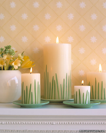
If you are looking for springtime wedding details, look no further! We've collected various projects and images of wedding decor and paper goods that will fit perfectly with the cheerful season about to bloom. The source for our inspiration is of course our Meadow wedding invitation designed for Hello!Lucky by EIEIO. The simple grassy illustration looks great in shades of green or yellow, and is a stunner letterpress printed. When browsing the Martha Stewart website for Easter craft ideas, we stumbled upon this adorable candle DIY and thought it would make a fantastic centerpiece at a Meadow inspired wedding. All it takes are some blades of grass, a strong adhesive, and some dollar store candles and you've got an inexpensive yet totally chic table display.

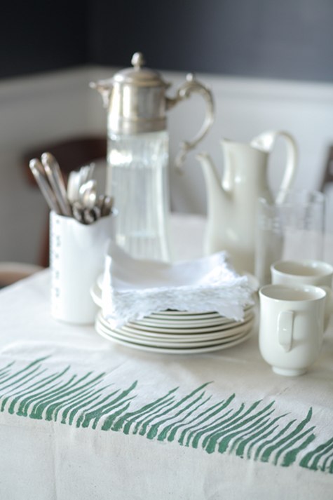
We also love these botanical stenciled tablecloths featured on Design*Sponge.

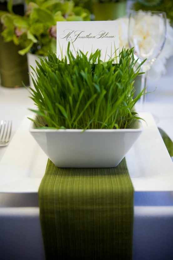
This wheat grass table setting with printed place cards makes for a classic and clean display. We found this one on Pinterest, among tons of other ideas!

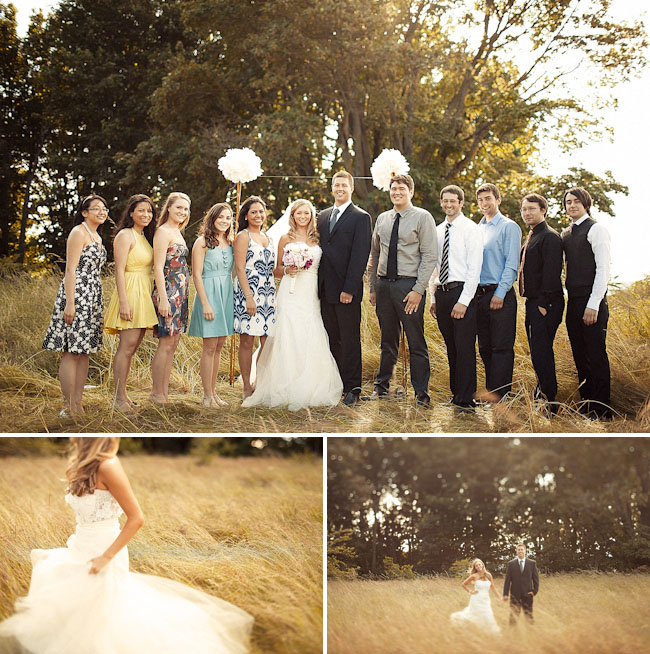
This wedding found on Green Wedding Shoes doesn't have tons of fancy decor, but the simple nature of the location still matches the theme perfectly.

Can't wait for spring to arrive! To view our Meadow wedding invitation, click here.

Martha Stewart Weddings

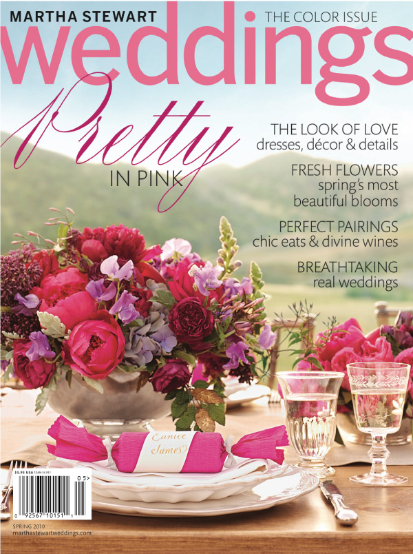
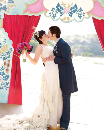
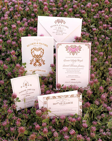
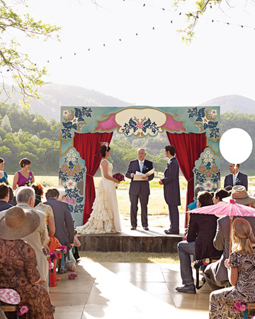
By now you most likely know about Eunice and Daniel's wedding featured in Martha Stewart Weddings back in 2010. The excitement was radiating around our studio, and we still relish in the memory of such an honor of appearing on the cover. Martha Stewart is one of the most inspiring bridal information destinations [along with endless craft and recipe ideas] so we feel blessed to be a small part of it every now and then. It's such a thrill to see weddings we have worked on appear in the Bride's Guide or even inside the shiny pages of the magazine, and because we love the Martha Stewart collection so much, we wanted to revisit all those moments of pleasure by bringing the real weddings to you.

Eunice and Daniel started the trend by customizing our Woodland Damask wedding invitations (designed by Joel Dewberry).

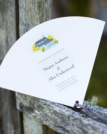
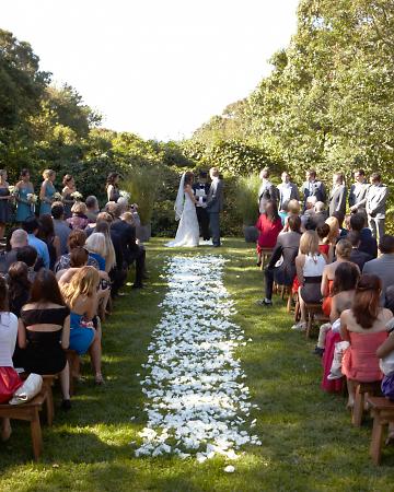
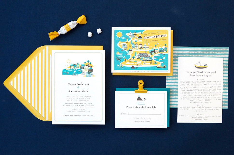
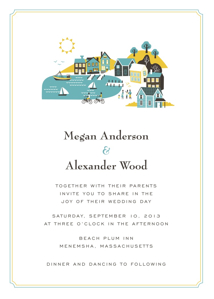
 Recently, Megan and Alex's wedding was featured including one of our newest destination invitations Visit Martha's Vineyard (designed by Lab Partners).

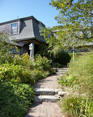
We also created these program fans incorporating an illustrated version of their reception spot The Beach Plum Inn. You can really see the resemblance!


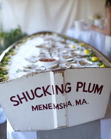
And of course, a New England wedding isn't quite complete without fresh oysters. We love the display atop this rustic mini fishing boat.

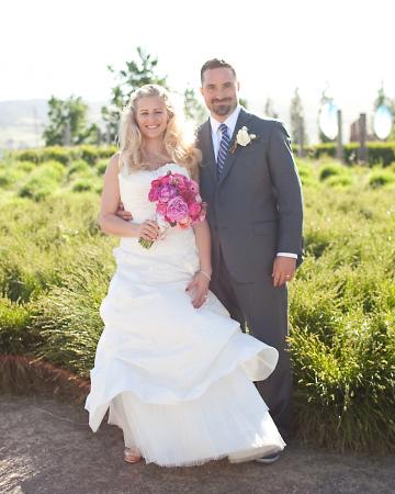
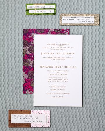
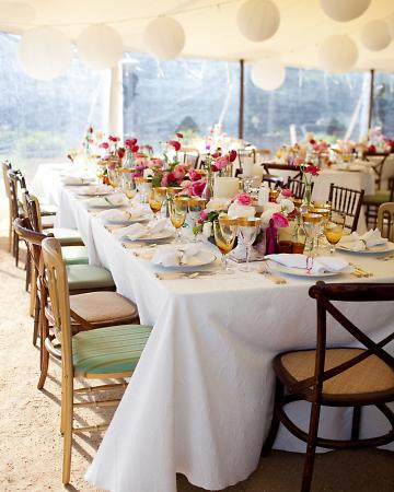
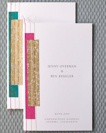
 Jenny and Ben's fairytale Sonoma wedding was a favorite last year, especially their custom created wedding invitations and programs. Their feature in MSW really highlighted their charming characteristics and artistic creations for the ceremony. We love that they weren't afraid to incorporate bright colors!

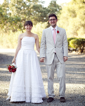
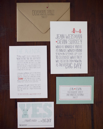
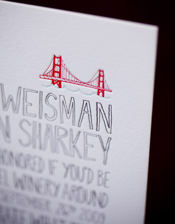
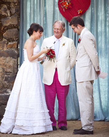
We can't forget about Jean and Devin's whimsical wedding. The true inspiration for our Big Day invitation suite, this couple's witty wording set the tone for one lovely [big!] day.

With the help of our friends at Alison Events, lots of crafty details made this intimate barn yard setting pop with color.


Lucky Friday # 54, Esther Aarts Love Birds

Hello all you lucky folks out there! This is the 54th edition of our Lucky Friday Giveaway.  Each Friday we feature one of our letterpress greeting cards. We’ll choose THREE LUCKY WINNERS to get a free card.  Post a comment by 12 p.m. PST the following Thursday, and we’ll announce the winners on the following Friday!
The three winners from last week are (drum roll, please): Lauren, Loretta and Leah! We’ll contact you next week to arrange sending your Thinking of You card.

Design: Love Birds Artist: Esther Aarts Inspiration: We suppose she just had a rosy, bubbly, layered and lovely, golden day! Who to send it to: A pair of proud peacocks, a new pink and bluesome—twosome, the toasts of the town, or a gifted and gorgeous guy and gal! Favorite detail: So hard to choose one, but we can't say enough about how Esther knows how to rock her fab fonts! Why letterpress? It's the icing on the cake!

Don’t forget to post your comment and tune in next week, same time, different stationery, to see if you’ve won!

On Press: Broadside

This week James is operating the Vandercook and pressing a large broadside for a custom print job. The press is a No. 4 proof press from 1947. This video shows him setting up his guides and adjusting the furniture around the base for a perfectly positioned print. Next, he applies ink to the rollers and inks the polymer plates. Finally, after printing, he carefully cleans all the rollers.

Real Wedding: Kathryn And Joe

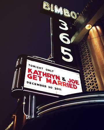
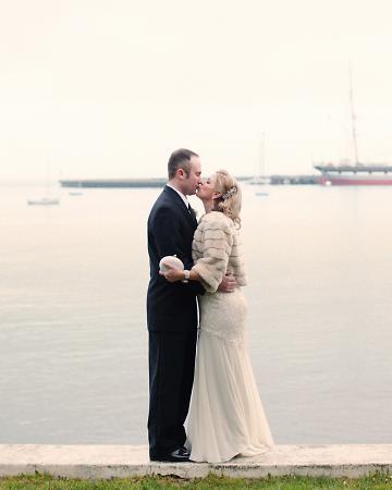
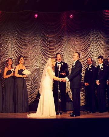
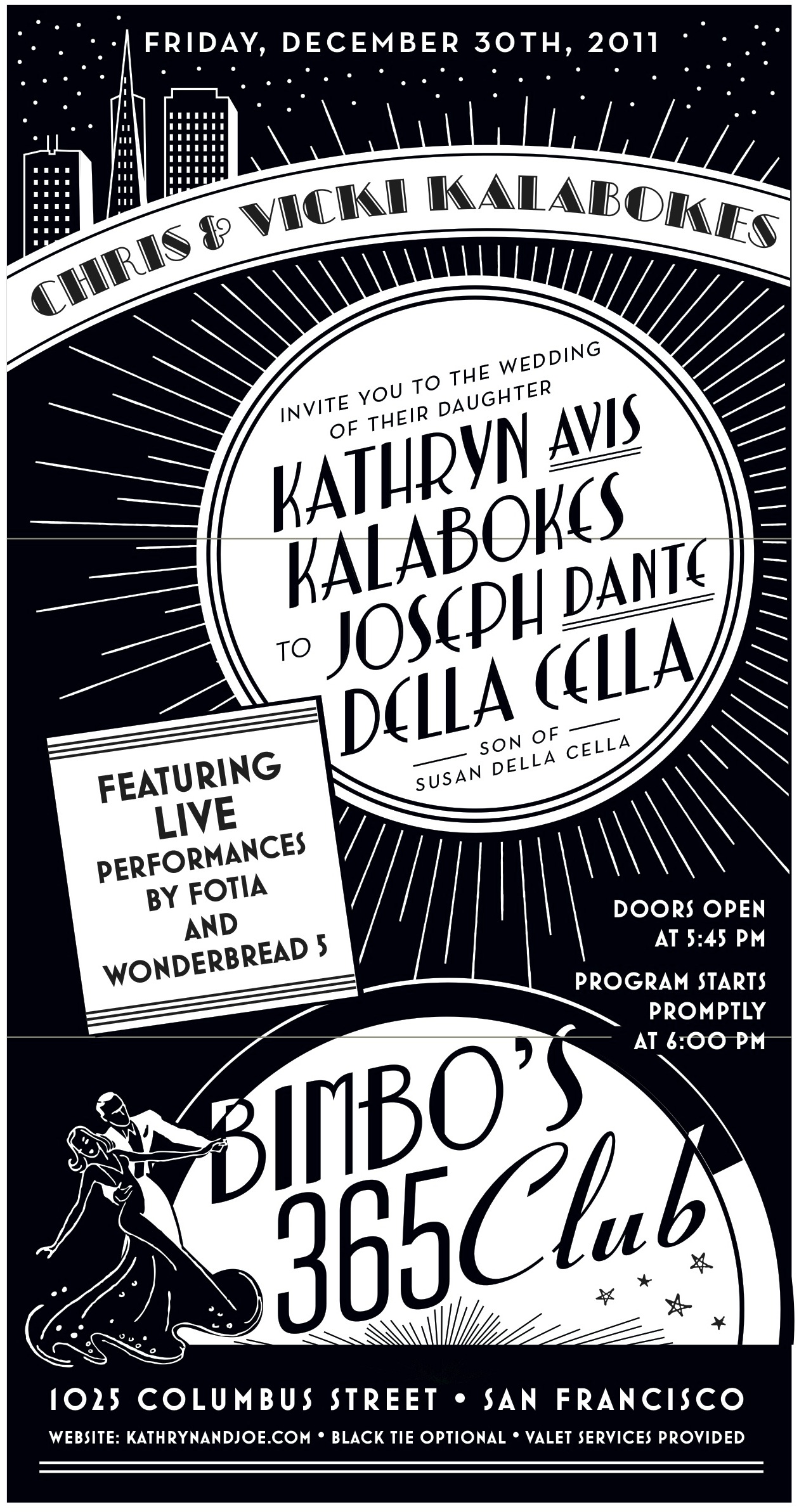
This wedding has been on our minds and in our hearts for months now, so we're thrilled to finally bring you the details of the event! Kathryn and Joe's glamorous San Francisco wedding has to be one of the most classic weddings we've seen yet. (Check it out on Martha Stewart Weddings!) Set in the heart of the city at the art deco designed venue Bimbo's 365 Club, this wedding was definitely not short on style. Kathryn is the founder and creative director of Dream a Little Dream Events, so without question, her wedding would be a show stopper. We love the classy details she and Joe chose - from all white flowers to fur shawls donned by her and the bridal party. And check out that sparkling backdrop for the ceremony!

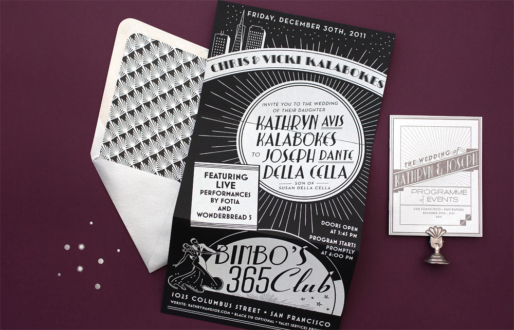
Eunice worked her magic on the wedding stationery, which included the invitation suite, table numbers, programs, menus, matchbook favors - the list goes on!  Kathryn and Joe had always enjoyed live music at Bimbo's so a New Year's Eve blowout was a no-brainer for them and creating a design to flatter such a classic San Francisco landmark was a dream come true for us.  The art deco themed invitation suite took cues from vintage concert posters and album covers with a clean black, white and silver color palette.  We called on a neighbor silk screen shop to help out with the impressive tri-fold invitation and the ever-amazing Michele Papineau added the final flourish with calligraphy addresses.

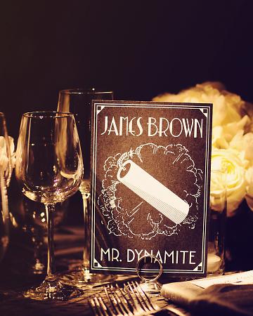
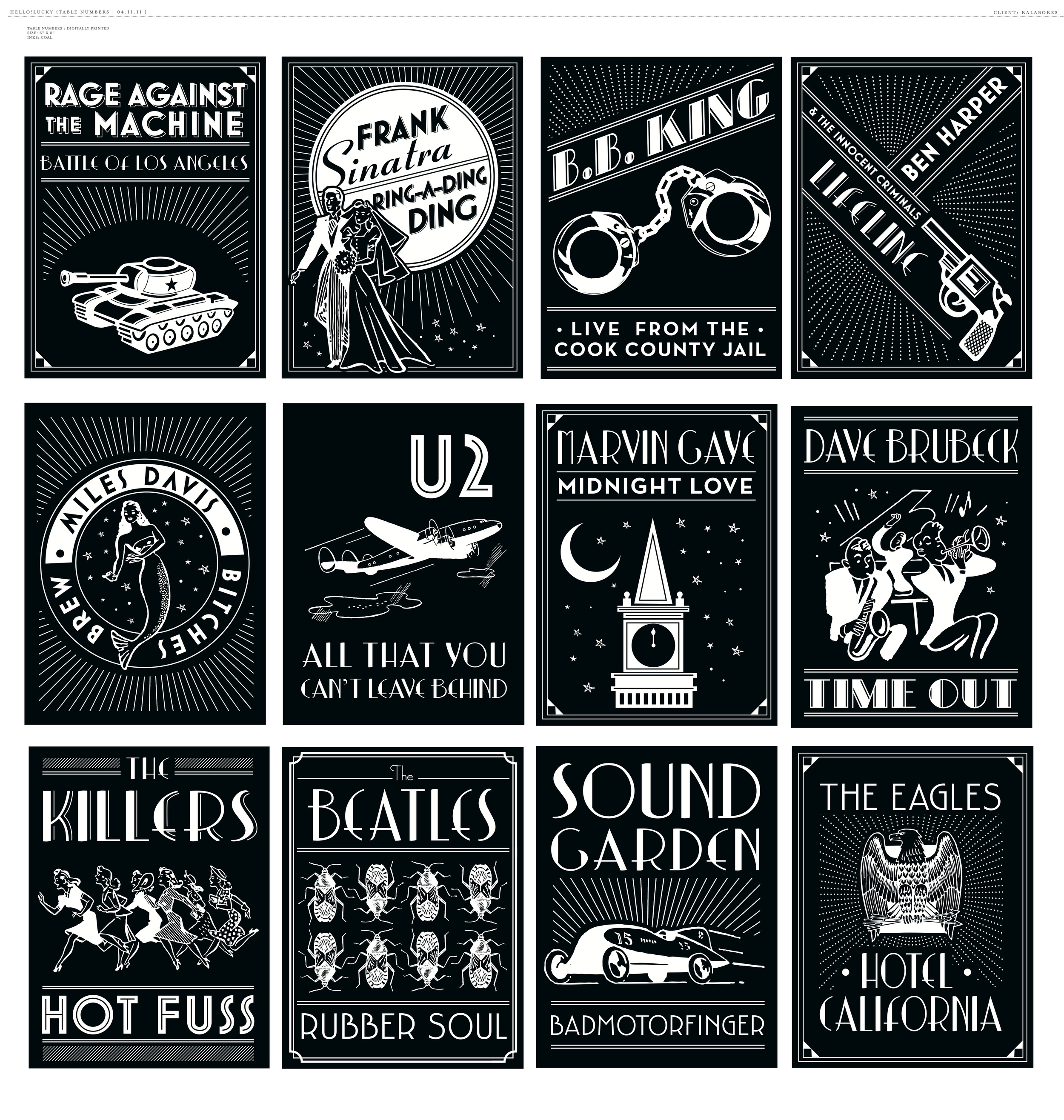
Since Kathryn and Joe are avid music lovers, it was only fitting to create table signs with names of their favorite albums.  This was no ordinary wedding of course, so we created unique artwork for every album.. that's forty-one tables!  The couple had such fun coming up with names that they ended up keeping the cards and framing them as artwork in their home!

One photo doesn't do it justice so below are a few of our working files.  Eunice really knocked it out of the park with this one, now we all want copies!

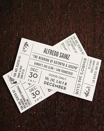
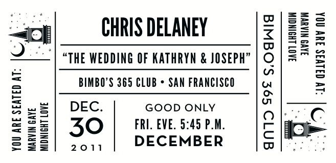
In keeping with the music theme, the escort cards were custom designed to resemble concert tickets with each guests name printed along with their table assignment and corresponding illustrations.

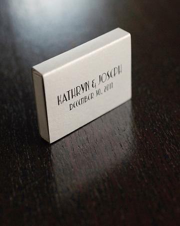
A classic takeaway from a music venue, each guest left with custom matchboxes as favors.

Congratulations Kathryn and Joe and cheers to a new year and a new life together! View more photos here.

Wedding photography by Kate Harrison Photography

How to Assemble your Wedding Invitations Video

How to Assemble Your Wedding Invitations from Hello!Lucky on Vimeo.

And now for a feature presentation! We're over the moon about this next installment of DIY videos and the first to debut is "How to Assemble Your Wedding Invitations." This short film gives detailed instructions about how to put your paper materials together tastefully and efficiently. You'll know just what to do once you receive your pretty blue boxes in the mail. Check out all of our feature films on Vimeo and stay tuned for more DIY to come!

Store Feature: Urbanic

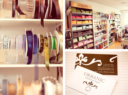
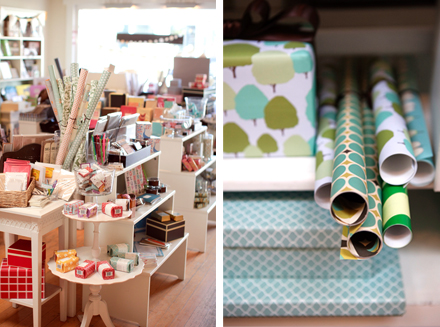
Some of the most significant members of the Hello!Lucky family tree are our trusty wholesale carriers. Though many of these vendors live far far away, we still think of them as close friends. We’re delighted to begin a regular blog feature in which we visit the amazing spaces that carry our greeting cards and gifts. These stores make the H!L name shine and so we're excited to give you a deeper look into their lovely boutiques and indy shops. Today we're visiting Urbanic, a sweet paper boutique in Los Angeles started 5 years ago by adorable husband and wife team Audrey Tantaros and Joshua Woollen.

Can you tell us a little bit about the neighborhood where Urbanic is located? Urbanic is located on Abbot Kinney Blvd in the Venice area of Los Angeles. Our street is full of hip, eclectic shops and restaurants in the local neighborhood of Venice (not the touristy part). Abbot Kinney is a creative shopping strip and bursting with good food, style, and design. An absolute must see destination when visiting Los Angeles!

What inspired you to open Urbanic? I've had a love of all things paper for as long as I can remember. My husband and I shared a long distance relationship across the country when we first met through letter writing, so the sentiment of a written letter will always be important to us. Once engaged and on the hunt for invitations we realized how difficult it was to find options that were unique and a reflection of who we were.  All of this combined with a dream of becoming a boutique owner gave me an A-HA moment to open Urbanic.

How long have you been carrying Hello!Lucky cards? Since we opened 5 years ago! H!L was one of our very first lines at the shop and have been with us ever since.

Do you have a favorite or best selling card from us? Quite honestly, our customers love all of what we choose from Hello!Lucky. Different seasons bring on different favorites. I usually try keep "birthday girl" in stock because she is part of what drew me into the line originally, and of course the sock monkey is always a hit. Lately the seagulls and L.A postcard greetings have been some of our best sellers.

From what's selling well  right now what do you think is the next big paper or wedding trend? Pops of interest and unexpected color (ie. edge painting, backing patterns, printed center wraps, neon). Handwriting fonts - be them casual or script, people are loving fonts that have character and they've never seen before. Novelty Reception Pieces - drink flags, coasters, and signage of every sort!

Anything else? We're thrilled to be the first boutique featured on the HL blog!

Thanks Urbanic for all your beautiful work! If you live in the Los Angeles area, go say hello! The shop is located at 1644 Abbot Kinney Boulevard, Venice, California 90291

On Press: Midsummer


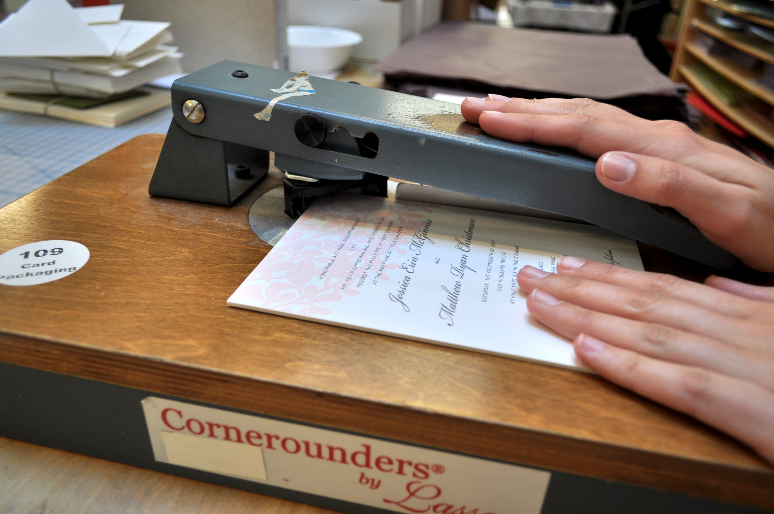
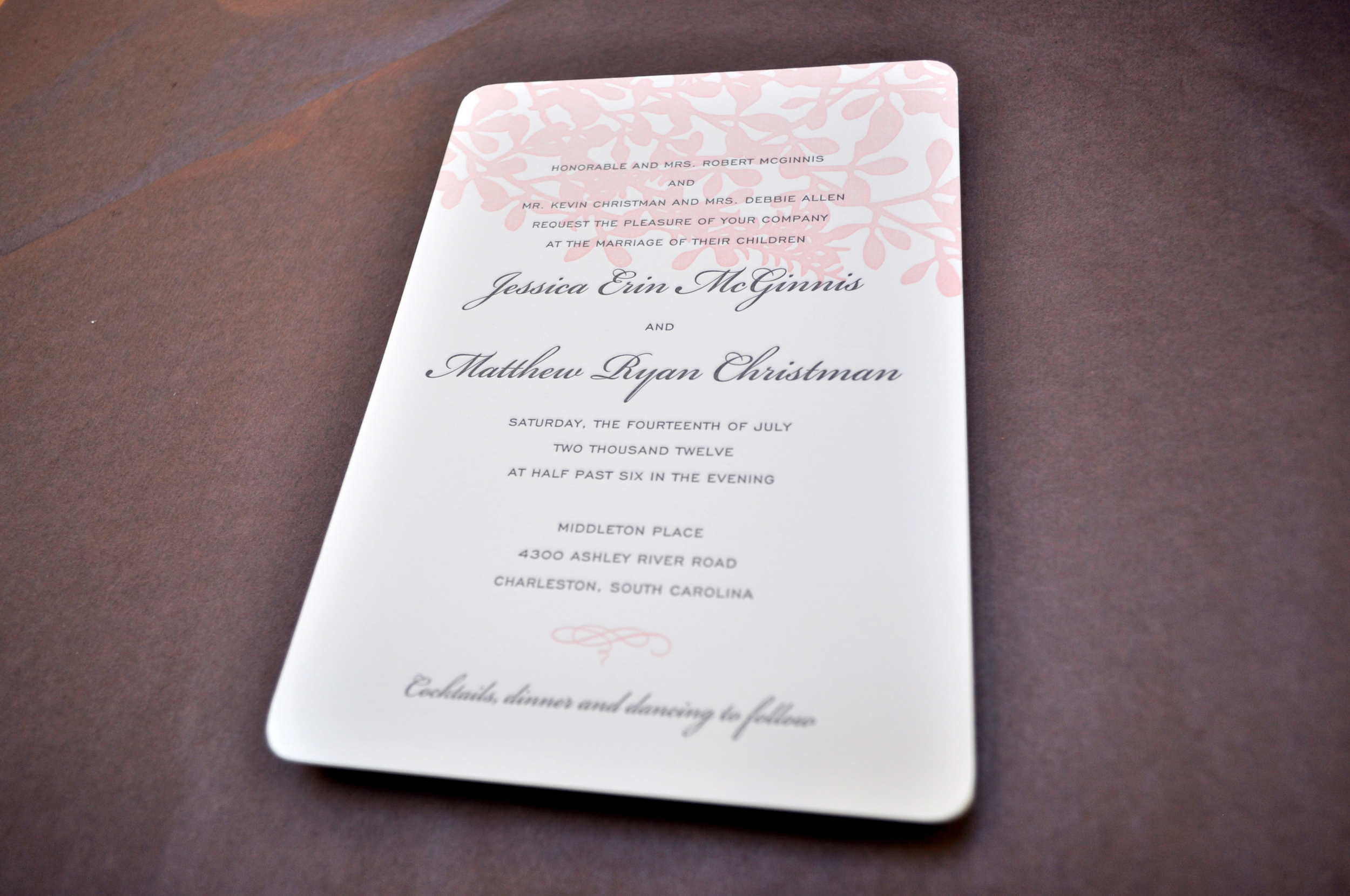
This week On Press is the two-color Midsummer wedding invitation design on white duplex paper with rounded corners (yes, we offer corner rounding!).

After their first color run, the invitations on the feed table are ready for their second color.

The invite rests securely in the guides to be pressed into the polymer plate.

 ...on the delivery table after the second color run.

Look at the beautiful impression! Duplex paper (220lb) is double the thickness of our standard 110lb paper and leaves a much deeper impression. We do offer duplex paper for all letterpress invitations for an extra cost, just be sure to ask!

 Anna meticulously rounds each corner.

 And here is the finished product! If you are interested in corner rounding or duplex paper for your invitations, just give us a call at (415) 355-0008, we'd love to hear from you!


Eunice's Pinterest Picks - Art Deco Glamour

Art Deco Glamour

 We've just added our Marquee wedding invitation to our website, an invitation I designed for a fabulous Art Deco inspired wine country wedding, so this week I've been daydreaming about a glamorous 20's era wedding. Darkly romantic florals from Saipua and these gorgeous sparkly shoes (Kallima Photography). I love the drape and details on this Temperley London Jean Dress and this whimsical shooting star headpiece from Rodarte. St. Germain favors with perfect labels from this amazing speakeasy inspired wedding, crystal and chiffon headband by our dear friend Jennifer Behr (who designed my wedding headpiece!). This simple golden cake (via StyleMePretty) is just stunning and Chie Mihara's Stratosphere Mary Janes via BHLDN are both elegant and witty. Art Deco perfection in Coralie Bickford-Smith's foil stamped cover design for the Great Gatsby and of course one must have a bass and banjo player ( The Two Man Gentleman Band ) and a perfect bridesmaid's dress from BHLDN...See my entire Marquee Inspiration Board here!

Lucky Friday # 53, Thinking of You

Hello all you lucky folks out there! This is the 53rd edition of our Lucky Friday Giveaway.  Each Friday we feature one of our letterpress greeting cards. We’ll choose THREE LUCKY WINNERS to get a free card.  Post a comment by 12 p.m. PST the following Thursday, and we’ll announce the winners on the following Friday!

The three winners from last week are (drum roll, please): Luke Stanton, Irma M and Robin! We’ll contact you next week to arrange sending your Just Married card.

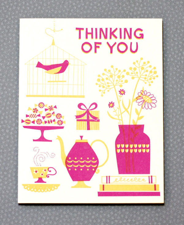
Design: Thinking of You Artist: Eunice Moyle Inspiration: We just got to thinkin'. We thought it was a nice notion to think about thinkin'. And thinkin' of someone hard enough to be inspired to send a card is a rare, beautiful thing. Who to send it to: Someone you forgot to remember to forget, someone who's on your mind all the time, or just an old friend, relative or loved one you want to drop a line. Ideas we scrapped in favor of this one:  "Hare's Looking at You, Kid" with a Humphrey Bogart-ish hare regarding a baby goat— wasn't sure where that one was going. Favorite detail: Love how the flower stems show through the translucent fuchsia vase. Why letterpress? How better to stay in touch than with something so tangible?

Don’t forget to post your comment and tune in next week, same time, different stationery, to see if you’ve won!

Evolution of a Design: Seagulls

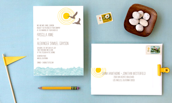
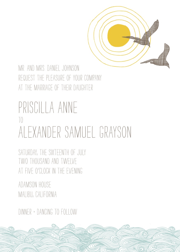
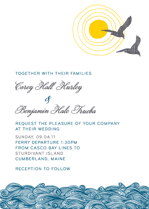
One of the joys of working in a design studio is getting to see our ideas come to life on paper. Seagulls has been a favorite invitation for quite some time, but it's the little changes that makes this design unique. It fits perfectly with outdoor beach weddings and oceanside events, and with a personal touch, it's great for any event.

The soft pool and stone colorway creates a casual vibe, but customizing the fonts and ink colors can really make a bold statement.

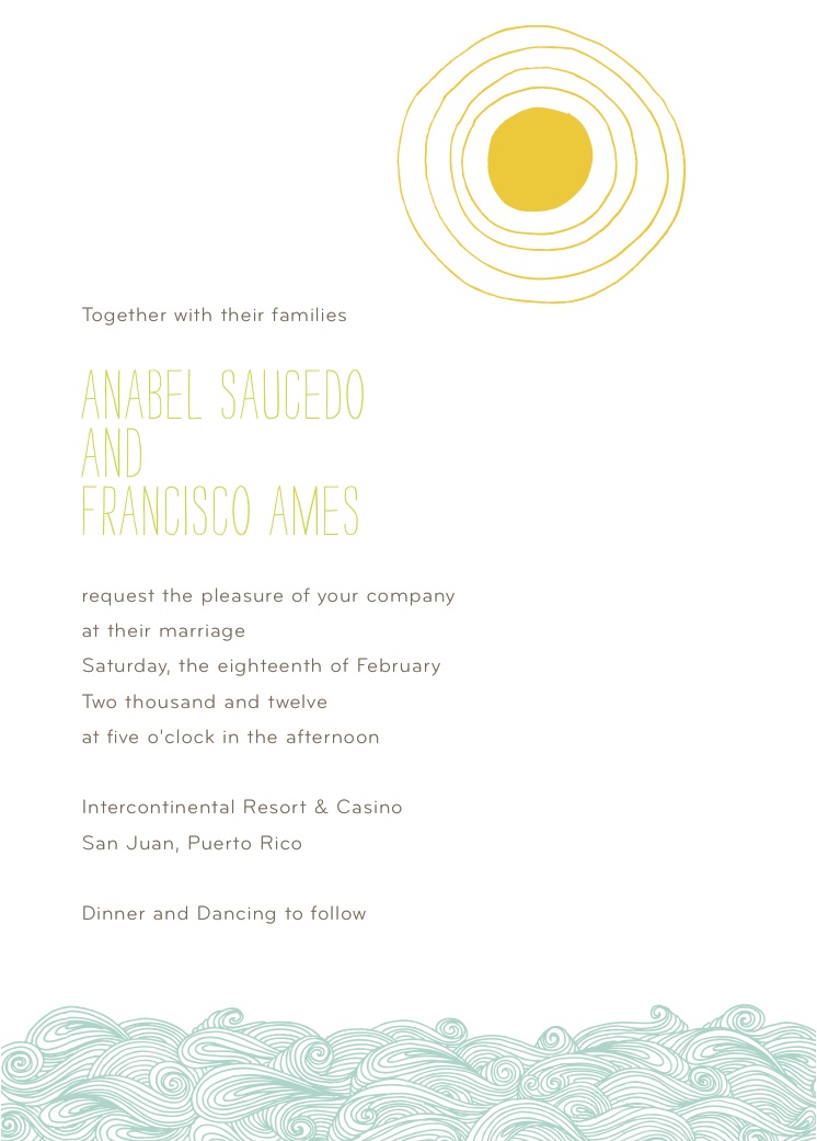
And simply removing an icon makes for a fresh, clean composition.

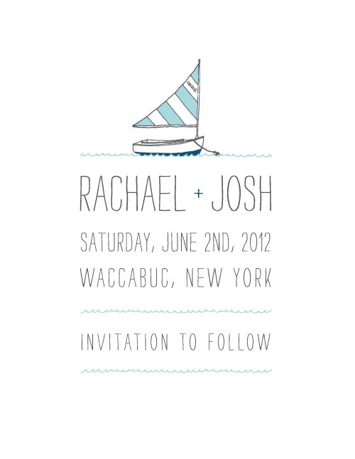
This save the date was inspired by the original design, but simplified to match the couples' nautical New York wedding.

Fly fishermen Erin and Joseph wanted to incorporate icons that represented their favorite hobby, so the fish were the perfect fix.

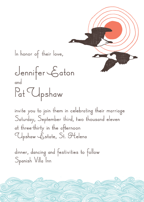
And as the seasons change, this early autumn invitation designed for Jennifer and Pat offers a more comfortable style. If you like any of the designs you see here, just give us a call and we can give you more ordering information!

Check our our evolution of Heartland and Big Day!

Wedding DIY: Cupcake Liner Pom-Poms

These pretty patterned cupcake liner pom-poms featured in our book Handmade Weddings (published by Chronicle Books) are perfect for a wedding celebration or casual party at home. Just a bit of glue and string will transform your ordinary cupcake liners into festive pom-pom strands. Mix and match colors and patterns to compliment your party palette and your decor will be a huge hit. Hang them in your living room, over your reception tables, or in your cocktail area for instant DIY delight!

Materials

Makes six 12-foot strands

• 720 cupcake liners, approximately 120 per strand

• Six 12-foot lengths white kitchen string

Tools

• Bone folder (or popsicle sticks work, too!)

• Rubber bands (optional)

• Glue sticks

• Clear tape

How to

1. Flatten and fold your cupcake liners. Using a bone folder, flatten each cupcake liner into a circle. Fold in half, wrong-side out. Repeat for all of your liners. You will need 10 identical liners per pom-pom. If you are using a variety of patterns and colors, stack or rubber band them by pattern. If your cupcake liners have scalloped edges, be sure to fold them along the same axis every time. This will ensure that the segments that make up each pom-pom are all symmetrical, making for a pleasing whole.

2. Make the pom-poms. Place 10 folded cupcake liners, of the same pattern and color, on your work surface. Using a glue stick, spread glue over one-half of a cupcake liner. Align it to the corresponding half of a second cupcake liner. Press down and smooth with your bone folder (figure 1, page 29). Let dry. Continue attaching the cupcake liner halves, smoothing each segment as you go to ensure a secure bond. Do not glue the last segment. When complete, the pom-pom will form an accordion-like sphere with one open segment, which allows you to flatten the pom-pom into a circle (figure 2). Let dry completely. Continue making pom-poms.

3. Attach the pom-poms to the string. Leaving about 2 feet on either end of the garland for hanging, attach the pom-poms along the string, at 2-inch intervals (or greater if desired). To attach, lay a flattened pom-pom on your work surface and align the string along its central axis (i.e., along the crease). Secure the string with two small pieces of clear tape, one on each end of the pom-pom. Spread glue over one half of the circle, as well as on the string, and sandwich the two halves of the open segment together, trapping the string (figure 3). Let dry. When all the pom-poms are attached and dry, hang the garland. “Fluff” the pom-pom segments by hand to create full circles.

Get your own copy of Handmade Weddings here. Happy crafting!

New Wedding Invitations!

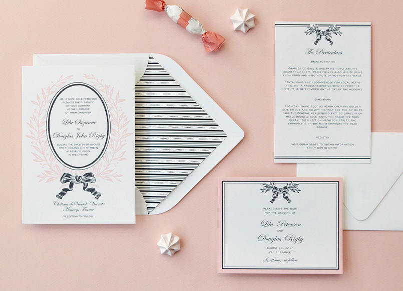
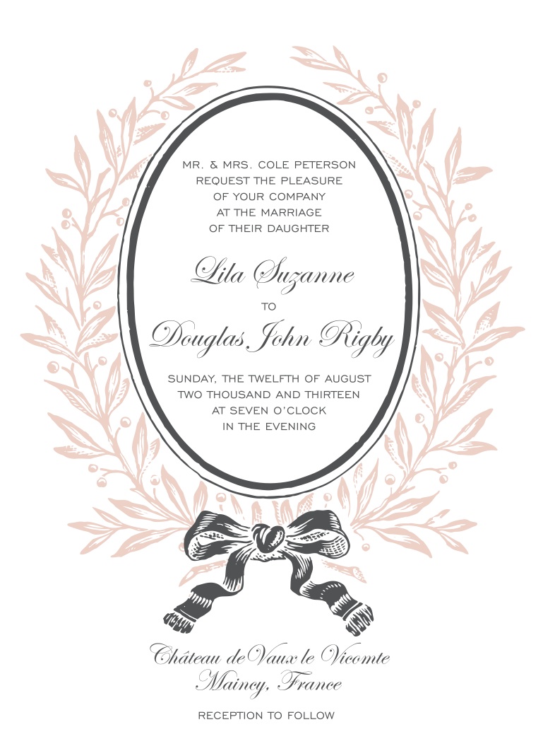
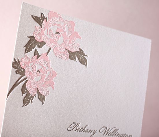
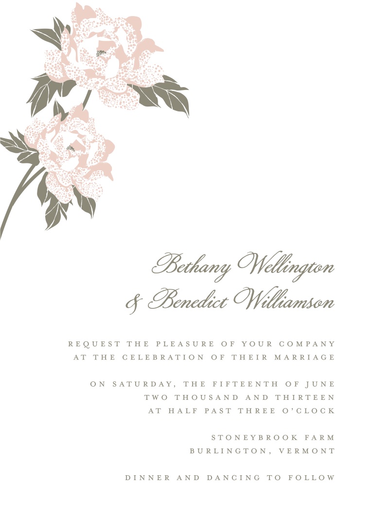
C'est magnifique! More new wedding invitation designs have arrived! Last week we revealed our new modern and classic wedding designs, and today we're excited to share our new delicate floral suites. We are certain you'll fall in love with French Bow, inspired by darling French patisseries and delicate details.

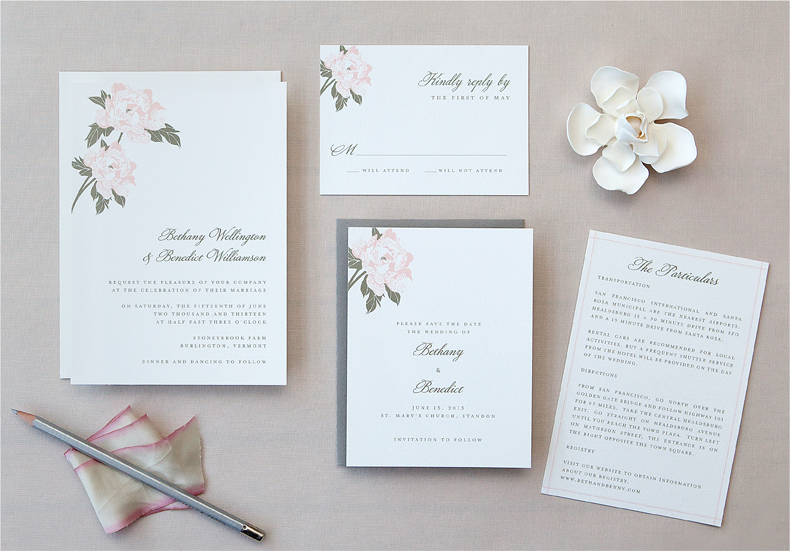
Romantic Garden has similar qualities, offering a simpler yet elegant composition. And we must say, these designs look très jolie letterpress printed!

Photos by Edyta Szyszlo

Gorgeous Paper Wedding Details

This paper wall decor spotted on Green Wedding Shoes stopped us dead in our tracks. We definitely have a sweet spot for paper wedding details, but this bride's DIY wall art just topped the charts! Inspired by the always extraordinary Anthropologie window displays, this bride used tons of rolled paper strips to create an enormous abstract backdrop for her reception. Stunning!


Lucky Friday # 52, Esther Aarts, Just Married

Hello all you lucky folks out there! This is the 52nd edition of our Lucky Friday Giveaway.  Each Friday we feature one of our letterpress greeting cards. We’ll choose THREE LUCKY WINNERS to get a free card.  Post a comment by 12 p.m. PST the following Thursday, and we’ll announce the winners on the following Friday!
The three winners from last week are (drum roll, please): Naomi A, Laura H and Matthew Duerksen! We’ll contact you next week to arrange sending your Nuts for You card.
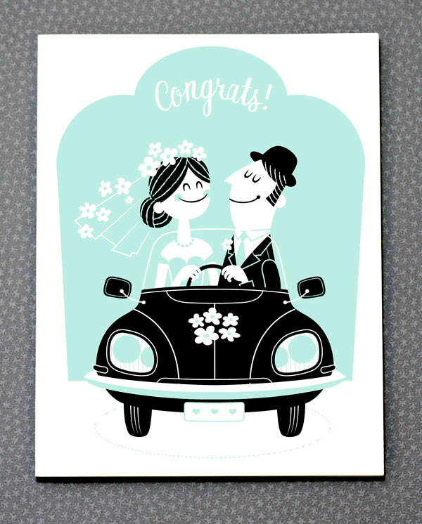
Design: Just Married Artist: Esther Aarts Inspiration: A euro-retro-boho moment of brilliance! Who to send it to: Any adorable young couple, of course... Ideas we scrapped in favor of this one: Esther thought the Hummer didn't quite fit. Favorite detail: We love how they're both steering! Why letterpress? Only the best for the newlyweds!

Don’t forget to post your comment and tune in next week, same time, different stationery, to see if you’ve won!

New Wedding Designs: Visit Series

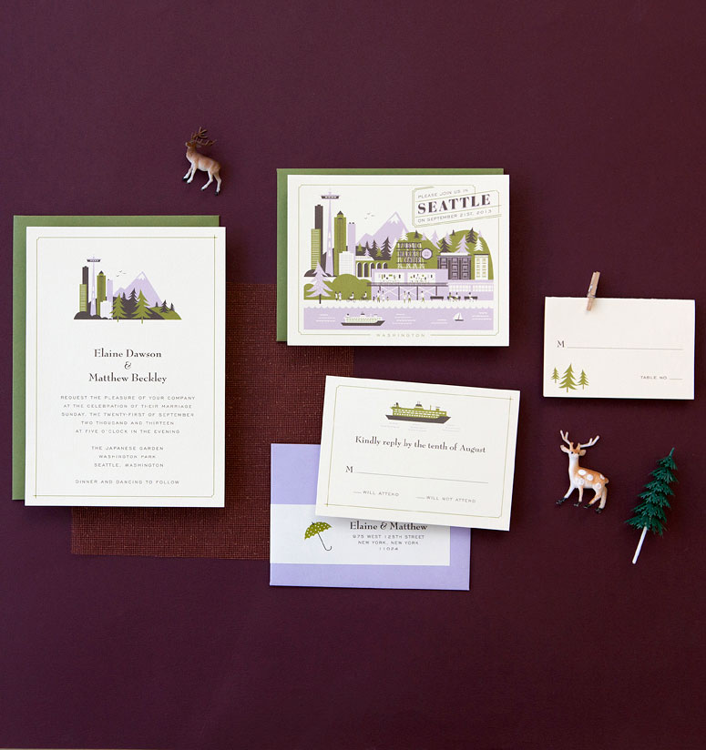
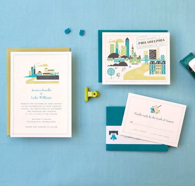
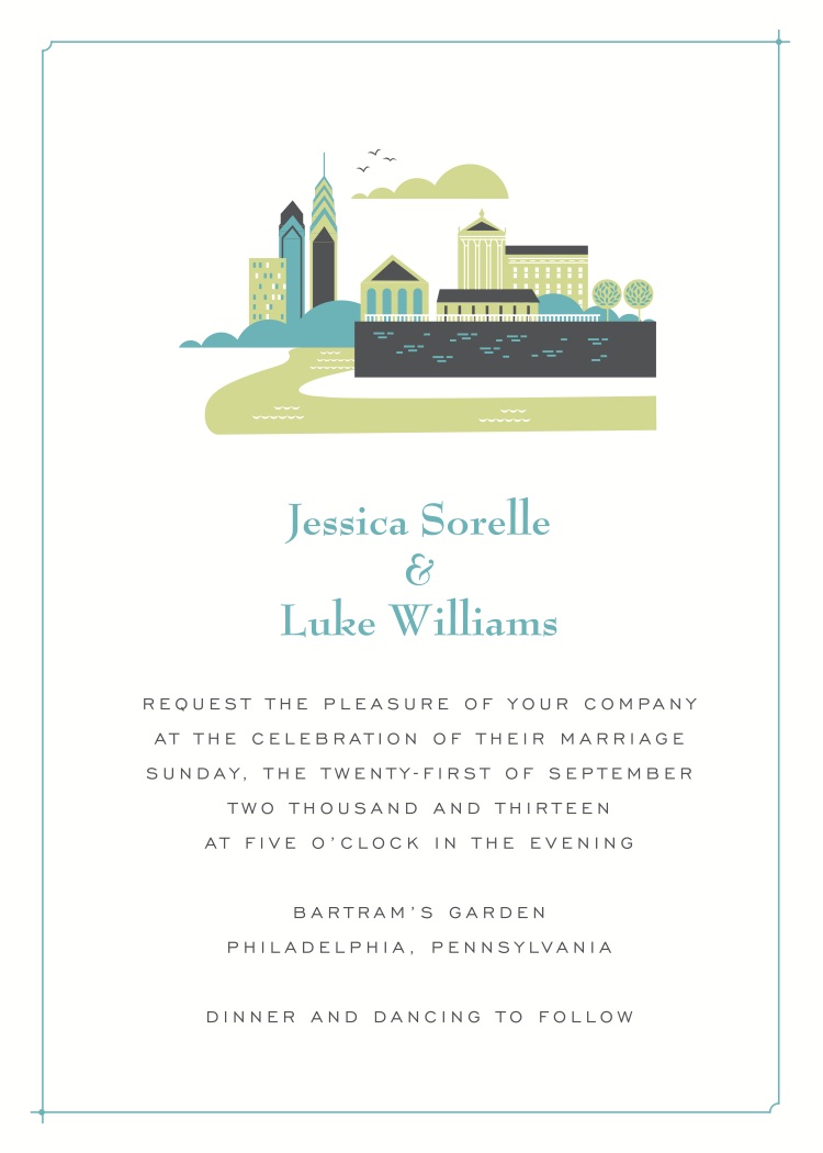
We know you've all been anxiously awaiting new destination wedding invitations by Lab Partners exclusively for Hello!Lucky, well wait no longer! We're proudly introducing four new American destinations to the collection: Martha's Vineyard, Seattle, Philadelphia, and Washington D.C.! Each design delicately captures the characteristics of its location, and the iconic features they have to offer. The nautical charm of Martha's Vineyard shines through in this suite. We're especially loving the map-like layout of the double-sided save the date. Having so many boutique towns in that area, this design fits all types.

Our west coast brides will be at ease with the new Visit Seattle invitation. Mount Rainier looks down upon the pacific oceanfront and among all the shoppers of Pike Place Market. Seattle's rainy reputation doesn't hold us back, cause we are loving the wooded wonderland of the Pacific Northwest.

Bells will be ringing in Philadelphia, the Liberty Bell that is! Our Visit Philadelphia suite is packed with iconic landmarks and monuments. Placed among the beautiful Delaware River, this invitation has all the perfect elements.

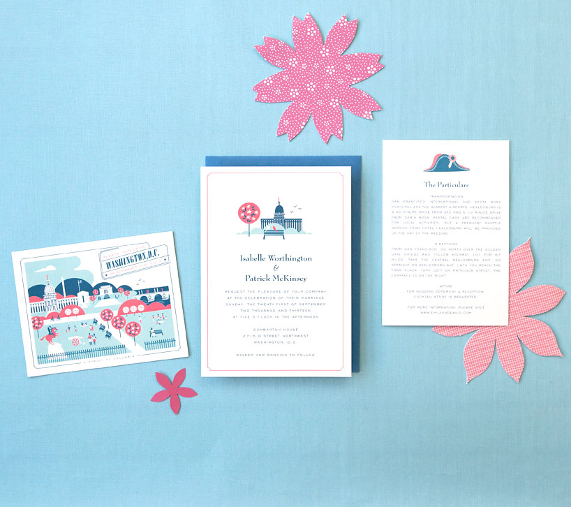
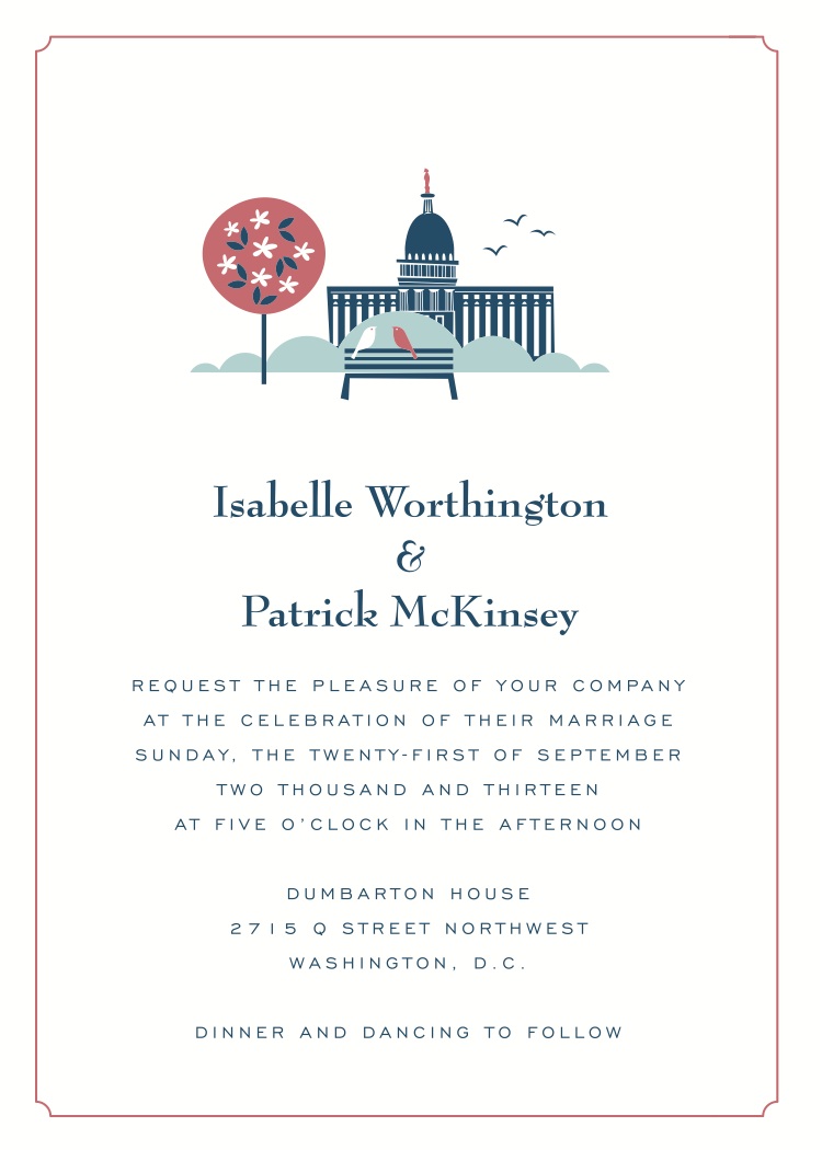
And finally, our nations capital Washington D.C. looking sharp among the classic cherry blossoms and historical architecture. This invitation has local love birds sitting pretty.

Many many thanks to Lab Partners for these fantastic new collections!

Photos by Edyta Szyszlo