Lucky Friday # 58, Tea Time: Mother's Day

Hello all you lucky folks out there! This is the 58th edition of our Lucky Friday Giveaway.  Each Friday we feature one of our letterpress greeting cards. We’ll choose THREE LUCKY WINNERS to get a free card.  Post a comment by 12 p.m. PST the following Thursday, and we’ll announce the winners on the following Friday!

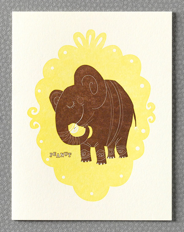
The three winners from last week are (drum roll, please): Katie J, Katie & Jessica@TWB! We’ll contact you next week to arrange sending your Peanut card. Design: Tea Time Artist: Esther Aarts Inspiration: The scent of bergamot on an Earl Grey kind-of-a day made us miss Mum's tea and her marvelous marmalade! Who to send it to: Well, whom else? All moms in flesh or spirit deserve a day's recognition. Ideas we scrapped in favor of this one:  The diapers idea was dear, but a little too funky/retro, and the Milk and Honey card made the men squirm. Favorite detail: Love how the teabag tag is personalized. Hrmm, that's a great idea, actually... Why letterpress? Make mom proud that she raised you to have such impeccable taste!

Don’t forget to post your comment and tune in next week, same time, different stationery, to see if you’ve won!

On Press: Dinosaurs--Paper Cutter.

Here is the next installment in the series of videos on the production of our “Dinosaurs” birthday card designed by Julia Rothman. Max is now cutting down large parent sheets into smaller sheets to be printed on.

On Press: Dinosaurs--Paper Cutter from Hello!Lucky on Vimeo.

Pikku

When we spotted these silk screened cotton ribbons by Pikku on Parcel Post we stopped right in our tracks. Pikku has an entire collection of pillows, office accessories, ribbons, and wrapping paper! What a perfect coincidence it is that our custom birth announcements by Pikku go hand in hand with these accessories. We personalized our Mums birth announcement to match their lemony color scheme, and it's truly a match made from heaven.

Check out the entire Pikku shop here, and our Pikku birth announcements here!

The Every Girl

Eunice and Sabrina are featured in The Every Girl today! It's such a sweet review and we're delighted to be a part of their collection. The Every Girl is an online resource for the working woman and offers inspiration for a life well lived. With a lovely assortment of topics from finance to health, there's something in there for everyone. And we can definitely relate to their manifesto:

Whether she is searching for her dream job or a new city to call home; is saving up for a down payment or a trip to Europe; is learning to cook or speak another language, she wants a little guidance. She wants to be inspired.

Check out the slideshow here! Thanks The Every Girl!

Photos by Edyta Szyszlo

New Jacqui Lee Wedding Invitations

Hold on to your hats! The brand new Jacqui Lee collection has completely blown us away. The four invitation suites each have their own magical theme, but all have one thing in common - they were hand illustrated by the insanely talented Jacqui Lee. It's easy to see how much time and consideration was given to these mini artworks, all suitable for their own frame. These designs are now available just in time for spring, and just in time for your wedding stationery needs. Flora and Fauna (above and below) includes all the tiny elements of spring that we adore. And with Jacqui's charming critters and characters making appearances, they are perfect for an outdoor celebration.

Classic Parisian delight inspired this French Bicycle suite. With dreams of strolling the cobblestone streets and picking up a fresh bunch of flowers at the local market, this design is c'est magnifique.

It's time to channel your inner princess! Happily Ever After is exactly how you'll be living after a wedding inspired by this fairytale suite.

And Adventure sets the tone for a lifetime of romance and thrill. We love the evening enchantment of this suite, which would suit a celebration under the stars just magically.

Meet Jacqui Lee. Currently living and working in Vancouver, BC, her painterly style shines among a growing world of graphic design. Her holiday cards last year were such a hit, we honestly couldn't wait to collaborate for a wedding collection. Jacqui give us some insider information about her process:

1. What was your inspiration for this collection?

A lot of my inspiration came from imagery I associate with spring. I was working on this in the middle of a rainy and gloomy winter, so it seemed natural that all the ideas I was sketching down were bright and fun.

2. Did you like designing for a wedding collection?

Yes! I think there is so much opportunity to get really creative when designing for weddings. I've been seeing a lot of really great wedding work lately, so it was a ton of fun to try my hand at it. I was really trying to get into different niche personalities for each suite, and I hope that people can really connect with them.

3. What usually inspires your illustrations?

I'm always very inspired by the work of mid-century designers and illustrators.

4. If you had to pick one which suite would you chose?

Honestly, it's a tough choice. I worked on all of the suites simultaneously so they sort of grew off one another, yet there are separate elements in each that I really like. However, my initial starting point for the whole collection was the Foliage design, so I would have to say it's closest to me.

5. You illustrate so many adorable animals, is there anything behind that? Which is your favorite to illustrate?

That's funny because I never considered myself an illustrator who especially enjoyed drawing animals until they started showing up everywhere in my work. I decided to just embrace it, and then it became very natural for me to start using animals as different personalities. As of yet, I don't think I have a favourite...but bears have been popping up a lot in my work lately.

Check out the entire Jacqui Lee collection right here!

Employee Spotlight: Anna H.

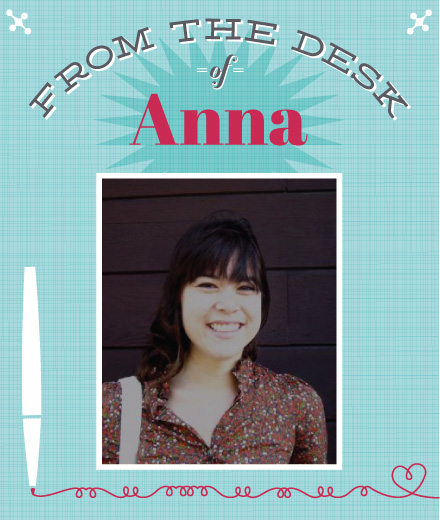
Continuing along with our employee spotlight series, this week we put our talented designer Anna Hurley in the hot seat. Anna has graced the Hello!Lucky studio for four years now, and her cheerful demeanor and witty jokes continue to keep us smiling. Anna reveals below that there are many talented bakers and chefs in our studio, but the truth is, she takes the cake for most talented when it comes to baked goods.

My role at Hello!Lucky is.... 
design ninja.
I can't get through the day without.... 
coffee and music.

My ideal weekend activities include.... 
lolling about, reading, riding my bike.

My favorite Hello!Lucky design is...... 
Marquee is a new one that just came out and it's lovely. Especially the save the date card.

I prefer to listen to a lot of classic rock really loudly while designing. 

Secret insider info you might not know about Hello!Lucky..... 
Everyone working here is an amazing chef/baker—I never ever pass up a dinner party invite. 

Lucky Friday # 57, Peanut Baby Congratulations

Hello all you lucky folks out there! This is the 57th edition of our Lucky Friday Giveaway.  Each Friday we feature one of our letterpress greeting cards. We’ll choose THREE LUCKY WINNERS to get a free card.  Post a comment by 12 p.m. PST the following Thursday, and we’ll announce the winners on the following Friday!

The three winners from last week are (drum roll, please): CZ, Jana and Margaret! We’ll contact you next week to arrange sending your Inchworms card. Design: Peanut Artist: Eunice Moyle Inspiration: A certain little swaddled sweet pea. Who to send it to: A proud pachyderm parent of a precious little peanut. Works great for non-elephant expectant parents, too. Ideas we scrapped in favor of this one: We thought of a mouse cradling a little cheese baby, titled "Curd." Didn't have the same... je ne sais quoi. Favorite detail: Just noticed the tip of the elephant's trunk is heart-shaped. Why letterpress? Elephants, like letterpress, make a strong impression.

Don’t forget to post your comment and tune in next week, same time, different stationery, to see if you’ve won!

Real Wedding: Katie & Justin

Think pink! We were thrilled to be part of Katie & Justin's wedding, featured today on Green Wedding Shoes. We had so much fun designing this custom suite, which included a few of our current obsessions - neon and edging. We worked with the couple's navy and fuchsia palate to create a modern yet elegant design (calligraphy by Michele Papineau).

The couple selected the Majestic Halls, located in the heart of downtown Los Angeles. Built in 1921 as the former Los Angeles Bank of America, the building retains many of its original historic and ornate details. Katie and Justin fell in love with these architectural elements that made the space feel unique to downtown Los Angeles.

Aren't the flowers stunning? Katie and Justin wanted a pink ombre effect and The Little Branch executed their vision perfectly. Each table had various distressed bronze buckets filled with fuchsia, pink or blush flowers. The bride’s bouquet was comprised of a variety of deep pink flowers, including roses, and tied with a navy ribbon.

Katie's dress was Halston Heritage, her shoes were RED Valentino and her stole was vintage, purchased from a local flea market. Justin's suit was from Hugo Boss.

The ring pillow was made by Katie's mom using our how to guide! We love the addition of the pom pom border.

In addition to the invitation suite, we also created matching day of materials: menus, place cards, table numbers and programs.

Congratulations Katie and Justin! To see more of this gorgeous wedding, please click here.

All photos by Erin Hearts Court. Wedding coordination by Kristeen LeBrot.

New from Lab Partners

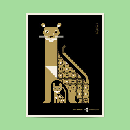
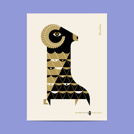
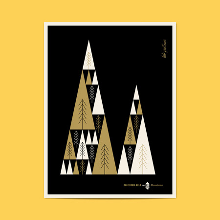
Can you say "Me-ow?" This new collection of silkscreened prints by the Lab Partners is majorly tantalizing. The series (printed in the USA!) features the many natural wonders of California. The best part? 5% of all sales are donated to the California Nature Conservancy. We love that they are contributing to a good cause, and can definitely picture these sleek black/gold printed pieces making a statement at home or in the office. Check out the entire shop here!

On Press: Dinosaurs--Polymer Plates

This is the first in a series of videos on the production of our "Dinosaurs" birthday card designed by Julia Rothman. Here Max demonstrates the polymer plate making process.

To create the plates, we first start with a film that has a clear image area and an opaque non-image area. We place this film on top of the polymer plate that has a layer of photo sensitive emulsion and expose it to UV light. The light that shines through the clear image area of the film hardens the light sensitive emulsion. Then we scrub the unexposed soft emulsion away, leaving a raised relief plate. After rinsing the plate and putting it on a heating tray to dry, we expose the plate to light again for added strength. Lastly, we apply an adhesive backing to attach the polymer plate to a boxcar base.

Stay tuned next week for the next step in creating this letterpress Dinosaur greeting card.

Store Feature: Modern Mouse

This week we’re continuing with our vendor feature series and highlighting the lovely indie shop Modern Mouse. Opened in 2009 and tucked away in an open-air shopping center in Alameda, California, this sweet boutique offers loads of handcrafted goods. We asked owner Eleen Hsu some questions about how this unique shop got its start and what makes it so special.

What inspired you to open Modern Mouse? In mid-2009, I heard about a business plan competition offering the grand prize of a 1-year lease on a retail space at a local shopping center. I'd grown up crafting and loved the world of DIY/handmade, was running a tiny little business on Etsy selling handmade bags and dreamed of having my own brick-and-mortar shop, so I entered! I made it to the semi-finalists with a concept pretty close to Modern Mouse's current business model, but in the end I lost out to a learning cafe concept. A few months later, I noticed that CCA (California College of the Arts) had opened a pop-up shop in my neighborhood shopping center. Inspired, I wrote to the property manager and within 6 of the busiest weeks of my life, Modern Mouse opened its doors! We started off as a holiday pop-up shop with goods from about 50 artists, and 2 years later we've tripled our roster and thrive on being able to bring the amazing work of local and indie artists to our community.

What makes Modern Mouse so unique? One of the things that we think makes us unique is that we're such big fans of DIY that we love sharing it as much as we love selling it. Every month we host a Crafty Hour that's led by queen of crafting Polly Conway. We choose a fun craft that teaches a different skill each month, round up supplies (and of course snacks and beverages), and invite the community to join us for an enlightening evening of crafts! We also love putting a name, face, and story to the goods that our customers purchase. We display artist profile cards alongside their work, as well as feature each one on our blog. We've also started a series called "Show Your Studio" to give customers behind-the-scenes looks into where all the magic happens.

How long have you been carrying H!L cards? We started carrying Hello!Lucky cards just a few months after we opened. H!L cards are right up our alley because like most of our products, they're also locally made just across the bay in San Francisco! Not to mention that the H!L team makes it fun and super-easy to order. :]

Do you have a favorite or best selling card from us? Peeps is our best-selling H!L card! Unicorns and Lionheart are tied for second, and the Sock Monkey series are all around faves as well. My fave is the new Greetings from San Francisco card!

Can you tell us a little bit about your staff and what they are loving in the store right now? Fuzzy monster gear by Ghoulie Girls is a perennial favorite, but the plush critters by Phil Barbato have also recently snatched a special place in our hearts, along with 3 Fish Studios' "I Love California" prints. Not to mention, of course, the work of three of our very own talented staffers: Genevieve Santos of Le Petit Elefant, Polly Conway of Pollyannacowgirl and Marguerite Payne of Bella Beads!

Anything else? We're so grateful for the support of our customers, our artists, the handmade community and wonderful vendors like Hello!Lucky for making it a joy to do what we love!

Thanks Modern Mouse! If you live in the Bay Area, go say hello! The shop is located at 2228 S Shore Ctr, Ste A, Alameda, CA 94501.

Bridal Accessories by Twigs & Honey

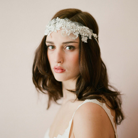
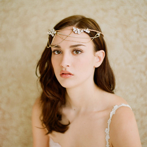
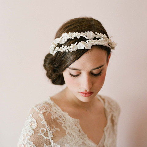
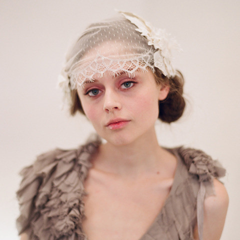
We're absolutely drooling over these bridal accessories by Twigs & Honey. We spotted their collection over on the lovely blog Honey Kennedy, and since then have been adoring everything they showcase. Their use of vintage laces and delicate silks provide the perfect mix of classic and feminine. Plus, their new 2012 collection includes beaded and rhinestone crowns, seriously stunning!

You can view all Twigs and Honey products here, enjoy!

Lucky Friday # 56, Inchworms

Hello all you lucky folks out there! This is the 56th edition of our Lucky Friday Giveaway.  Each Friday we feature one of our letterpress greeting cards. We’ll choose THREE LUCKY WINNERS to get a free card.  Post a comment by 12 p.m. PST the following Thursday, and we’ll announce the winners on the following Friday!

The three winners from last week are (drum roll, please): Grace, Jen B. and Jenna! We’ll contact you next week to arrange sending your Three Ring Circus card.

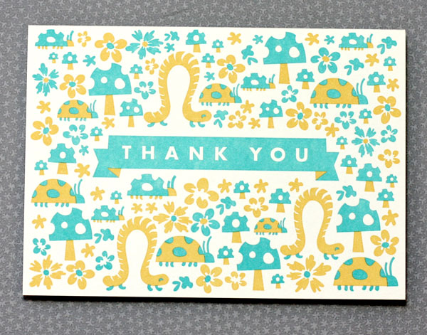
Design: Inchworms Artist: Anna Hurley Inspiration: Spring has been inching our way! Who to send it to: Someone who swoons at daylight savings, who balances eggs on the equinox, who cries when the crocuses finally arrive, who dances in the daffodils... and who shares some measure of that joy with you. Ideas we scrapped in favor of this one: The mayfly & cicada version was a little overwhelming and we made sure the mosquito Mother's Day card never made it off the ground. Favorite detail: Love how the toadstools and ladybugs shop at the same itty bitty boutique. Why letterpress? Letterpress packs the most loveliness per inch!

Don’t forget to post your comment and tune in next week, same time, different stationery, to see if you’ve won!

Today's Bride

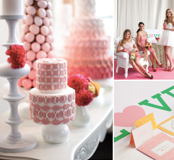
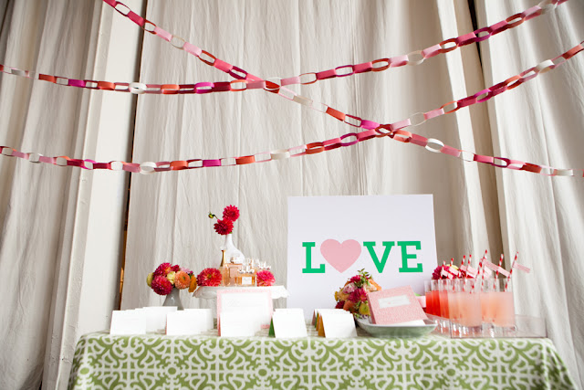
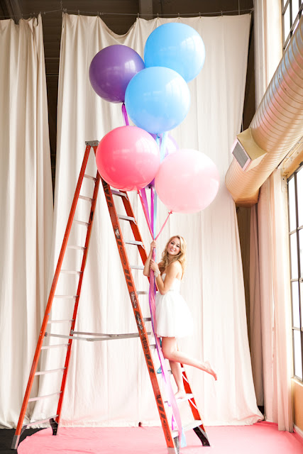
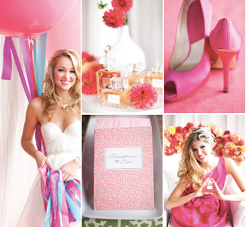
These photos from Nancy Liu Chin's Anatomy of Today's Bride for Today's Bride SF are to die for! We were approached by Nancy awhile ago in efforts to come up with a classic and whimsical invitation and day-of paper suite for her ultra-sweet photo shoot. It was a piece of cake once she shared her inspiration with us, and knowing which amazing vendors were also on board, we knew it would be a hit.

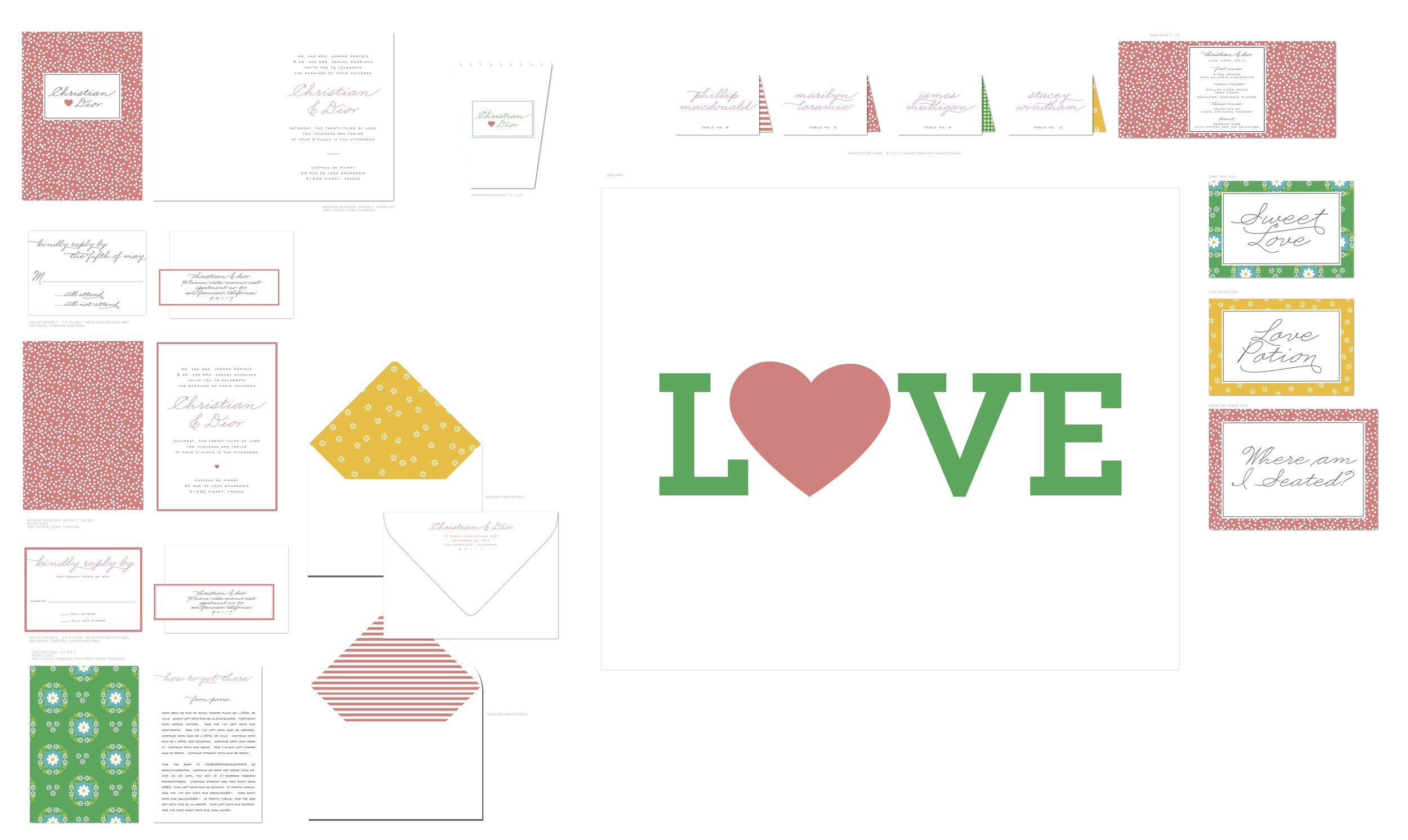
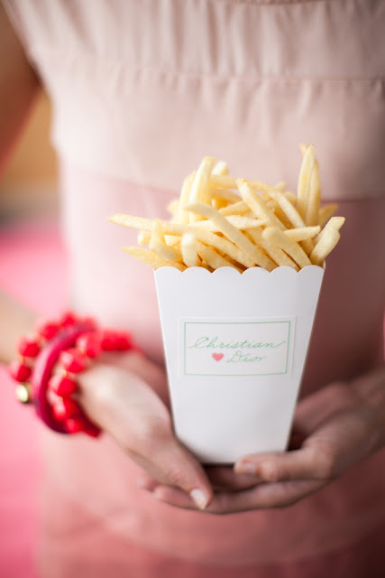
You can see our working files below. We were really into mismatched patterns and folded cards. If you look closely, the invitation reads Christian & Dior, tres chic!

Visit Nancy's Brown Bag to view Anatomy of Today's Bride Part I and Part II, and watch the amazing video by Luke Goodman here!

Photography by Kevin Chin

Employee Spotlight: Stewey

So you want to know more about Hello!Lucky?! Now you can see the faces of our hard working employees and learn a little bit about the daily life as an H!L member. To kick it all off, we're delighted to introduce Stewey. His optimism and cheer light up the entire office, and his can-do attitude keeps this place running smoothly (especially on rainy days like today!). When you place a custom order, Stewey is one of the fabulous design consultants who will walk you through every step of the process and help guide you if you need a little extra help! We asked him a few questions:
  
My role at Hello!Lucky is.... 
Design Consultant.

I can’t get through the day without.... 
a run to the local corner store for a Green Tea Ginger Ale.

My ideal weekend activities include.... 
Tartine Bakery’s Quiche and an exploratory SF neighborhood walk with Matt.

My favorite Hello!Lucky design is.... 
Visit London (I lived there for 2 years), or Hearts-and-Arrows.

Secret insider info you might not know about Hello!Lucky.... 
There are a few Undercover Karoke Superstars working here- but you didn’t hear that from me.

Eunice's Pinterest Picks - Desert Skyline

This week I've been loving succulents, the perfect thing for a romantic desert wedding. Our Desert Skyline invitation would be perfect for the occasion, as would this super cool and minimalist tumbleweed bouquet by JL Designs (photography by Gabriel Ryan Photographers), and fabulous sparkly purse - very 70's disco halter top but in the coolest possible way (photo by Max Wanger from this inspiring Palm Springs weddding). The Ace Hotel in Palm Springs (photo: Lane Dittoe) would make for a hip wedding venue, and I love this bridesmaid's dress (photography by Gabriel Ryan Photographers). Gorgeous and simple cake (from Whole Foods! Photo by Jose Villa), fabulous signs by Lorie Marie from Pretty Little Things, cowboy boots are an obvious shoe choice and a brilliant option for dancing the night away hobble free (Nicole Chatham Photography), these pretty centerpieces by Air Plant Supply Co. (photography by Brandon Kidd), and brilliant dahlia and succulent wedding bouquet recipes from the Wedding Chicks.

Spring DIY: Paper Flower Wreath

Spring may be a time to get organized, but we think it's a great time to bust out the dusty craft bins and get creative! There's no better feeling than recycling something disposable and transforming it into something worth saving. We know you're left with all those leftover holiday cards and wrapping papers, so this is the perfect opportunity to put them to good use! This lovely wreath from our book Handmade Weddings (published by Chronicle Books) uses a variety of found papers, including patterned paper scraps, kraft paper, glassine, tracing paper, and graph paper. This colorful wreath is perfect as a welcome sign at a wedding or party, or to adorn your front door as a welcome sign for Spring!

Materials

Makes 1 wreath

• 15 to 20 sheets assorted scarp papers e.g., construction paper, kraft paper, graph paper, tissue paper

• 30 to 40 colorful 1/4-inch brads

• Four 18-inch pieces floral wire (optional)

• One roll floral tape (optional)

• 1/4 yard scrap fabric

• 18-inch cardboard or particleboard wreath form

• Paper clip (optional)

• 1 to 2 pieces scrap cardboard or foam core

• 1 sheet text-weight paper (optional)

 Tools

• Paper Flower templates (available here)

• Pencil

• Scissors

• Small flower punches

• 1/8-inch hole punch

• Hot glue gun and glue sticks

• One 1 1/2-inch Styrofoam ball (optional)

• Inkjet printer, with extra ink cartridges (optional)

 How to

1. Make your flowers.

For flat flowers: Cut out the Paper Flower templates. Trace them onto patterned scrap paper, and cut out with scissors. Fold the flowers along the center axis of the petals to add dimension. You can also fringe the petals or crinkle flowers made of tissue to add depth. Punch small flower shapes for the flower centers. Stack several flower designs on top of each other, and punch a hole in the center. Insert a brad into the center and flatten the ends. Repeat to make as many flowers as desired.

 For cupped petal flowers: Cut out the Petal template. For each flower, trace the template four times onto graph paper or another text-weight paper. Cut the petals out. Slide a 6-inch length of floral wire into an unopened brad so that the brad grips firmly and the round end faces up. Fold the base of the petal into an M shape, position on the wire, and affix with a dab of hot glue. Place the next petal, and repeat until all four petals are in place. Wrap the petal bases with a strip of floral tape. Repeat to make as many flowers as desired.

 For tissue paper flowers: For each flower, cut four 1 1/2-×-4-inch strips of tracing paper or tissue paper. Place a piece of tissue, long side facing you, on your work surface. Center the Styrofoam ball on the paper, wrap the long ends up, and twist the ends to hold them in place. Trim the twisted ends with scissors and remove the ball, creating a cupped petal. Repeat to create four petals per flower. Slide a 6-inch length of floral wire into an unopened brad so that the brad grips firmly and the round end faces up. Position a petal on the wire, and tape it in place with a strip of floral tape, wrapping it around the wire a few times. Place the next petal and repeat until all four petals are in place. Repeat to make as many flowers as desired.

2. Prepare your wreath form. Cut your fabric into 3-inch-wide strips. Hot glue one end of a strip to the wreath form, and wrap it around the wreath until you run out of fabric. Glue the fabric end down and continue with a new strip until the wreath is completely covered. Avoid covering the hole in the wreath (for hanging). If desired, flatten a paper clip into an S shape and insert it into the hole, to be used as a hook when you are ready to hang your wreath.

3. Attach your flowers. Arrange your flowers in a wreath shape on your work surface. When you are happy with their placement, begin hot-gluing them to the form. To create depth, cut out several 1/2-inch squares of cardboard or foam core and affix these to the wreath form before gluing a flower on top, so that these flowers are slightly raised.

4. Add a sign (optional). If desired, lay out a sign such as “Welcome!” or your names and wedding date using a wordprocessing program and printing on text-weight paper, or write the sign by hand. Attach to the wreath using a dab of hot glue.

For more fun DIY ideas, visit our website here!