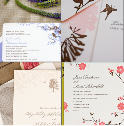
 You’ve set the date, picked a venue, and read every back issue of Martha Stewart Weddings. Now, you’re thinking about taking the plunge for letterpress printed wedding invitations. You’ve shopped around and know that letterpress wedding invitations can be more expensive that other types of invitations. What you may not know is that the product you get can vary wildly in quality.
These days, with so many designers and hobbyists diving into letterpress printing, it can be easy to overlook the fact that letterpress printing is a craft (some go so far as to call it an art form) that takes years to truly perfect. The difference in experience between an amateur- and a professionally-printed product is not unlike the difference between wriggling into that itchy sweater than your best friend knitted for you (too-small arm holes and all!), and slipping into a beautifully constructed couture garment. Since a letterpress wedding invitation sets the tone for your entire wedding day, it should be of the best quality.
Here are some tips for spotting fine-quality letterpress printing:
- Detailed impression that gently depresses into the paper. One of the lovely things about letterpress is the tactile impression the plate leaves after it has been pressed into the paper. However, it is possible to go overboard. Less experienced printers often press the plate so hard against the paper that the type or design punches through the back side, making your invitation feel more like a ticket than a piece of fine stationery (and making the inside of a folded card, such as a thank you note, difficult to write on). The hallmark of fine letterpress printing is that the plate “kisses” the paper, leaving the back of the card smooth yet achieving enough indentation to achieve depth and detail in the design.
- Thick, soft paper. To truly showcase its tactile quality, letterpress wedding invitations should use soft, 100% cotton archival printmaking papers. These papers are thick, soft (almost cashmere-like), and absorbent, so are thus best able to receive the ink and impression of the letterpress plate. Commercial papers tend to be harder and less absorbent so result in a less deliciously exquisite result.
- Even ink coverage. One of the trickiest aspects of letterpress printing is to get just enough ink on each area of the design. When the design includes a large solid area as well as an area of fine type, (as in our L’Oiseau invitation above), the large area requires more ink and the fine type less ink. A skilled printer will make numerous detailed adjustments to achieve perfect coverage in all areas. Squishy and/or uneven ink coverage are hallmarks of a novice printer.
- Perfect registration. Since each ink color is printed in a separate press run, each colored area of the design is printed separately, too. After the first layer is printed, the plate for the second later must be mounted and adjusted so the second part of the design fits perfectly with the first. This can be especially difficult when the design has details that require tight registration, for example small pink polka dots against a brown background.
Designing for Letterpress. Like printing, designing for letterpress is an art as well, requiring the ability to work within a constrained color palette (since each ink color is applied separately, letterpress printing typically involves one or two ink colors) and intimate knowledge of the printing process and the printer’s capabilities. The more skilled the printer, the more flexibility the designer has to experiment creatively.
The best design for letterpress capitalizes on the vintage nature of the printing process, capturing an authentic, vintage feel that is updated for modern style, whether it be Art Nouveau, Pop Modern, or Chinoiserie. Letterpress printing has been around since the 1400s, so there’s a wealth of stylistic history to draw on. The best designers have a broad stylistic vocabulary and thus can customize your invitations to suit your style or theme.
